Food & Beverage
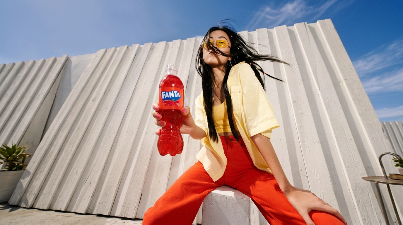
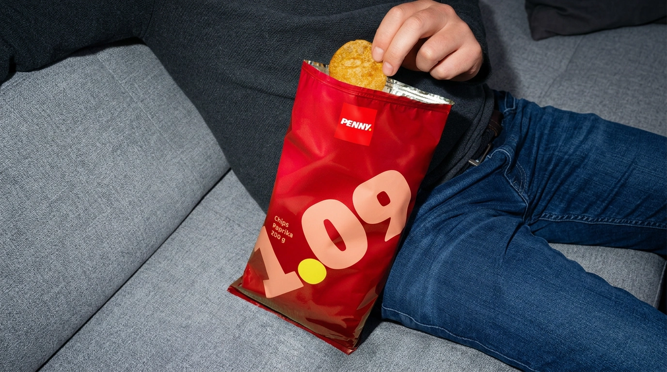
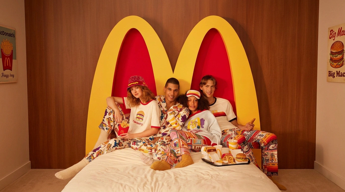
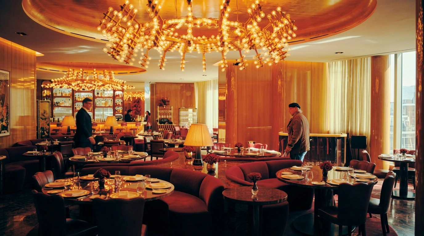
Food & Beverage on Visie covers campaign and product photography for marques spanning fast food, soda, beer, and packaged snacks — including McDonald's, The Coca-Cola Company, Heineken, and Oreo, shot by photographers and food stylists working against the clock before real food and drink lose their appeal under hot lights.
Explore Food & Beverage categories
This week's top Food & Beverage projects
This week's top Food & Beverage projects, carefully handpicked by Visie's expert curators, showcase the best in style and innovation.
 Project
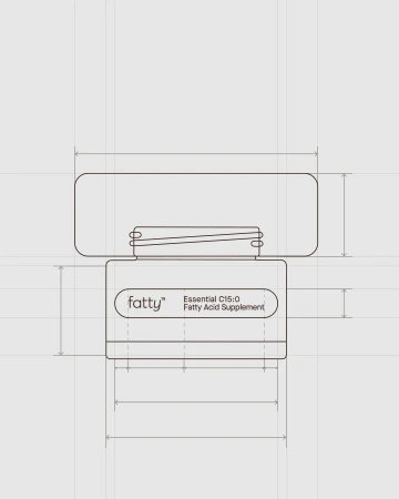
 fatty15’s AFEX packaging, Design Dept® looked to fine fragrance · Brand Identity
Design Dept® developed the brand identity and packaging for fatty15’s AFEX supplement line, drawing aesthetic cues from the fine fragrance industry. The design language utilizes minimalist typography, neutral palettes, and refined structural elements to elevate the presentation of the C15:0 dietary supplement. Technical illustrations and studio photography highlight the geometry of the product’s dark wooden caps and glass vessels. The project features clean layouts and vector-based graphics to emphasize a polished, minimalist visual identity, supported by editorial imagery that situates the brand within a lifestyle context. Design Dept® handled the brand design, with packaging production by Emma Lusher, illustrations by Brian Rea, and photography by Spencer Wells and Caroline DeSmet.
Alterna · Brand Identity
Alterna’s brand identity project establishes a visual language centered on earthy tones and structured, minimalist composition. The project integrates photography and graphic design to bridge culinary presentation with architectural branding elements. Comedor Studios and FAENA developed the creative direction, employing a layered, collage-inspired approach alongside clean, commercial product shots. The imagery balances high-contrast, moody cocktail photography with editorial-style menu design and ambient architectural signage.
KFC · How Much Do You Believe in Chicken
KFC’s How Much Do You Believe in Chicken is a cinematic commercial that leans into a suspenseful, high-energy narrative. Directed by Vedran Rupic with creative development by Mother London, the film shifts from the static, atmospheric tension of a dimly lit warehouse to an urgent, coordinated movement sequence. Characters move through industrial corridors with live-action technique, their actions defined by pools of overhead lighting. The visual language emphasizes a moody aesthetic as the cast navigates the space in unison.
 Project
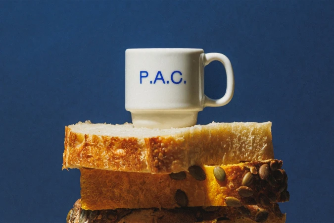
 P.A.C. · Brand Identity
P.A.C. establishes a cohesive visual language through this comprehensive brand identity project. The work leans into a warm, minimalist aesthetic, featuring a distinct royal blue palette applied across ceramic goods, packaging, and retail touchpoints. Photography by Brejo captures the product range and storefront environment using natural light and clean, high-contrast compositions. The visual system is further defined by illustrative elements from Beatriz Batisteli and design support from Polar, Ltda., who also contributed motion and illustration assets to the project.
 Project
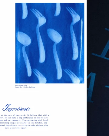
 Helsinki restaurant Elm · Brand Identity
For the Helsinki restaurant Elm, Classmate Studio developed a comprehensive brand identity that merges artisanal printmaking with editorial design. The system leans into an atmospheric, tactile aesthetic, anchored by a series of vibrant cyanotype prints that incorporate botanical forms and abstract cutlery silhouettes. This use of analogue film techniques and traditional chemistry provides a distinct, deep blue visual foundation that carries through the restaurant’s menus, signage, and environmental collateral. Illustrator Linda Linko provides the project’s expressive, handwritten script and fluid ink compositions, which balance the structured, clean typography seen across menus and entrance signage. The brand’s identity is further documented through photography by Sofia Kulianu, who captures the restaurant’s architectural heritage and hospitality through a documentary lens. By layering these graphic elements with authentic interior and culinary shots, the identity achieves a cohesive, craft-focused presentation that emphasizes texture and organic detail.
M&M's · Scene of The Crime
M&M's presents "Scene of The Crime," a commercial campaign for the packaged food brand that plays with genre conventions through a cinematic lens. Directed by Rami Hachache, the spot leans into a moody, live-action aesthetic, contrasting deep blue night tones with sharp, warm emergency lighting to build a dramatic atmosphere. Produced by Omnicom Production with creative support from BBDO Chicago, the narrative follows a forensic investigation before pivoting to the brand's signature character-driven humor. The project utilizes high-contrast lighting to balance its procedural-inspired visual style with the established visual identity of the characters.
Berto reworks the osteria’s codes · Brand Identity
Berto's brand identity project translates the traditional osteria experience into a cohesive visual language. Designed by Jean-Michel Mercier and documented through photography by Eliane Cadieux, the work employs a warm palette and clean typographic layouts to unify the restaurant’s physical and printed elements. The identity relies on natural light and raw textures to anchor the brand, balancing modern graphic design with interior architectural details. The project spans from embossed menu covers and stationery to storefront signage, all unified by a consistent use of red accents against deep, earthy materials. The execution captures a refined atmosphere that aligns with the project’s editorial and commercial focus.
Stella Artois · The Gentlemen's Serve
Stella Artois presents 'The Gentlemen's Serve,' a narrative-driven commercial directed by Fredrik Bond. The film follows a group of men in tailored suits navigating a formal estate auction, utilizing a distinct aesthetic shaped by low-key lighting and atmospheric shadows to build tension within the frame. Produced by Stink Films with agency support from GUT Amsterdam, the project features cinematography by Ben Seresin and product design by Simon Bowles. The visual tone is reinforced by costume design from Rosa Dias and hair and makeup by Michele Baylis, anchoring the cinematic, live-action sequences within a structured, moody environment.
 Project
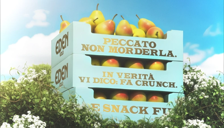
 Greenyard Fresh Italy · Brand Identity
Greenyard Fresh Italy partnered with AUGE Design and 3D artist Sara Bigagli to develop a comprehensive brand identity for their Eden Gold pear range. The project blends functional CPG design with classical aesthetics, utilizing a mix of 3D render/CGI and painterly illustrations to elevate the brand's presence in the food and beverage sector. Across the visual suite, the identity leans into a nostalgic and tactile narrative, featuring motifs of woodland scenes, human hands, and orchard life finished with a raw, earthy color palette. The execution balances structured packaging design with fine art textures, incorporating clean typography that stands out against grainy, cinematic backgrounds. The branding extends across various media, from physical packaging and die-cut templates to outdoor advertising, maintaining a consistent focus on a high-end, artisan-led market approach.
 Project
 Salsa Mutua · Brand Identity
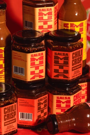
Salsa Mutua establishes a vibrant market presence through a comprehensive brand identity project that blends playful character-driven illustration with bold, high-contrast graphic design. The project centers on a striking yellow, red, and green color palette, utilizing clean vector typography to define the brand's visual language across both physical packaging and digital touchpoints. The visual system leans into an editorial and commercial aesthetic, featuring candid photography of the product in use, alongside stylized vector illustrations of cats and kinetic typography. AH Work led the design efforts, while Adrián Zarraga handled motion work and Alberto Pinto contributed photography. The execution employs varied techniques, including flash and natural light, to create an energetic, saturated look that emphasises the brand’s distinct personality.
 Project
 Manta · Brand Identity
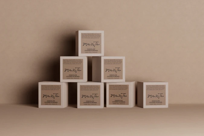
The brand identity for Manta spans a complete ecosystem of CPG packaging and digital touchpoints within the food and beverage sector. The design relies on minimalist principles, utilizing a palette of earth tones such as terracotta, sage green, and warm beige to ground the product presentation. Across the packaging, Studio Tyrrell implemented precise typography and tactile finishes, including emboss and deboss techniques that invite interaction with the physical product. The project incorporates professional 3D rendering by Elliott Barker to visualize packaging structures and organic textures. This CGI work is complemented by the studio photography of Jason Lewer, which captures the matte and metallic surfaces of the brand’s assets in soft, even light. Further visual depth is provided through UI illustrations from Lily Kong, which delineate the brand's connection to its raw ingredients and geographic origins. The final output is rounded out by web development from Rob Dove and high-quality print production by Generation Press, resulting in a cohesive, clean design language.
Hoplark · Case Study Loop
This commercial video case study for Hoplark provides an overview of the brand's visual identity, focusing on its range of hopwater beverages. The footage highlights product packaging through a series of dynamic sequences, showcasing the cans in both controlled studio settings and outdoor environments. Produced by Gus, the execution employs live-action technique and warm lighting to emphasize the product's colorful design. The edit incorporates various touchpoints, including close-ups of product handling and documentation of street poster displays.
Explore other industries
Explore Visie's leading industries, projects, and the talented creatives representing them.