CPG / Packaged Food
CPG and Packaged Food is where most of the classic food-photography tricks actually live, because the real product rarely survives long enough under hot lights for the shot. On Visie, that craft spans campaign and product photography for marques like Heinz, Oreo, Doritos, and Snickers, built and rebuilt by hand between nearly every frame.
This week's top CPG / Packaged Food projects
This week's top CPG / Packaged Food projects, carefully handpicked by Visie's expert curators, showcase the best in style and innovation.
Pringles · Once You Drop
The 'Once You Drop' commercial for Pringles follows a funeral director balancing the somber atmosphere of his work with the presence of the snack brand. Directed by Brody Bernheisel, the spot employs deadpan humor and precise cinematic staging to create a contrast between the character's professional environment and his snack of choice. Captured by director of photography Jordan T. Parrott, the piece utilizes live-action technique to ground the narrative in a detailed interior setting. Production was handled by Omnicom with agency and creative support from BBDO, featuring talent Dan McDonald as the lead character.
Cheetos · The Other Hand
Cheetos explores the universal struggle of snacking in 'The Other Hand,' a humorous commercial campaign that leans into the physical comedy of attempting everyday tasks with one's non-dominant hand. Directed by Harold Einstein, the film sequences a series of vignettes—from a chaotic police sketch interrogation to a backyard birthday party—to highlight the specific inconvenience of the snack-dust phenomenon. The production maintains a clean aesthetic, utilising bright, even lighting across various interior and exterior commercial environments. Developed by Goodby Silverstein & Partners, the campaign relies on a straightforward live-action technique to ground the humorous premise in recognisable scenarios.
 Project
Madeleine · Brand Identity
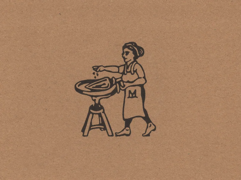
The brand identity for Madeleine centres on a tactile, artisanal aesthetic that bridges traditional print techniques with clean, modern layout design. The visual language utilises a palette of earthy brown paper textures contrasted against vibrant yellow accents and crisp black typography to establish a premium presence within the packaged food industry. Studio Hi Ho led the design of the identity, which features illustrative work by Pat Rogasch and photography by Shelley Horan. The execution leans into a minimalist sensibility, employing graphic ink illustrations and structured flat-lay compositions to highlight the product’s craft-focused nature. Through the integration of varied geometric forms and careful material choices, the project balances commercial clarity with a raw, tactile materiality.
 Project
fatty15’s AFEX packaging, Design Dept® looked to fine fragrance · Brand Identity
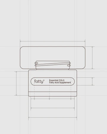
Design Dept® developed the brand identity and packaging for fatty15’s AFEX supplement line, drawing aesthetic cues from the fine fragrance industry. The design language utilizes minimalist typography, neutral palettes, and refined structural elements to elevate the presentation of the C15:0 dietary supplement. Technical illustrations and studio photography highlight the geometry of the product’s dark wooden caps and glass vessels. The project features clean layouts and vector-based graphics to emphasize a polished, minimalist visual identity, supported by editorial imagery that situates the brand within a lifestyle context. Design Dept® handled the brand design, with packaging production by Emma Lusher, illustrations by Brian Rea, and photography by Spencer Wells and Caroline DeSmet.
 Project
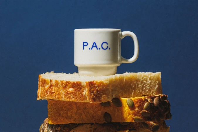
P.A.C. · Brand Identity
P.A.C. establishes a cohesive visual language through this comprehensive brand identity project. The work leans into a warm, minimalist aesthetic, featuring a distinct royal blue palette applied across ceramic goods, packaging, and retail touchpoints. Photography by Brejo captures the product range and storefront environment using natural light and clean, high-contrast compositions. The visual system is further defined by illustrative elements from Beatriz Batisteli and design support from Polar, Ltda., who also contributed motion and illustration assets to the project.
M&M's · Scene of The Crime
M&M's presents "Scene of The Crime," a commercial campaign for the packaged food brand that plays with genre conventions through a cinematic lens. Directed by Rami Hachache, the spot leans into a moody, live-action aesthetic, contrasting deep blue night tones with sharp, warm emergency lighting to build a dramatic atmosphere. Produced by Omnicom Production with creative support from BBDO Chicago, the narrative follows a forensic investigation before pivoting to the brand's signature character-driven humor. The project utilizes high-contrast lighting to balance its procedural-inspired visual style with the established visual identity of the characters.
 Project
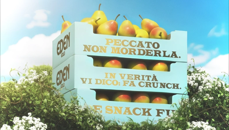
Greenyard Fresh Italy · Brand Identity
Greenyard Fresh Italy partnered with AUGE Design and 3D artist Sara Bigagli to develop a comprehensive brand identity for their Eden Gold pear range. The project blends functional CPG design with classical aesthetics, utilizing a mix of 3D render/CGI and painterly illustrations to elevate the brand's presence in the food and beverage sector. Across the visual suite, the identity leans into a nostalgic and tactile narrative, featuring motifs of woodland scenes, human hands, and orchard life finished with a raw, earthy color palette. The execution balances structured packaging design with fine art textures, incorporating clean typography that stands out against grainy, cinematic backgrounds. The branding extends across various media, from physical packaging and die-cut templates to outdoor advertising, maintaining a consistent focus on a high-end, artisan-led market approach.
 Project
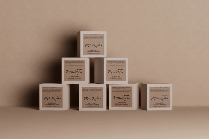
Manta · Brand Identity
The brand identity for Manta spans a complete ecosystem of CPG packaging and digital touchpoints within the food and beverage sector. The design relies on minimalist principles, utilizing a palette of earth tones such as terracotta, sage green, and warm beige to ground the product presentation. Across the packaging, Studio Tyrrell implemented precise typography and tactile finishes, including emboss and deboss techniques that invite interaction with the physical product. The project incorporates professional 3D rendering by Elliott Barker to visualize packaging structures and organic textures. This CGI work is complemented by the studio photography of Jason Lewer, which captures the matte and metallic surfaces of the brand’s assets in soft, even light. Further visual depth is provided through UI illustrations from Lily Kong, which delineate the brand's connection to its raw ingredients and geographic origins. The final output is rounded out by web development from Rob Dove and high-quality print production by Generation Press, resulting in a cohesive, clean design language.
Doritos · The Barbershop
Doritos leans into its snack-centric brand identity for this comedic commercial spot, The Barbershop. The narrative unfolds within a vibrant, retro-styled environment where a routine haircut takes an unexpected turn after the barber shares a bag of Nacho Cheese Doritos. The film utilizes a classic live-action technique to capture the awkward interaction, emphasizing the messier side of snacking. With production led by Patrick Koitzsch, the spot relies on timing and physical comedy to lean into the brand’s humorous tone.
Hershey's · Pinky Up (feat. KATSEYE)
Hershey’s latest collaboration, Pinky Up, serves as a masterclass in modernizing CPG brand storytelling by blending high-energy pop culture with everyday consumer experiences. Featuring members of the global breakout group KATSEYE, this commercial project leans into a vibrant, urban aesthetic that feels both accessible and aspirational. The creative execution, managed by MiltonOne, transforms a mundane subway commute into a rhythmic, cinematic spectacle where the product sits at the very heart of the motion. By utilizing a live-action technique interspersed with artful slow motion, the film captures a sense of spontaneous joy that resonates with a younger, rhythm-focused audience. The cinematography prioritizes a crisp, polished look that elevates the fashion-forward styling of the talent, ensuring the vibrant yellow and deep brown color palette pops against the industrial backdrop of the train car. Rather than relying on static product shots, the campaign uses fluid, fast-paced choreography to embed the chocolate bar into the lifestyle of the protagonist, creating a seamless connection between indulgence and movement. It is a sharp, confident departure from traditional food and beverage advertising that succeeds by focusing on personality-driven engagement and sleek, contemporary visual polish, proving that even iconic packaged food brands can find a fresh, rhythmic pulse in the bustling landscape of modern city life.
Dr. Squatch · SPEEDRUN: Million Dollar Mission - Hero Trailer
In a departure from traditional grooming marketing, Dr. Squatch leans into the frenetic energy of internet culture with their latest campaign, SPEEDRUN: Million Dollar Mission. Featuring the polarizing and high-octane personality IShowSpeed, this hero trailer transforms the brand into the center of a heist-inspired narrative. Set against the stark, industrial backdrop of a mock bank vault, the visuals utilize a blend of Live-action Technique and polished Motion Graphics to mirror the pacing of modern digital content. By positioning stacks of soap alongside mounds of cash, the project cleverly bridges the gap between premium grooming products and the high-stakes world of creator-led spectacle. The cinematography relies on dynamic, rapid-fire camera work—including intentional zoom effects and quick cuts—to maintain a relentless momentum that resonates with a younger, web-native audience. With production oversight from Jirka Cerny, the creative team captures a distinct Lifestyle aesthetic that feels less like a traditional commercial and more like a high-production social media stunt. This CPG campaign successfully leverages the influence of its talent to turn a standard promotional beat into an Action-oriented event, effectively proving that personality-driven content remains the gold standard for cutting through the digital noise. By utilizing strategic Slow motion sequences to emphasize product placement, the trailer achieves a sophisticated balance between chaotic entertainment and disciplined brand messaging.
bibigo · Korea Everywhere
The Korea Everywhere campaign for Bibigo masterfully bridges the gap between traditional culinary heritage and the hyper-modern aesthetics of global youth culture. By enlisting actor Randall Park to anchor the narrative, the commercial functions as a high-octane exploration of identity, effortlessly transitioning from the bustling, neon-soaked authenticity of a Seoul night market to the polished intensity of a K-pop performance stage. The production, spearheaded by the agencies Rethink New York and Cinélande, relies on a dynamic live-action technique that gives way to sophisticated CGI-infused urban fantasy sequences. This stylistic pivot underscores the brand's expansive reach, framing the CPG product as a ubiquitous cultural connector. The visual language is defined by rapid-fire editing and stylized lighting, which maintain a frenetic, engaging pace while ensuring the Bibigo identity remains central to the visual storytelling. Behind the scenes, the integration of complex VFX and motion graphics—honed by Post 430 and Morgan Rojas—creates a seamless, high-production aesthetic that feels both cinematic and rooted in modern lifestyle trends. Ultimately, this commercial campaign elevates the food and beverage category by treating it with the same kinetic energy and artistic ambition typically reserved for entertainment, effectively positioning Bibigo not just as a pantry staple, but as a vibrant, essential element of a contemporary global lifestyle.
Top CPG / Packaged Food brands
Browse the world's most renowned CPG / Packaged Food brands, their projects and creatives who worked with them.
Explore other industries
Explore Visie's leading industries, projects, and the talented creatives representing them.