Travel & Hospitality
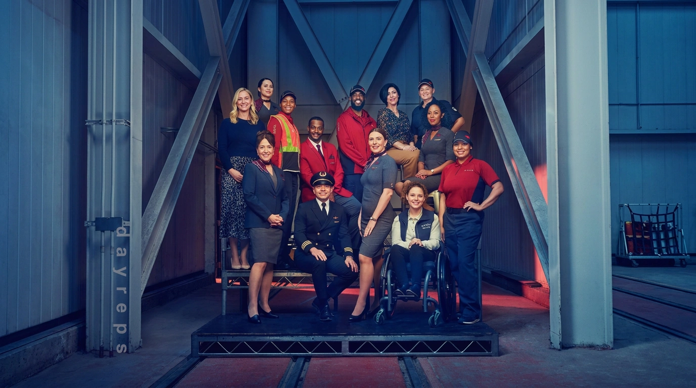
Travel & Hospitality on Visie covers campaign and destination photography for marques spanning airlines, hotels, cruises, and booking platforms — including Delta, Hilton, Royal Caribbean, and Booking.com — almost entirely anticipatory work, selling an experience that happens somewhere else, weeks after anyone sees the image.
Explore Travel & Hospitality categories

This week's top Travel & Hospitality projects
This week's top Travel & Hospitality projects, carefully handpicked by Visie's expert curators, showcase the best in style and innovation.
 Project
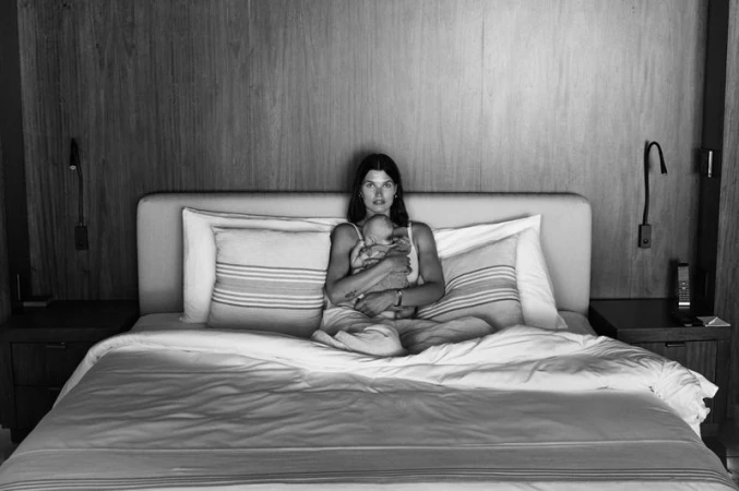
 One&Only · Mandarina Moments
One&Only presents Mandarina Moments, an editorial campaign for the luxury hospitality brand. Photographer Max Papendieck and creative director Edward James Lee collaborate to document a series of intimate, atmospheric scenes set against the resort's lush coastal backdrop. The imagery utilizes a monochrome palette and analogue film techniques to emphasize texture and organic detail. The project features model Julia van Os in diverse settings, from tropical hillsides and secluded coves to interior suites. The visual language leans into natural light and earthy surroundings, balancing composed portraiture with candid, quiet moments of travel and relaxation.
Sydney Airport · Life Takes Off When You Do - Film
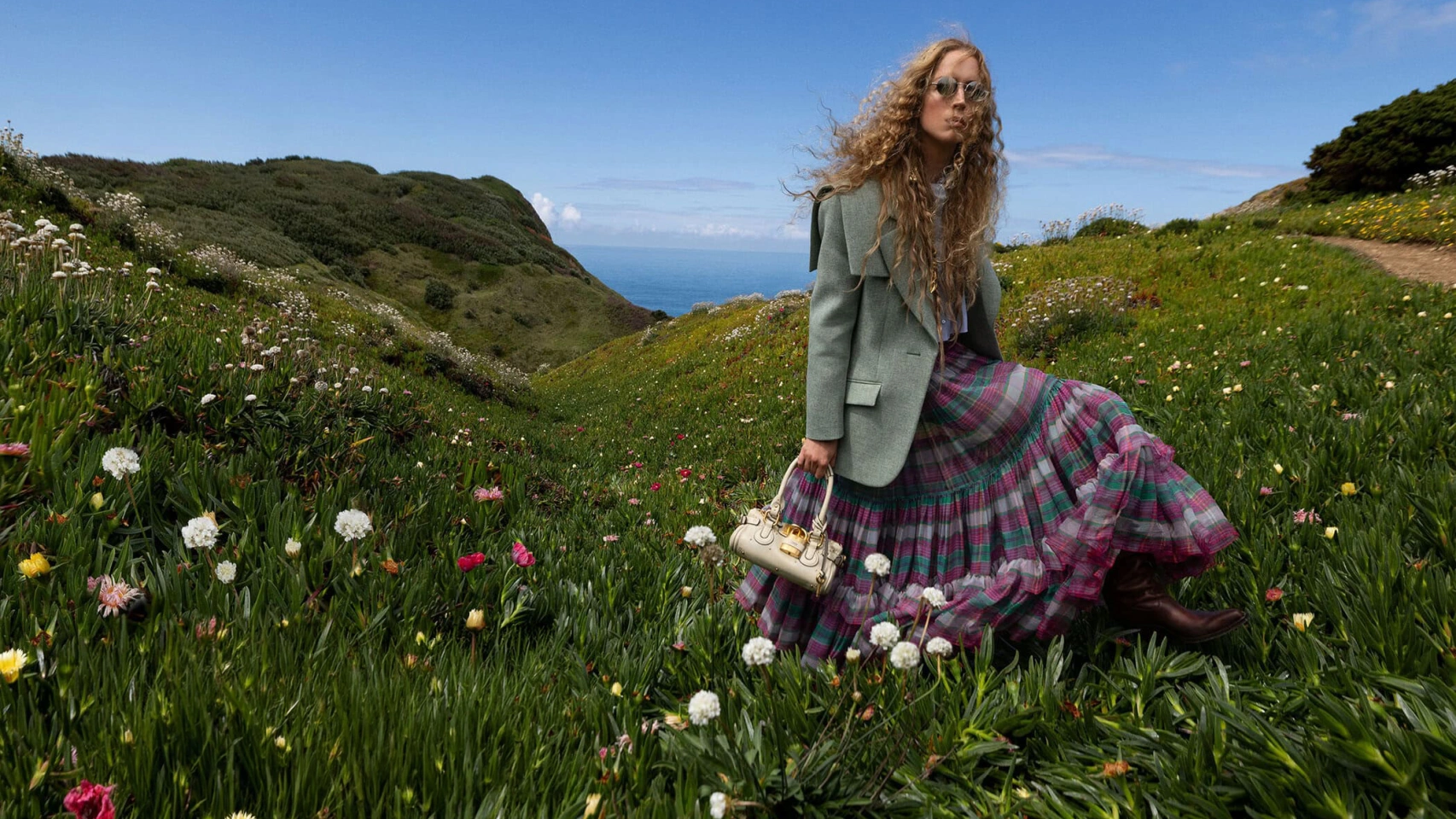
Sydney Airport launches its latest campaign, 'Life Takes Off When You Do,' an evocative film capturing the anticipation of travel. The production leans into a cinematic aesthetic, utilizing natural light and the soft tones of the golden hour to frame its aspirational narrative. Produced by Sam I Am, the film follows a central character through a sprawling meadow, contrasting the quiet scale of the landscape with the overhead transit of an aircraft. The project highlights a travel-focused theme, prioritising a warm, expansive visual language.
Away · Actually Away: The Last Train
Travel is rarely about the destination alone, a sentiment captured perfectly in Actually Away: The Last Train. In this cinematic short film for the fashion and accessories brand Away, the focus shifts from the utilitarian function of luggage to the spontaneous, fleeting moments that define a journey. Set against the grand, sweeping architecture of a historic train terminal, the narrative follows two protagonists whose playful interactions breathe life into the cavernous space. The creative direction, led by Michael Gaston, expertly balances the scale of the environment with an intimate, character-driven lens. By leaning into an editorial lifestyle aesthetic, the film elevates the suitcase from a mere accessory to an essential companion for those who find rhythm in movement. The technical execution relies on a blend of dynamic camera movements and live-action technique, capturing everything from quiet, candid close-ups to wide, atmospheric shots that emphasize the warmth of the lighting. Every frame feels deliberate yet unscripted, leaning into the whimsical unpredictability of transit. By prioritizing a narrative-driven flow over a traditional commercial structure, the project successfully positions Away within the cultural zeitgeist of modern wanderlust. It is a masterclass in atmospheric storytelling, where the interplay between the polished, high-ceilinged environment and the casual, grounded humanity of the subjects reinforces the brand identity with refreshing, authentic clarity.
Airbnb · Weekends Forever
Airbnb channels the quintessential spirit of spontaneity in its latest campaign, Weekends Forever, a vibrant exploration of leisure and human connection within the travel and hospitality industry. By leaning into a nostalgic visual language, the project masterfully captures the fleeting, sun-drenched joy of weekend getaways, weaving together candid moments of family breakfasts and surfing sessions. The production, helmed by the teams at Photoplay and Playtime with strategic creative direction from AKQA Australia, employs a sophisticated blend of live-action technique and authentic storytelling to ground the brand in genuine experience. The aesthetic is defined by its warm, evocative palette, utilizing 16mm and Super 8 film textures that lend a cinematic weight to simple, lived-in memories. Beyond the visuals, the project benefits from seamless post-production work by Heckler and an immersive sonic layer curated by Sonar Music, which together elevate the narrative from a mere montage into a cohesive celebration of togetherness. By focusing on the intimate intersection of indoor domesticity and expansive outdoor environments, the campaign avoids the generic trappings of travel marketing. Instead, it offers an honest look at the messy, beautiful reality of shared time, casting diverse groups that resonate with an audience seeking authentic escape. Through careful casting by Byrne Creative, the imagery succeeds in feeling both aspirational and entirely attainable, firmly positioning the brand as the curator of life’s best memories.
Uber · Punctual Queen
In the fast-paced world of digital platforms and modern transit, Uber leans into the everyday rhythm of personal preparation with its latest campaign, Punctual Queen. The creative vision, helmed by the team at Mother New York, reframes the backseat of a ride-share vehicle as a functional extension of one's vanity. By showcasing a protagonist who seamlessly transitions from a home skincare routine to the final stages of a bold makeup application while in transit, the project highlights the reliability of the service through a lens of relatable human behavior. Executed through a clean, live-action technique, the narrative captures the essence of efficient city living with a cinematic flair. Production support from Arts & Sciences ensures the visual language remains grounded yet elevated, utilizing bright, natural lighting that emphasizes a lifestyle aesthetic. The narrative flow is punctuated by post-production work from Niccolò Montanari and sonic layers curated by Premier Music Group, grounding the high-energy concept in a polished reality. Rather than relying on heavy artifice, the commercial celebrates the quiet autonomy of the modern commuter, positioning the brand as the invisible partner to a busy schedule. This spot successfully balances high-level production values with a grounded, intimate performance, serving as a masterclass in how lifestyle branding can feel both aspirational and entirely accessible to the everyday user.
 Project
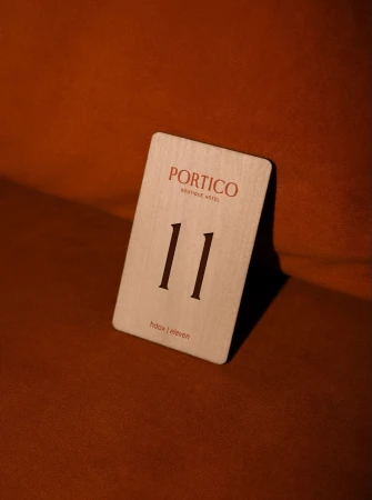
 Portico · Brand Identity
The brand identity for Portico Boutique Hotel masterfully bridges the gap between historical architectural heritage and modern, minimalist luxury. Situated in Mosta, Malta, the property is defined by a visual language that celebrates tactility and organic form. Through a sophisticated interplay of earthy terracotta tones, deep mahogany, and clean, elegant serif typography, the design team at Hangar has crafted an atmosphere that feels both professional and deeply inviting. The project, which spans across diverse media including stationery design, editorial food photography, and cinematic brand motion graphics, leans into a palette of warm, sun-drenched hues to emphasize a sense of sanctuary. Dynamic motion graphics by Nicole Micallef serve to animate this identity, with fluid animations that trace the intricate curves of classical architectural elements, such as stone-carved acanthus leaves, and transform them into precise, contemporary logo marks. The inclusion of bespoke illustrations by Jan Frantz further grounds the brand in its unique environment. By utilizing live-action techniques alongside refined graphic design, the identity evokes a dreamlike, golden-hour aesthetic that promises high-end hospitality. Whether through a macro shot of a textured soap bar or the deliberate, smooth transitions of its typographic reveal, the Portico brand identity achieves a cohesive, polished look that remains rooted in minimalist principles while delivering an unmistakably editorial sensibility for the travel and hospitality industry.
 Project
 The Marram Collection · Brand Identity
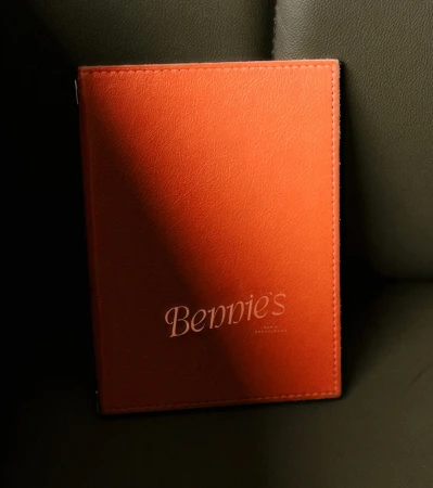
The brand identity for The Marram Collection, executed by Crown Creative, masterfully bridges the gap between historic architectural grandeur and contemporary hospitality elegance. This commercial project encompasses a comprehensive suite of assets, ranging from signage and environmental design to refined product packaging and lifestyle photography captured by Stephen Lister. The visual language centers on a sophisticated serif typeface, brought to life through precise emboss and deboss techniques that invite tactile interaction, while the color palette of sage, olive, and burnt orange offers a grounded, organic warmth. By integrating 3D elements produced by Chris Hamill, the design system achieves a cohesive, multi-dimensional presence that feels both timeless and sharp. Whether applied to the weathered stone facade of The Kithmore or the curated interior of a bedroom suite, the aesthetic leans into a minimalist, cinematic quality that prioritizes material texture and high-contrast typography. The photography, characterized by soft light and high-angle composition, documents a brand that respects its physical environment while asserting a modern identity. Through this balance of corporate professionalism and lifestyle-driven storytelling, the design ensures that every touchpoint—from menu covers to bespoke stationery—functions as a deliberate extension of the brand's premium, immersive, and highly structured character.
College HUNKS · Moving Houses of All Sizes
College HUNKS reimagines the often stressful logistics of relocation by focusing on the intimate connection between people and their belongings in the new campaign Moving Houses of All Sizes. Operating within the vehicle rental and hospitality sector, the project bridges the gap between large-scale logistics and personal sentiment through a carefully constructed narrative. The film leans into a bright, clean aesthetic that prioritizes professional reliability, effectively utilizing a high-energy live-action technique to showcase the team at work. Central to the commercial is a charming sequence featuring professional movers wrapping a delicate Victorian dollhouse in branded green protective blankets, a move that highlights the company’s signature attention to detail. By centering a young girl observing the care afforded to her prized toy, the agency PPK successfully distills the brand’s promise of trustworthy service into a relatable, human-scale experience. The cinematography adopts a distinctly cinematic approach to make what is essentially a utility service feel approachable and premium. By leaning into the brand’s signature green and orange palette, the spot reinforces identity while maintaining a professional tone that speaks to the logistical demands of moving. This project serves as a masterclass in visual storytelling, transforming standard moving procedures into a narrative about care, security, and the preservation of what matters most to the client during a period of transition.
Hertz · Kirk Herbstreit
In a clever display of self-aware brand storytelling, Hertz leans into the comedic potential of its Gold Squad campaign by enlisting the help of college football personality Kirk Herbstreit. This live-action technique advertisement masterfully balances professional polish with a lighthearted, absurd edge that immediately captures the viewer's attention. The spot features Herbstreit reflecting on his high-profile partnership with the vehicle rental brand, though the narrative quickly shifts to the spotlight-stealing antics of a golden retriever donning a yellow bandanna. By situating the canine star within the tropes of a traditional press conference—complete with contract signings and selfie sessions—the agency, Preacher, successfully positions Hertz as a brand capable of not taking its corporate image too seriously. The aesthetic remains grounded in a relatable lifestyle setting, utilizing sharp, clean compositions that contrast Herbstreit’s measured reactions with the undeniable charm of his furry co-star. The project functions as both a celebration of brand personality and a meta-commentary on the nature of celebrity endorsements, proving that high-level travel and hospitality marketing can thrive when it embraces a bit of spontaneous humor. With the creative direction from Preacher, this campaign underscores the evolving strategy of connecting with audiences through unexpected, highly shareable moments that resonate far beyond the standard, static expectations of the travel industry.
 Project
 The Calile · Brand Identity
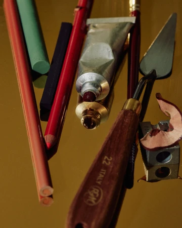
The brand identity for The Calile represents a masterclass in modern hospitality design, seamlessly blending leisure with an intellectual, curated atmosphere. Through a diverse collection of commercial lifestyle imagery and editorial graphics, the project captures the essence of a premium stay, leaning into a sophisticated, minimalist aesthetic that defines the property. Photographers Annika Kafcaloudis, Scottie Cameron, Libby Willis, and Georgia Wells, alongside videographers Scottie Cameron and Jensen Cope, employ natural light and cinematic techniques to create a cohesive visual language. The project expertly utilizes fine art still lifes, soft lifestyle portraits, and clean typography to communicate both the tactile, high-end interior details and the broader, laid-back energy of the hotel. A recurrent emphasis on high-contrast lighting and carefully considered material textures—from warm wood grains and brass accents to polished marble—anchors the brand in a space of quiet luxury. The inclusion of thematic touchpoints like the hotel's book club program demonstrates a commitment to storytelling, further elevated by a vibrant color palette that balances terracotta tones with serene, muted accents. By integrating these disparate elements into a unified, high-concept brand identity, the collaboration achieves a rare, contemporary editorial feel that invites guests into an immersive, aspirational world. Every frame and layout choice serves to reinforce the hotel’s reputation as a destination where refined design meets absolute, effortless comfort.
 Project
 The Dock · Brand Identity
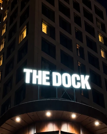
The brand identity for The Dock captures a sophisticated intersection between commercial architecture and intimate, lifestyle-driven storytelling. Eschewing the conventional trappings of hospitality branding, the project leverages a cinematic visual language to anchor the identity in a sense of place. Through the expert design work of Söderhavet, the creative output relies heavily on high-contrast environments and moody, intentional lighting to establish a distinct tone. The visual narrative transitions seamlessly from bold, graphic typographic applications, such as the neon signage and distinctively minimal door hangers, to the quiet introspection of low-key chiaroscuro portraits. By utilizing macro photography that emphasizes tactile textures—like deep red card sleeves set against light-absorbing velvet—the brand crafts an aesthetic that feels both elevated and grounded. The project effectively balances these commercial elements with soft, natural light photography that documents a minimalist interior, suggesting an atmosphere of refined leisure. Throughout the execution, the use of shallow depth of field and carefully managed reflections reinforces a sense of architectural rhythm and symmetry. Ultimately, The Dock identity leans into a cohesive, atmospheric strategy, transforming functional wayfinding and touchpoints into essential components of a broader, well-considered brand experience that prioritizes mood and sensory detail over simple utility.
Airbnb · Experiences - Things to do that stay with you (Original Music)
Airbnb leans into the visceral intimacy of human connection in this evocative campaign for its Experiences platform. By shifting the focus from mere accommodation to the ephemeral, memory-making moments of global travel, the brand curates a tapestry of discovery that feels both expansive and deeply personal. The visuals, captured with a documentary-like sensibility, skip across a diverse array of settings, from the lush, wild spray of a hidden waterfall to the vibrant, chaotic hum of an open-air market brimming with fresh spices and local catches. This live-action technique is grounded by an authentic, observational rhythm, utilizing slow motion to linger on the sensory details of the journey, such as the tactile selection of ingredients or the shared warmth of a meal under the open sky. The project’s aesthetic is bolstered by warm, engaging lighting that accentuates the rich textures of these environments, bridging the gap between exotic locales and the common experience of human wonder. Central to this immersive storytelling is a bespoke original soundscape provided by The Crystal Creative, which weaves a melodic backbone through the fast-paced montage, ensuring that the kinetic energy of the visuals is met with a resonant, cinematic emotional weight. Ultimately, the work succeeds by transforming the travel booking platform into a conduit for genuine cultural exchange, reinforcing the idea that the most profound souvenirs are the interactions that stay with us long after the journey concludes.
Explore other industries
Explore Visie's leading industries, projects, and the talented creatives representing them.