Sports & Gaming
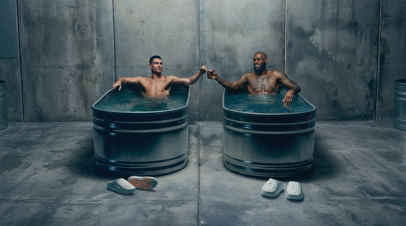
Sports & Gaming on Visie spans two opposite ends of one taxonomy — live, unscripted human performance, and fully rendered, computer-built worlds. That craft covers live event, campaign, and key art photography for marques including the NFL, NBA, EA, and FANDUEL, broken into twelve very different categories below.
Explore Sports & Gaming categories
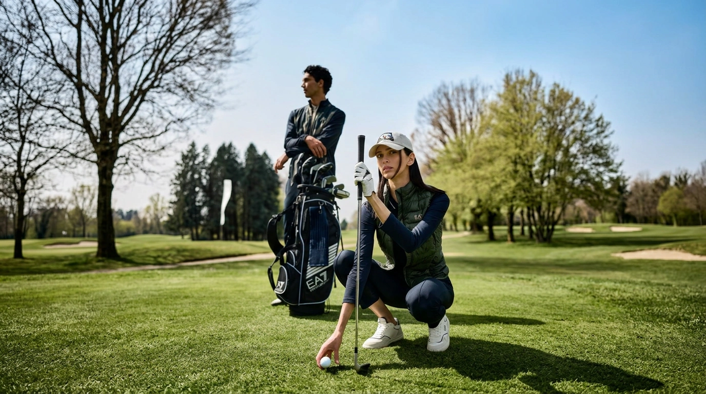
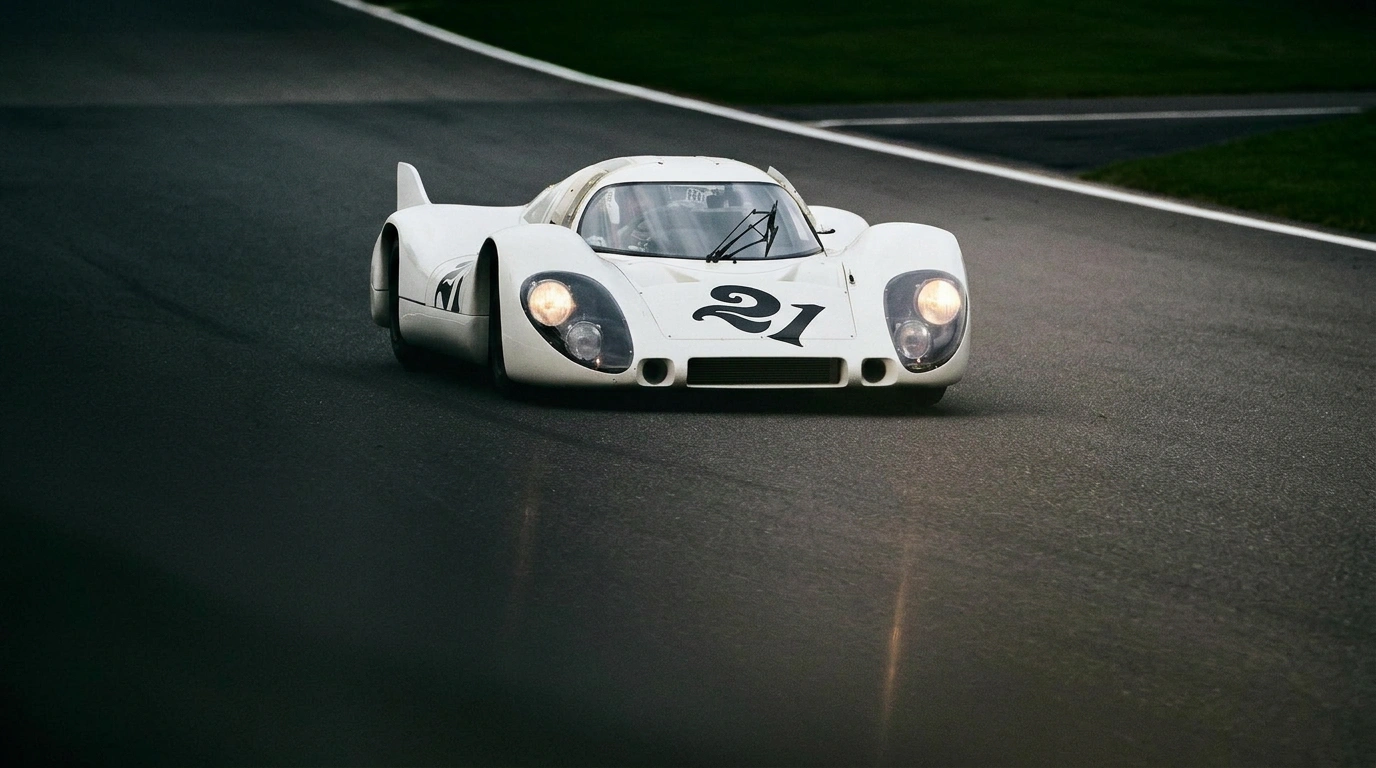
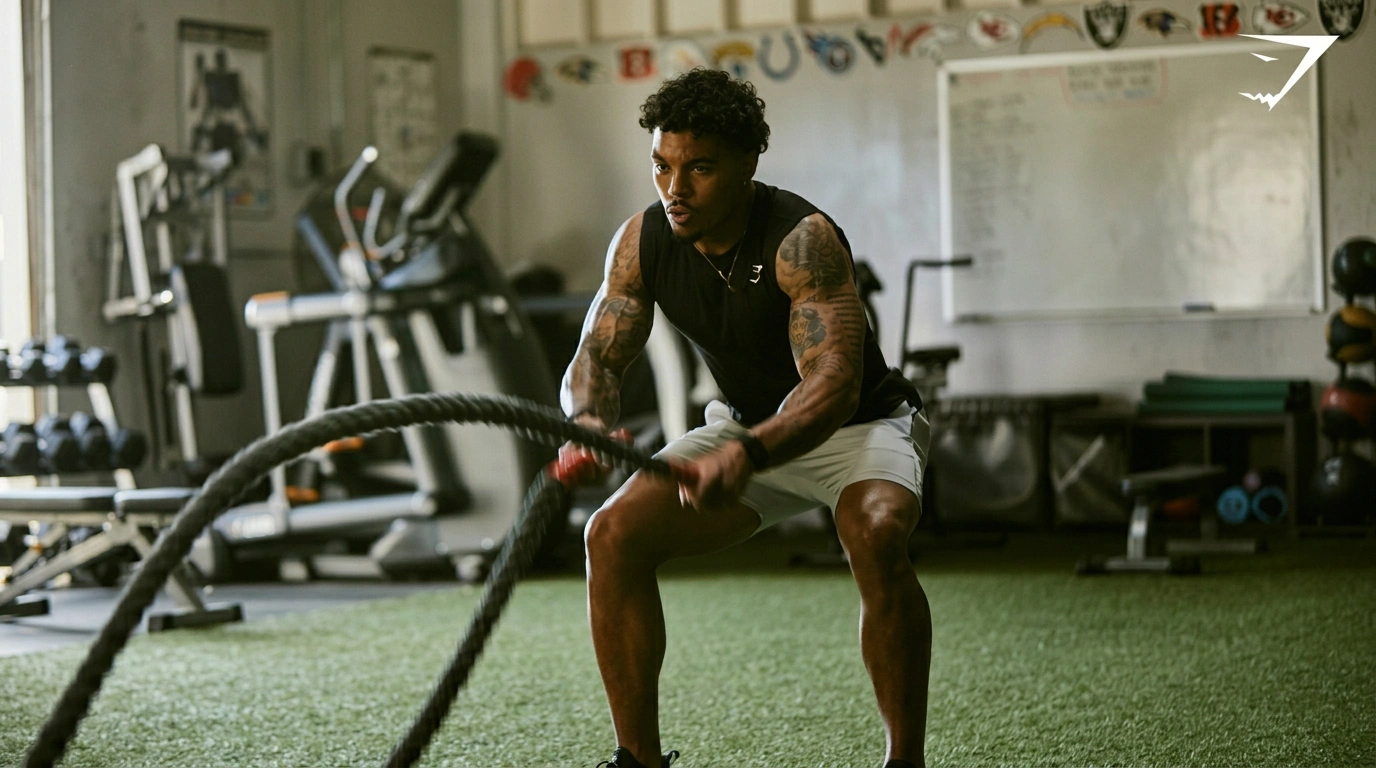
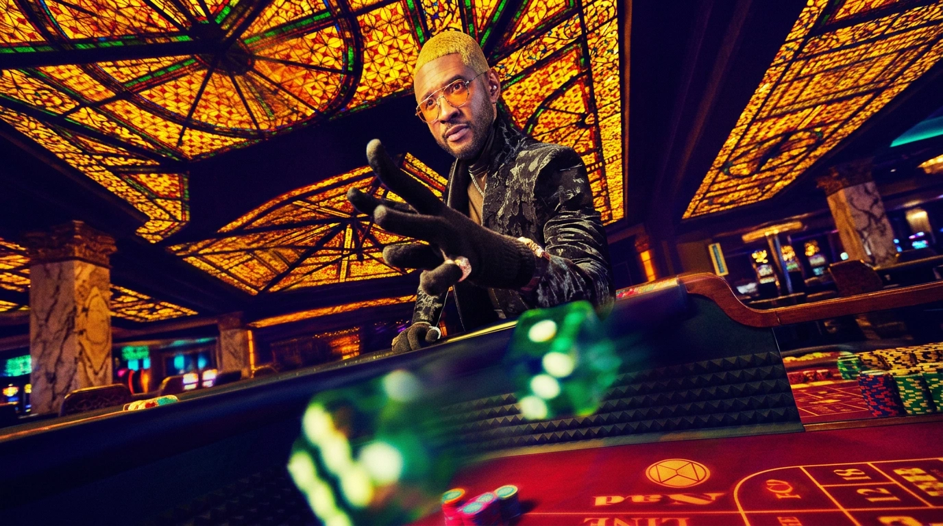

This week's top Sports & Gaming projects
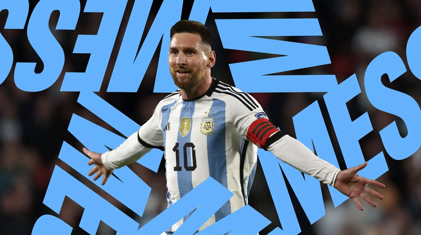
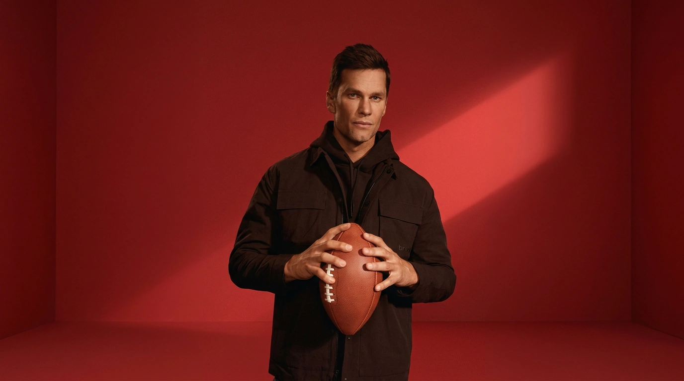
This week's top Sports & Gaming projects, carefully handpicked by Visie's expert curators, showcase the best in style and innovation.
Nike · Nothing Special to See Here
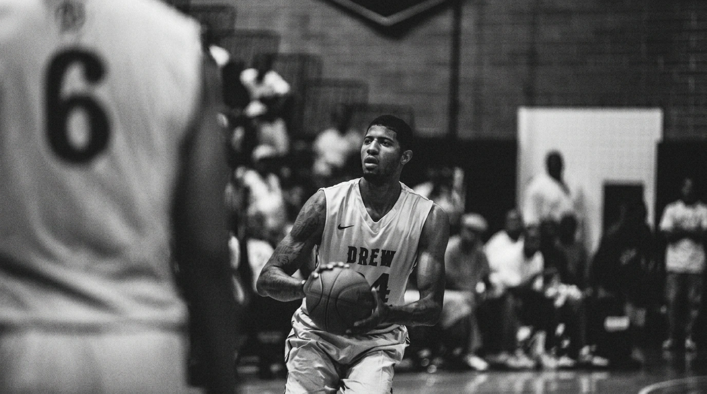
Nike's 'Nothing Special to See Here' project, created by agency Wieden+Kennedy and directed by Elliott Power, centres on a direct-to-camera performance. The live-action film captures a young basketball player on the court, leaning into a cinematic aesthetic through intimate close-ups and natural lighting. Designed for the sports and gaming industry, this vertical piece utilises performance-focused storytelling. The project relies on a focused dialogue-driven approach to establish its narrative rhythm.
Peloton · Let Yourself Run
Peloton’s 'Let Yourself Run' campaign centers on a cinematic live-action sequence featuring artist Miley Cyrus. The film, directed by Bethany Vargas with production support from DIVISION Global and producer Angelo Mazzamuto, frames Cyrus during a session on a treadmill within a mirrored studio environment. The visual approach, led by director of photography Ben Carey, utilizes clean composition and drone footage to capture the movement. The aesthetic is defined by a distinct golden hour lighting palette, supported by a creative team including fashion stylist Bradley Kenneth, hair stylist Bobby Eliot, makeup artist Janice Daoud, and manicurist Miho Nails.
 Project
 Women's Health U.S · Kerry Washington Opens Up About Heal ...
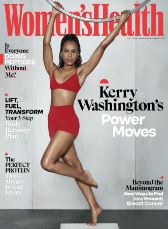
Women’s Health U.S. features actor Kerry Washington in a series of editorial portraits that focus on movement and athletic form. Captured by photographer Dana Scruggs, the imagery utilises a minimalist studio setting with neutral textures to emphasise dynamic physical poses, ranging from Pilates-inspired stretches to suspended action shots. The project incorporates both warm-toned colour palettes and monochrome compositions to highlight sculptural lines and core strength. The aesthetic leans into a clean, directional lighting style that reinforces the editorial approach. Fashion styling by Mariel Haenn and Rob Zangardi provides a versatile athletic wardrobe, complemented by makeup from Keita Moore and manicures by Pattie Yankee.
Adidas · Endtroduction
In the Endtroduction commercial, Adidas explores the crossover between professional athletics and pop culture. Featuring athlete Anthony Edwards, the project leans into late-night television aesthetics to frame a high-energy stage performance. The spot was directed by Onda, with cinematography by Iain Trimble. Creative direction was led by Alfonso Ruiz and Zack Browne, capturing Edwards against a signature warm orange backdrop and stylized skyline. The production utilizes live-action techniques to integrate athletic branding with entertainment-focused visuals.
Hoka · One Day I Started to See Birds
The Hoka campaign titled One Day I Started to See Birds follows a young woman as she navigates an urban landscape, transitioning from a convenience store setting to the city streets. The project leans into an atmospheric narrative, utilizing live-action techniques to emphasize the subject's movement and her choice of footwear. Produced by Object & Animal with production service from Xiadani Castanos, the commercial features a distinct cinematic aesthetic. The visuals are defined by cool color grading and quick pacing, focusing on character interactions and close-ups of the product in motion, with post-production and visual effects provided by ETHOS and editing by Church Edit.
Novig · Just Sports
Novig enters the sports betting space with its 'Just Sports' campaign, featuring actor Sydney Sweeney. The commercial leans into a moody, high-contrast aesthetic, placing the focus on stylized equipment and athletic imagery within a clean studio environment. Executing a polished visual approach, the work utilizes hard light and chiaroscuro techniques to frame Sweeney alongside various sports apparatus. The result is a series of focused, editorial-style live-action spots that highlight the brand's identity.
 Project
 ICON America · Taylor Fritz
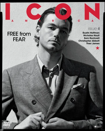
ICON America presents a series of athletic portraits featuring professional tennis player Taylor Fritz. This editorial campaign captures the athlete across a range of environments, moving from controlled studio settings to outdoor court locations. The imagery leans into a clean, classic aesthetic, highlighting the precise tailoring of the apparel through sharp, monochromatic compositions. Photographer Blair Getz Mezibov utilizes a mix of natural light and studio textures to document the subject, with fashion styling provided by Tony Irvine. The production incorporates analogue film techniques, emphasizing subtle textures in the knitwear and cotton fabrics while maintaining a crisp, refined look throughout the series.
Madden'27 · Cover Reveal - 15s
The latest campaign for Madden 27 marks a high-energy return to form, perfectly balancing the intensity of professional sports with the irreverent humor synonymous with the franchise. Centered on a 15-second promotional reveal, the project leans into a playful narrative featuring actor Vince Vaughn, who steps into the role of a quintessential Chicago Bears General Manager and Head Coach. The execution shines by intercutting Vaughn’s deadpan, mock-press conference bravado with pulse-pounding, hyper-realistic game engine footage, grounding the digital experience in the high-stakes world of the NFL. By utilizing a live-action technique to bridge the gap between the virtual field and the real-world fan experience, the creative team ensures that the game’s scale feels both massive and personal. The transition to a gym-based secondary scene, where a weightlifter reacts to the broadcast, serves to ground the promotional effort in a relatable, authentic atmosphere. Through the clever use of slow motion and sharp editing, the clip manages to capture the essence of a major sports gaming launch while maintaining a consistently confident tone. Ultimately, this commercial manages to distill the complex appeal of the industry into a tight, memorable sequence that prioritizes character-driven storytelling as much as the cutting-edge mechanics of the game itself, positioning Madden 27 as a cultural touchstone for football fans everywhere.
ESPN · Super Bowl
ESPN's latest promotional campaign for their Super Bowl broadcast leans into a high-octane aesthetic, perfectly capturing the frantic, exhilarating energy synonymous with the biggest night in sports. By centering on a charismatic lead character draped in a striking blue suit, the production masterfully blends the polished nature of a commercial project with a cinematic flair that keeps viewers hooked. The narrative pulse moves rapidly through a bustling city plaza, utilizing dynamic camera movements and quick cuts to mirror the intensity of live-action technique, while brief, grounded cameos from Stephen A. Smith provide a necessary news-desk transition that tethers the exuberant visual storytelling back to the reality of the game. Mint Films achieves this vibrant atmosphere by leveraging saturated colors and crisp, natural outdoor lighting, creating a clean look that pops on screen. This project successfully pivots between the heightened world of character-driven performance and the professional gravity of sports broadcasting. The seamless integration of slow motion highlights provides visual punctuation to the choreography, ensuring the tone remains athletic yet entirely entertaining. It is a bold, rhythmic piece of media and entertainment production that prioritizes visual impact and momentum, reinforcing the brand's identity as the primary destination for championship-level coverage while maintaining a polished, high-energy finish that invites the audience to get lost in the excitement.
Verizon · A New Game Plan
In the fast-paced world of telecommunications marketing, Verizon continues its tradition of high-energy brand storytelling with A New Game Plan, a commercial that masterfully balances star power with polished brand messaging. The campaign leans into the natural charisma of comedian Kevin Hart, who assumes the role of a makeshift locker room coach tasked with rallying a group of Philadelphia Eagles players. Through a refined live-action technique, the narrative channels the intensity of professional sports while maintaining the approachable wit synonymous with Hart. The spot is anchored by a distinctly cinematic aesthetic, utilizing bright studio lighting to sharpen the textures of athletic gear and capture the genuine camaraderie within the huddle. Beyond the performance, the production team, including the creative heavyweights at MikeTeevee and Pretty Bird, ensures that every frame feels intentional and high-octane. The project effectively bridges the gap between massive reach and individual brand personality, culminating in a clear, succinct call to action that highlights the simplicity of the Verizon service plan. With crisp post-production work from Arcade Edit and sound design that punctuates the energetic dialogue, the commercial serves as a masterclass in modern technology advertising. By focusing on the intersection of cultural relevance and clean, high-impact visuals, the project successfully cuts through the digital noise, ensuring that the brand identity remains front and center in a competitive, crowded industry landscape.
 Project
 Palermo FC · Brand Identity
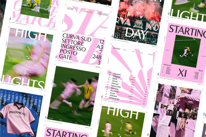
The brand identity overhaul for Palermo FC serves as a masterclass in modern sports branding, successfully bridging the gap between historic club heritage and contemporary graphic design. By leaning into a sophisticated visual language that prioritizes editorial minimalism and clean typography, the project elevates the team’s identity far beyond the pitch. The execution effectively balances high-energy live-action technique with a structured, corporate aesthetic, utilizing a distinct color palette—Rosa Palermo, Nero Notte, and Blu Mediterraneo—to honor the club’s deep-rooted connection to its home. The design strategy, helmed by the creative team at Alkemy, masterfully integrates archival research and raw fan culture with polished, high-contrast serif lettering. From stadium signage and ticketing systems to dynamic social collateral, the work channels a sense of local pride through layered collages and atmospheric cinematic imagery. Whether depicting the kinetic motion blur of players in their iconic pink kits or the rugged texture of weathered Sicilian stone, the identity is cohesive, tactile, and highly intentional. The project demonstrates how professional graphic design can transform raw, emotional sporting passion into a refined, recognizable brand system. By blending symmetrical 3D renders with candid documentary-style photography, the identity feels both timeless and aggressively modern, setting a new gold standard for professional football branding in an increasingly competitive global landscape.
 Project
 Various Campaigns · Wilson Defyer Campaign
The Wilson Defyer campaign serves as a masterclass in high-contrast product photography, meticulously stripping away environmental clutter to elevate sports equipment into objects of pure desire. Through the lens of photographer Calvin Pausania, the project leans into a dramatic, cinematic aesthetic that prioritizes form, material texture, and technical precision above all else. By employing low-key chiaroscuro lighting and a saturated red-to-black color palette, the creative team transforms standard tennis rackets and athletic bags into heroic subjects that command attention. The composition is consistently minimalist, often utilizing mid-air suspension or sleek, reflective studio surfaces to emphasize the aerodynamic silhouettes and industrial design of the gear. Throughout the series, the use of macro photography captures the intricate details of synthetic strings and glossy frames, while the interplay between hard and soft light provides a depth that feels both aggressive and sophisticated. This commercial campaign succeeds by treating athletic hardware with the same reverence as luxury fashion, using symmetry and deliberate negative space to create a graphic, high-performance visual language. Ultimately, the work functions as a study in modern branding, where the iconic Wilson logo is framed not just as a mark of utility, but as a central design element that anchors the entire aesthetic experience, effectively communicating strength, speed, and uncompromising quality.
Explore other industries
Explore Visie's leading industries, projects, and the talented creatives representing them.