Restaurants
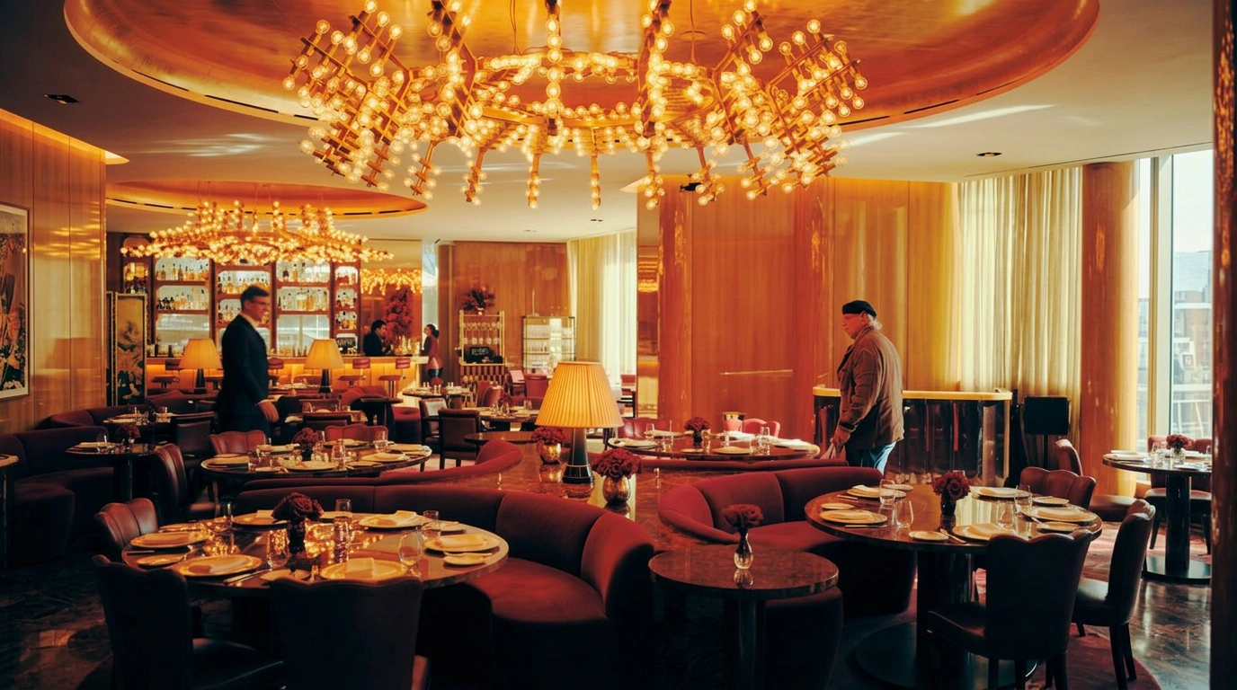
Restaurant photography puts the room, not just the plate, at the centre of the shot — the experience of eating out is as much the product as any dish. On Visie, that craft spans campaign and plating photography for marques like Applebee's, IHOP, Panera Bread, and Shake Shack, alongside interior shots that sell the dining room itself.
This week's top Restaurants projects
This week's top Restaurants projects, carefully handpicked by Visie's expert curators, showcase the best in style and innovation.
 Project
 Helsinki restaurant Elm · Brand Identity
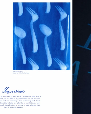
For the Helsinki restaurant Elm, Classmate Studio developed a comprehensive brand identity that merges artisanal printmaking with editorial design. The system leans into an atmospheric, tactile aesthetic, anchored by a series of vibrant cyanotype prints that incorporate botanical forms and abstract cutlery silhouettes. This use of analogue film techniques and traditional chemistry provides a distinct, deep blue visual foundation that carries through the restaurant’s menus, signage, and environmental collateral. Illustrator Linda Linko provides the project’s expressive, handwritten script and fluid ink compositions, which balance the structured, clean typography seen across menus and entrance signage. The brand’s identity is further documented through photography by Sofia Kulianu, who captures the restaurant’s architectural heritage and hospitality through a documentary lens. By layering these graphic elements with authentic interior and culinary shots, the identity achieves a cohesive, craft-focused presentation that emphasizes texture and organic detail.
Berto reworks the osteria’s codes · Brand Identity
Berto's brand identity project translates the traditional osteria experience into a cohesive visual language. Designed by Jean-Michel Mercier and documented through photography by Eliane Cadieux, the work employs a warm palette and clean typographic layouts to unify the restaurant’s physical and printed elements. The identity relies on natural light and raw textures to anchor the brand, balancing modern graphic design with interior architectural details. The project spans from embossed menu covers and stationery to storefront signage, all unified by a consistent use of red accents against deep, earthy materials. The execution captures a refined atmosphere that aligns with the project’s editorial and commercial focus.
Hector's Deli · Socials
Capturing the easy, unvarnished rhythm of urban connection, this latest social content piece for Hector's Deli leans into a lifestyle narrative that feels both spontaneous and grounded. Set against the authentic backdrop of a city street and sidewalk cafe, the project utilizes live-action technique to translate the simple joy of a casual encounter into a relatable brand story. By focusing on the candid interaction between two leads, the film avoids the polish of traditional commercial advertising, opting instead for a documentary-style intimacy that reflects the daily reality of the brand's neighborhood community. The natural daylight washing over the scene enhances the candid atmosphere, making the moment feel like a genuine snippet of life rather than a staged production. With production by Max Cooper, the film expertly balances character-driven performance with a sense of place, grounding the brand within its vibrant culinary ecosystem. This approach reinforces the deli's identity as a neighborhood staple where food serves as a facilitator for human moments. By stripping back the artifice and embracing a clean, observational style, the project successfully bridges the gap between digital content and experiential branding, ensuring that every frame resonates with the viewer through a lens of authenticity and warmth that defines the current landscape of restaurant social media marketing.
 Project
 Côt Parrilla · Brand Identity
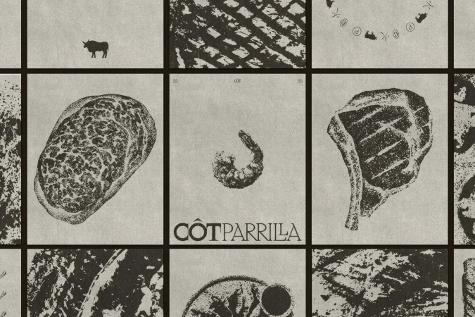
Côt Parrilla establishes a distinct visual language that bridges the gap between traditional grill culture and contemporary culinary sophistication. Through a cohesive brand identity, the project channels an artisanal, tactile aesthetic that leans into the raw elegance of charcoal illustration and lithographic textures. Design work by Estúdio Gole grounds the brand in a refined, serif-heavy typography that appears across an array of touchpoints, from menu design on textured beige paper to the iconic bull silhouette found on coaster details. The visual execution is masterfully supported by the cinematic photography of Isabelle Gantus, who utilizes low-key chiaroscuro lighting to capture the moody, atmospheric nature of the restaurant interior and the reflective depth of premium glass and woodwork. Meanwhile, 3D renderings by Vinicius Monteiro provide structural clarity to the brand's physical presence, balancing the graphic vector elements with high-end lifestyle captures of branded merchandise. Whether displayed on urban outdoor billboards or reflected in the polished surfaces of a stainless steel grill station, the identity feels both grounded and elevated. By integrating Japanese kanji and Portuguese elements into a unified circular design, Côt Parrilla successfully communicates a modern, global perspective on hospitality. This project avoids sterile corporate tropes, opting instead for a deliberate, texture-forward approach that makes the brand feel like a permanent, well-established fixture within the food and beverage industry.
 Project
 Salva Bar · Brand Identity
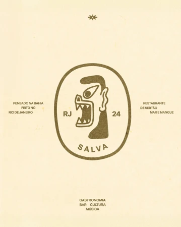
The brand identity for Salva Bar, executed by design house Biabum, serves as a vibrant visual bridge between the culinary heritage of the sertão and the coastal spirit of Rio de Janeiro. This extensive project functions as a masterclass in brand storytelling, utilizing a rich, saturated color palette and a consistent illustrative language that feels both folkloric and modern. Central to the identity is a quirky, abstract creature icon that anchors the brand across various mediums, from exterior signage on pastel walls to the tactile surfaces of screen printed tiles and textured terracotta-orange paper. The design work leans into a flat, graphic aesthetic, effectively employing vector illustration to catalog nautical elements, local architecture, and traditional ceramics. Captured through the lens of photographer Rafael Salim, the brand assets—ranging from apparel to complex mural patterns—communicate a narrative of gastronomy, culture, and music. By weaving together typography-heavy compositions with regional motifs and evocative Portuguese phrasing, the design team has successfully crafted a cohesive commercial atmosphere that feels deeply authentic and rooted in place. The resulting project is a tactile, highly disciplined system where every piece of collateral, including the t-shirt designs and uniform tile grids, contributes to a singular, inviting world that celebrates the unique intersections of sea, land, and cultural pride inherent in the Salva Bar experience.
 Project
 Bakery · Brand Identity
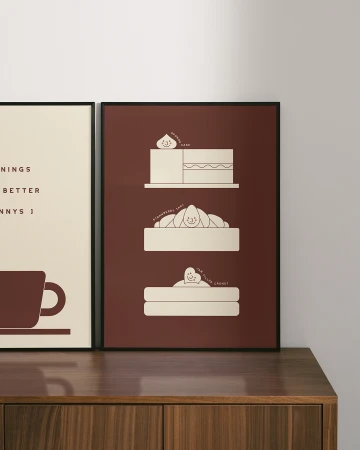
The brand identity for Jenny's Bakery expertly balances a sophisticated, modern aesthetic with a sense of playful, approachable charm, effectively positioning the establishment within the competitive landscape of the food and beverage industry. Through a cohesive visual language, the project elevates the everyday bakery experience into a lifestyle brand. With creative design work by Divide, the identity relies on a refined, limited color palette dominated by deep red, cream, and navy, which provides a bold foundation for the graphic elements. The photography, captured by Jack Fenby, leans heavily into natural light to accentuate the tactile qualities of the packaging and the artisanal details of the products. By utilizing vector-based line art and clean typography, the identity avoids the clutter of traditional retail branding, favoring a minimalist, symmetrical approach that feels both timeless and contemporary. The project seamlessly translates these visual cues across multiple touchpoints, from exterior signage and interior retail design to carefully staged commercial product shots and lifestyle imagery. Techniques such as high-contrast color-blocking and intentional shadow play serve to emphasize the brand's distinct personality, while the consistent inclusion of whimsical icons ensures the overall visual narrative remains engaging. This holistic brand rollout successfully creates an immersive environment that is as technically polished as it is welcoming, demonstrating a masterclass in modern, experience-driven design.
Resy · Right This Way
Resy’s commercial spot, Right This Way, captures the high-energy environment of professional restaurant kitchens. The project highlights the precision and preparation behind the scenes, from dough preparation and seafood handling to the final plating of dishes. Directed through a cinematic lens, the film emphasizes the technical rigor of hospitality staff. The visual language employs moody lighting and clean, live-action techniques to define the rhythm of a service shift.
Eataly · The Piazza
Eataly’s The Piazza campaign, produced by Johannes Leonardo, centers on an atmospheric, live-action narrative set within a classic Italian town square. The project features former professional footballer Alessandro Del Piero, who navigates the cobblestone surroundings in a sequence that draws on traditional architectural motifs. Leaning into a warm, cinematic aesthetic, the film captures the public square with an emphasis on authentic cultural textures. The narrative utilizes a humorous tone to explore themes of Italian identity, grounding the brand’s food and beverage focus within a staged, nostalgic environment.
Panera · Meaningful Meals
Panera's 'Meaningful Meals' campaign centres on the human connection fostered by shared dining experiences. The film features documentary-style interactions between individuals in a restaurant setting, emphasizing spontaneous reactions and genuine conversation. Utilizing natural light and intimate framing, the cinematography highlights the brand's space through a clean, warm aesthetic. This live-action work prioritizes authentic moments, stripping back production polish to focus on the interplay between guests and their surroundings.
OpenTable · The Proposal 20"
OpenTable debuts 'The Proposal,' a 20-second commercial spot that explores the intersection of dining and significant life moments. The narrative centers on a romantic setting, utilizing live-action technique to capture a quiet, intimate atmosphere. The film employs a cinematic aesthetic, leaning into warm lighting to build a contained, restaurant-focused narrative. Music and sound design, handled by Michael Ciccone, underpin the piece as the scene unfolds within a traditional dining environment.
Chili’s Grill & Bar · Margarita of the Month Club
Chili’s Grill & Bar leans into a high-energy social aesthetic for their Margarita of the Month Club campaign. Directed as a dynamic commercial, the production features an ensemble cast engaged in choreographed movement, set against a waterfront backdrop with a palette of vibrant pastel tones. The project captures a distinct 1980s-inspired atmosphere through its use of retro apparel and saturated staging. The live-action technique is complemented by fluid camera work and polished grading, highlighting the playful nature of the brand’s monthly promotion. The film was produced by Rebolucion Mexico and Ridley Scott Associates LA, with additional creative and media support provided by GALE.
 Project
 Carmel · Brand Identity
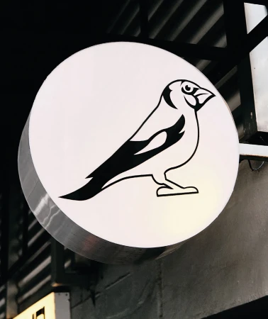
The brand identity for Carmel, designed by FAENA, establishes a cohesive visual language across the restaurant’s physical space and culinary presentation. The project utilizes clean graphic design and consistent typography to link interior elements, such as custom illuminated signage and apparel, with branded ceramic dishware. Captured through a blend of editorial and commercial photography, the visuals highlight the kitchen’s materiality through sharp flash techniques and natural light. The design system integrates line-based bird illustrations and bespoke phrases across the menu and serving ware, reinforcing a minimalist aesthetic within the hospitality environment.
Top Restaurants brands
Browse the world's most renowned Restaurants brands, their projects and creatives who worked with them.


Explore other industries
Explore Visie's leading industries, projects, and the talented creatives representing them.