Hotels
Hotel photography is dominated by the 'hero room' — one specific suite, staged beyond what a typical guest would actually experience, used to represent every room category the property sells. On Visie, that craft spans campaign and property photography for marques like Hilton, Marriott, Four Seasons, and Hyatt, often shot across several sessions to catch each space at its best time of day.
This week's top Hotels projects
This week's top Hotels projects, carefully handpicked by Visie's expert curators, showcase the best in style and innovation.
 Project
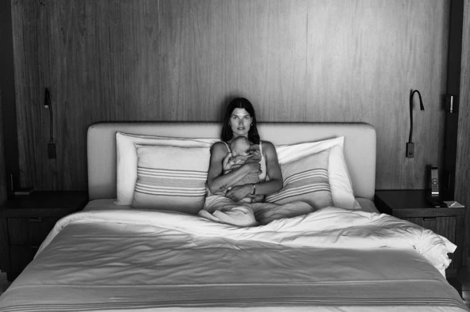
 One&Only · Mandarina Moments
One&Only presents Mandarina Moments, an editorial campaign for the luxury hospitality brand. Photographer Max Papendieck and creative director Edward James Lee collaborate to document a series of intimate, atmospheric scenes set against the resort's lush coastal backdrop. The imagery utilizes a monochrome palette and analogue film techniques to emphasize texture and organic detail. The project features model Julia van Os in diverse settings, from tropical hillsides and secluded coves to interior suites. The visual language leans into natural light and earthy surroundings, balancing composed portraiture with candid, quiet moments of travel and relaxation.
 Project
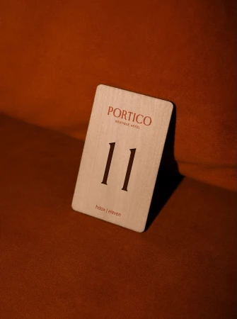
 Portico · Brand Identity
The brand identity for Portico Boutique Hotel masterfully bridges the gap between historical architectural heritage and modern, minimalist luxury. Situated in Mosta, Malta, the property is defined by a visual language that celebrates tactility and organic form. Through a sophisticated interplay of earthy terracotta tones, deep mahogany, and clean, elegant serif typography, the design team at Hangar has crafted an atmosphere that feels both professional and deeply inviting. The project, which spans across diverse media including stationery design, editorial food photography, and cinematic brand motion graphics, leans into a palette of warm, sun-drenched hues to emphasize a sense of sanctuary. Dynamic motion graphics by Nicole Micallef serve to animate this identity, with fluid animations that trace the intricate curves of classical architectural elements, such as stone-carved acanthus leaves, and transform them into precise, contemporary logo marks. The inclusion of bespoke illustrations by Jan Frantz further grounds the brand in its unique environment. By utilizing live-action techniques alongside refined graphic design, the identity evokes a dreamlike, golden-hour aesthetic that promises high-end hospitality. Whether through a macro shot of a textured soap bar or the deliberate, smooth transitions of its typographic reveal, the Portico brand identity achieves a cohesive, polished look that remains rooted in minimalist principles while delivering an unmistakably editorial sensibility for the travel and hospitality industry.
 Project
 The Marram Collection · Brand Identity
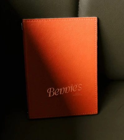
The brand identity for The Marram Collection, executed by Crown Creative, masterfully bridges the gap between historic architectural grandeur and contemporary hospitality elegance. This commercial project encompasses a comprehensive suite of assets, ranging from signage and environmental design to refined product packaging and lifestyle photography captured by Stephen Lister. The visual language centers on a sophisticated serif typeface, brought to life through precise emboss and deboss techniques that invite tactile interaction, while the color palette of sage, olive, and burnt orange offers a grounded, organic warmth. By integrating 3D elements produced by Chris Hamill, the design system achieves a cohesive, multi-dimensional presence that feels both timeless and sharp. Whether applied to the weathered stone facade of The Kithmore or the curated interior of a bedroom suite, the aesthetic leans into a minimalist, cinematic quality that prioritizes material texture and high-contrast typography. The photography, characterized by soft light and high-angle composition, documents a brand that respects its physical environment while asserting a modern identity. Through this balance of corporate professionalism and lifestyle-driven storytelling, the design ensures that every touchpoint—from menu covers to bespoke stationery—functions as a deliberate extension of the brand's premium, immersive, and highly structured character.
 Project
 The Calile · Brand Identity
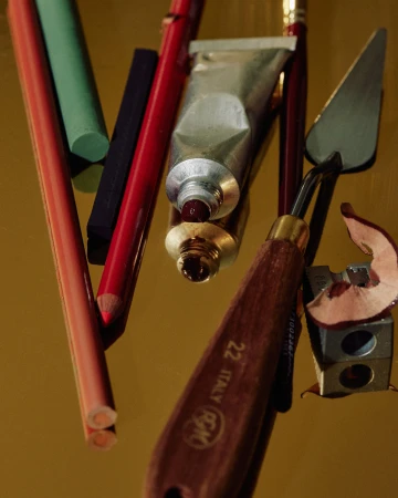
The brand identity for The Calile represents a masterclass in modern hospitality design, seamlessly blending leisure with an intellectual, curated atmosphere. Through a diverse collection of commercial lifestyle imagery and editorial graphics, the project captures the essence of a premium stay, leaning into a sophisticated, minimalist aesthetic that defines the property. Photographers Annika Kafcaloudis, Scottie Cameron, Libby Willis, and Georgia Wells, alongside videographers Scottie Cameron and Jensen Cope, employ natural light and cinematic techniques to create a cohesive visual language. The project expertly utilizes fine art still lifes, soft lifestyle portraits, and clean typography to communicate both the tactile, high-end interior details and the broader, laid-back energy of the hotel. A recurrent emphasis on high-contrast lighting and carefully considered material textures—from warm wood grains and brass accents to polished marble—anchors the brand in a space of quiet luxury. The inclusion of thematic touchpoints like the hotel's book club program demonstrates a commitment to storytelling, further elevated by a vibrant color palette that balances terracotta tones with serene, muted accents. By integrating these disparate elements into a unified, high-concept brand identity, the collaboration achieves a rare, contemporary editorial feel that invites guests into an immersive, aspirational world. Every frame and layout choice serves to reinforce the hotel’s reputation as a destination where refined design meets absolute, effortless comfort.
 Project
 The Dock · Brand Identity
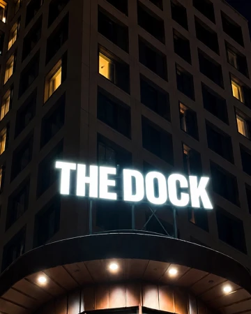
The brand identity for The Dock captures a sophisticated intersection between commercial architecture and intimate, lifestyle-driven storytelling. Eschewing the conventional trappings of hospitality branding, the project leverages a cinematic visual language to anchor the identity in a sense of place. Through the expert design work of Söderhavet, the creative output relies heavily on high-contrast environments and moody, intentional lighting to establish a distinct tone. The visual narrative transitions seamlessly from bold, graphic typographic applications, such as the neon signage and distinctively minimal door hangers, to the quiet introspection of low-key chiaroscuro portraits. By utilizing macro photography that emphasizes tactile textures—like deep red card sleeves set against light-absorbing velvet—the brand crafts an aesthetic that feels both elevated and grounded. The project effectively balances these commercial elements with soft, natural light photography that documents a minimalist interior, suggesting an atmosphere of refined leisure. Throughout the execution, the use of shallow depth of field and carefully managed reflections reinforces a sense of architectural rhythm and symmetry. Ultimately, The Dock identity leans into a cohesive, atmospheric strategy, transforming functional wayfinding and touchpoints into essential components of a broader, well-considered brand experience that prioritizes mood and sensory detail over simple utility.
 Project
 its first eight years · Brand Identity
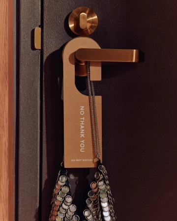
For The Calile Hotel, the brand identity project serves as a masterclass in cohesive, luxury hospitality design. By masterfully blending architectural materiality with tactile storytelling, the work establishes a visual language that feels both timeless and deeply rooted in its environment. Through the collaborative vision of Studio Bland, the project expands beyond simple graphic systems to curate an entire guest experience, from the nuanced typography of in-room signage and bespoke hotel-style door hangers to the elegant, minimalist packaging of signature room fragrances. The inclusion of evocative illustrations by Jessica Meyrick adds a layer of warmth and narrative flair, ensuring that the brand identity is not merely functional but inherently atmospheric. The imagery, captured through the lenses of Sean Fennessy, Toby Scott, David Chatfield, and others, leverages natural light to emphasize the rich textures of travertine stone, warm timber, and polished brass. This cinematic approach to lifestyle and commercial photography highlights the interplay between structure and comfort, where every detail—from the poolside monoliths to the neatly organized guest amenities—reinforces a sense of quiet luxury. Whether utilizing drone-captured aerial shots of the pool or tight, editorial-style product compositions, the project maintains a rigorous, high-end aesthetic. The result is a sophisticated, lifestyle-oriented identity that feels perfectly at home within its structural surroundings, transforming routine navigation and guest touchpoints into essential elements of the hotel’s overarching story.
Shinola · The Restaurant - On Shinola Time
Shinola’s 'The Restaurant - On Shinola Time' captures an intimate, character-driven narrative set within a dimly lit hospitality space. The project features a cinematic, low-key visual approach that emphasizes depth and expressive portraiture. Utilizing a moody, warm color palette, the film focuses on candid storytelling and quiet introspection. The work leans into chiaroscuro techniques to frame the subject, establishing an immersive, grounded atmosphere.
Four Seasons Athens · Summer Along The Athenian Riviera
Four Seasons Athens highlights its coastal resort experience in the promotional video Summer Along The Athenian Riviera. Directed by Quyen Mike, the piece focuses on the tranquil pace of a luxury getaway, moving from quiet moments on a sun-drenched balcony to open-air dining and spa sessions. The project leans into a serene aesthetic, utilizing warm natural light and the coastal landscape to establish the setting. The live-action technique emphasizes a calm, observational tone throughout the guest experience.
The Peninsula Hotels · There's No Greater Luxury Than Time
The Peninsula Hotels presents 'There's No Greater Luxury Than Time,' a campaign film that explores the intersection of refined service and the guest experience within the hospitality sector. Directed by Nur Casadevall, the project leans into a cinematic visual language that emphasizes architectural precision and quiet atmosphere. With cinematography by Thais Català, the film employs clean, live-action techniques to frame the interiors. Creative direction by Véronique Geiger provides a structured aesthetic, complemented by styling from Kim Bui that keeps the focus on understated, sophisticated detail. The final output is a series of polished vignettes centered on the hospitality environment.
Hilton · Curio Collection Brand Campaign | Hannah Bronfman, Crete
Hilton explores the Curio Collection through a new brand campaign featuring media personality Hannah Bronfman. Set against the backdrop of a resort in Crete, the vertical content captures a wellness-focused retreat, highlighting the property's architecture and coastal surroundings. The production leans into a warm, cinematic aesthetic, utilizing drone footage to frame the hospitality experience. The campaign emphasizes a sense of relaxation through sun-drenched visuals, focusing on spa environments and outdoor dining spaces.
Motto by Hilton · Brand Identity
Motto by Hilton redefines the urban hospitality experience through a cohesive brand identity that prioritizes social connection and sophisticated, minimalist design. The visual language, captured through the collaborative lens of photographers Calais Le Coq and Ty Cole, leans into a lifestyle-oriented narrative that bridges the gap between functional travel and aesthetic indulgence. By utilizing natural light to accentuate the textures of grey brick, tan leather, and light wood, the brand creates an atmosphere of accessible warmth that feels both curated and candid. This commercial photography approach avoids the sterile coldness of traditional corporate chains, instead favoring a lived-in authenticity that is reinforced by the inclusion of live-action techniques across their video assets. From the crisp, sans-serif typography found on functional merchandise like cotton tote bags and wooden chopstick sleeves to the rhythmic social energy within the lobby lounge, every touchpoint suggests a property designed for the modern, cosmopolitan traveler. With creative design input from Watson, the project successfully weaves together diverse urban environments under a single, recognizable visual banner. The result is a refined hotel identity that manages to feel personal, highlighting the seamless integration of global city motifs with the grounded, textural reality of contemporary interior spaces. This is a masterclass in modern hotel branding, where the details of everyday objects elevate the overall guest experience.
Four Seasons · "What to Visit in Prague" Four Seasons Hotel Prague
For the Four Seasons Hotel Prague, Consulate and creative James McClintock produced this cinematic travel narrative exploring the city's architectural heritage. The project highlights key cultural sites, Gothic cathedrals, and historic landmarks throughout Prague. The film utilizes monochrome visuals and high-contrast framing to capture the couple as they navigate elaborate stonework and interior spaces. Through the use of live-action technique and backlit shots, the production establishes a rhythmic, observational tone within the hospitality and travel sector.
Explore other industries
Explore Visie's leading industries, projects, and the talented creatives representing them.