
MoMA: Brand Identity



Dec 2019
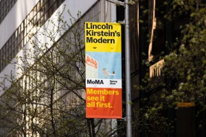
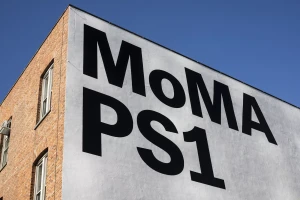
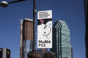
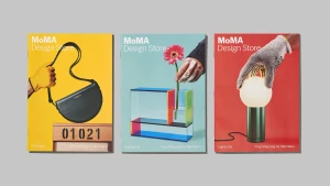
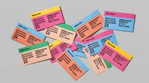
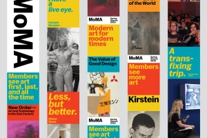
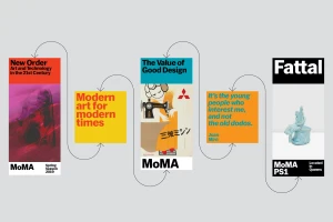
The brand identity for the Museum of Modern Art, meticulously crafted by the design studio Order, functions as a masterclass in institutional visual storytelling. By bridging the gap between historical weight and contemporary relevance, the project channels a sophisticated design language that feels both authoritative and accessible. The system leans into a rhythmic hierarchy of bold typography, utilizing a bespoke sans-serif typeface that anchors the institution's diverse range of programming. This cohesive approach is exemplified through a vibrant palette of primary colors—striking yellows, reds, and blues—which serve as a consistent thread across various touchpoints. From high-impact street banners mounted against the urban sprawl of New York to the precise, gridded layout of exhibition brochures and newspaper advertisements, the identity maintains a distinct graphic clarity. The project successfully employs UI illustration techniques and motion graphics to harmonize archival art prints with modern, abstract motifs, ensuring that the museum’s communication remains dynamic. Whether through the clean, modernist presentation of a typographic specimen or the playful organization of multilingual welcome cards, the work reinforces a corporate identity that is unmistakably rooted in the avant-garde. Through this strategic application of editorial minimalism and high-contrast typography, Order has solidified a visual ecosystem that elevates the museum’s status as a global leader in media and entertainment while celebrating the art of the exhibition itself.
Commercial, Clean, Horizontal
Typography
