
Frank Lloyd Wright Building Conservancy: Brand Identity




Mar 2026
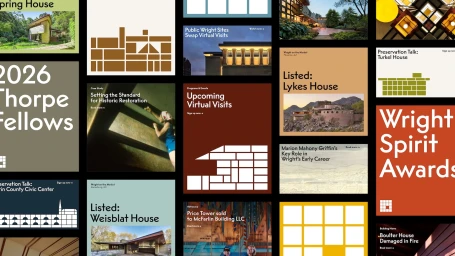
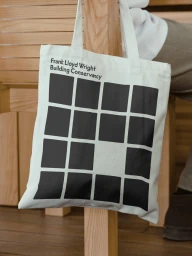
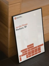
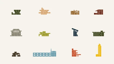
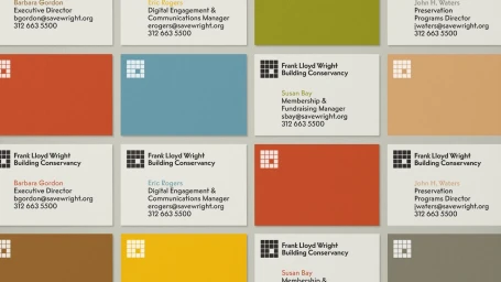
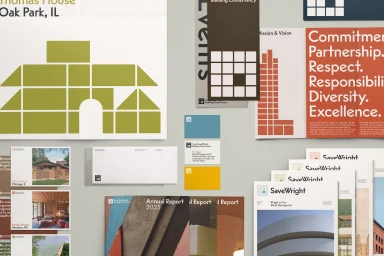
The new brand identity for the Frank Lloyd Wright Building Conservancy masterfully translates the architect's legendary structural philosophy into a cohesive visual language. Designed by the team at Order, the project functions as a sophisticated real estate platform identity that bridges historic architectural reverence with modern, modular design systems. By deconstructing Wright's complex spatial theories into a grid-based framework, the design team effectively distills intricate floor plans and building silhouettes into scalable, high-impact vector icons. This system relies heavily on minimalist typography and a curated, earthy color palette—featuring burnt oranges, deep reds, and olive greens—to evoke the organic textures of mid-century design. Beyond the digital and stationery assets, the brand identity incorporates archival documentary photography that anchors the work in Wright's own studious, industrial-era legacy. The collateral, ranging from functional business cards to branded canvas totes, employs a rigorous geometric layout that emphasizes precision and structural order. By balancing image-heavy storytelling with bold, blocky informational text, the project succeeds as a professional communication suite that reflects the Conservancy's dedication to preservation. The end result is an exercise in editorial minimalism, where the technical accuracy of the architectural diagrams meets the visual clarity of contemporary corporate branding, ultimately providing the organization with a refined, enduring aesthetic that honors its architectural roots while securing its future.
Horizontal, Commercial, Clean
Advertising Campaign
