Vessel Floats: Brand Identity


May 2020
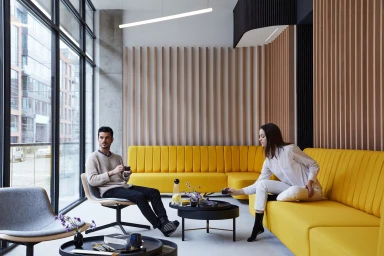
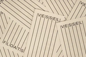
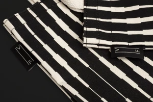
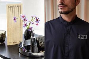
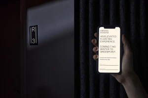
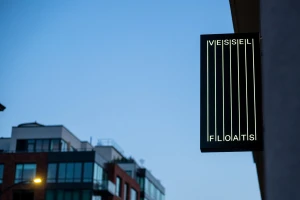
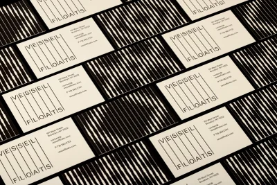
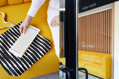
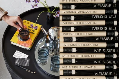
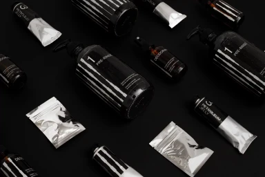
The brand identity for Vessel Floats is a masterclass in controlled minimalism and cohesive visual storytelling. Executed with a rigorous attention to detail, the project establishes a sophisticated corporate language that balances high-end hospitality with clinical precision. Through a series of carefully curated compositions, the work leans into an editorial aesthetic, blending architectural photography with precise graphic design to create a unified brand world. The visual system, developed by Order, relies on a recurring motif of thin, vertical black lines that act as a rhythmic anchor across everything from business cards and apparel to structural signage. This graphical architecture is softened by a warm, curated color palette where monochromatic stripes collide with vibrant, intentional pops of yellow and soft, natural light. Whether showcasing the brand through lifestyle imagery or macro product shots that highlight reflective metallic textures, the identity remains disciplined and legible. Captured through the lens of Chaunté Vaughn, the photography emphasizes tactile surfaces—ranging from thick canvas fabrics to high-gloss foil sachets—giving the brand a tangible, premium quality. By integrating clean, sans-serif typography into this structural framework, the project achieves a seamless blend of UI illustration and commercial branding. The result is a polished, professional identity that feels inherently modern and exceptionally intentional, successfully positioning Vessel Floats within a sleek, contemporary urban landscape.
Horizontal, Commercial, Clean
Advertising Campaign