
Floyd: Brand Identity


May 2019
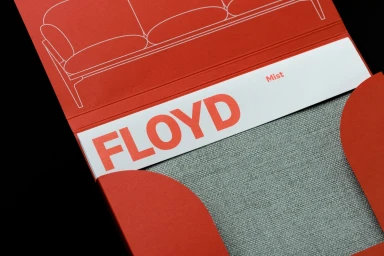
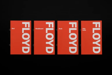
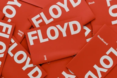
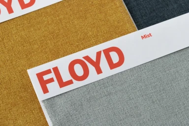
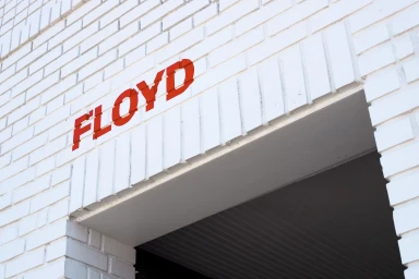
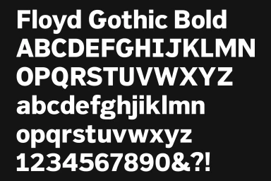
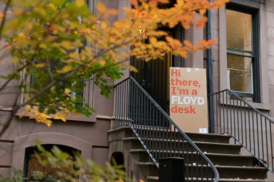
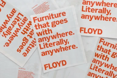
Floyd has redefined the Direct-to-Consumer furniture landscape by leaning into a rigorous, design-led visual identity that prioritizes clarity, modularity, and an unwavering commitment to minimalist aesthetics. Through a comprehensive corporate brand identity project, the furniture company achieves a seamless cohesion between its digital storefront and physical touchpoints. The project centers on a bold, high-contrast visual language defined by a vibrant orange-red palette and clean, geometric sans-serif typography that feels both approachable and authoritative. By employing precise vector graphics and structural typography, the brand reinforces its presence across a diverse array of assets—from tactile fabric swatches and promotional stationery to architectural exterior signage. Each execution relies on a disciplined use of hard light to ensure the brand name stands out with clinical precision, whether captured in a commercial studio setting or integrated into a lifestyle shot of a delivery box arriving at a residential brownstone. The design system succeeds because it is scalable and modular, mirroring the very nature of the products themselves. By focusing on essential forms and a limited color story, Floyd channels a sense of modern reliability. The result is an cohesive brand identity that feels as intentional as the furniture it represents, proving that effective e-commerce branding relies on the harmonious interplay between utility, graphic consistency, and authentic, human-centered messaging.
Horizontal, Commercial, Clean
Typography
Advertising Campaign
