
Dadada: Brand Identity

Jul 2019
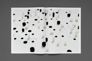
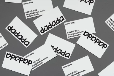
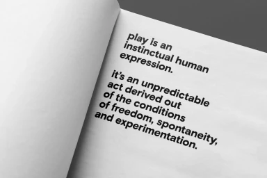
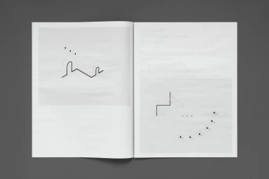
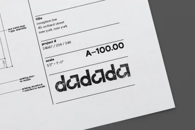
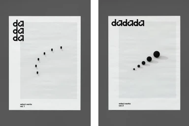
The brand identity for Dadada represents a masterclass in minimalist graphic design, effectively navigating the space between corporate professionalism and abstract artistic expression. By leaning into a strictly monochromatic palette, the project establishes a high-contrast visual language that is both timeless and strikingly modern. The work, executed with the precision of a technical architectural study, utilizes bold, sans-serif typography as its primary communicative tool, ensuring maximum legibility across both digital and physical touchpoints. Through the clever use of geometric elements and negative space, the branding avoids unnecessary ornamentation, instead prioritizing a clean, rhythmic structure that channels a sense of deliberate, intellectual experimentation. The execution relies heavily on sophisticated techniques like 3D render and CGI to bring depth to its abstract compositions, while tactile applications—seen in the embossed paper mock-ups and curated publication spreads—ground the identity in the physical realm. This project reads as a cohesive system where UI illustration and vector-based assets work in tandem to articulate a brand voice defined by clarity, instinct, and spontaneity. By synthesizing complex typographic arrangements with an editorial sensibility, the design creates a versatile toolkit that remains professional yet distinctively human. It is a rigorous exploration of balance that successfully transforms simple geometric forms into a powerful, multifaceted corporate identity suitable for any ambitious technology platform.
Horizontal, Clean, Minimalist, Commercial
Typography
