
Fedrigoni
Featured Fedrigoni projects
This week's top Fedrigoni projects, carefully handpicked by Visie's expert curators, showcase the best in style and innovation.
 Project
 Fedrigoni · Brand Identity
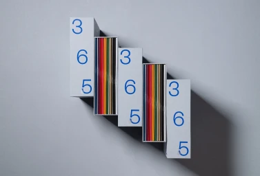
Fedrigoni presents a comprehensive brand identity system, showcasing the tactile potential of its specialty paper stocks. The project features custom grey packaging and modular storage solutions designed to hold a diverse range of vibrant, numbered notebooks and brochures. The identity relies on clean, geometric compositions and minimalist layouts to draw attention to the material qualities of the substrates. The execution incorporates precise typography and technical print finishes, including emboss and deboss techniques alongside metallic foil accents. The resulting collateral highlights a structured, chromatic sequence that emphasizes both graphic design precision and the high-end production capabilities of the paper brand.
 Project
 Fedrigoni · Brand Identity
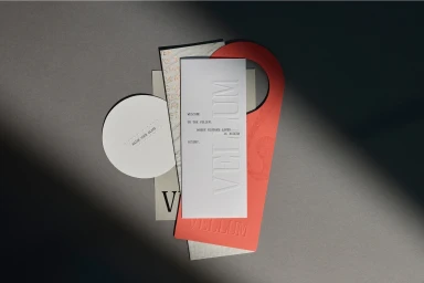
This brand identity project for Fedrigoni highlights the material versatility of specialty paper through a series of product-focused still lifes. The work channels a sophisticated aesthetic, relying on natural light and an earthy color palette to showcase the tactile qualities of the stock. By layering embossed and debossed typography against marble and wood surfaces, the composition elevates the stationery and collateral into a display of high-end print craftsmanship. The visual approach emphasizes the paper's physical properties, utilizing low-key lighting and clean, minimalist arrangements to draw attention to intricate foil-stamped details and varied textures. The project features graphic design by Seesaw Studio, with photography by Larry Vila Pouca, and specialized print work by Gunn & Taylor and Press Print.
 Project
 Fedrigoni · Brand Identity
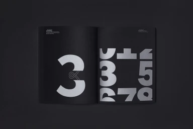
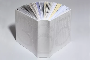
In the world of high-end print media, the Fedrigoni 365 brand identity project stands as a masterclass in material storytelling and editorial design. By marrying the tactile luxury of deep matte black paper stock with the precision of metallic silver foil, the execution elevates standard corporate collateral into a collectible artifact. The project leans heavily into minimalist aesthetics, utilizing a monochromatic palette to emphasize the deliberate interplay between negative space and crisp, sans-serif typography. Through the lens of commercial design, the work serves as a testament to the power of specialty printing techniques, where every page turn feels like a curated experience. With graphic design expertise provided by TM, the project avoids the common pitfalls of brand identity clutter, opting instead for an abstract and geometric language that celebrates the inherent quality of the substrate itself. The technical application of screen print and silkscreen processes brings a deliberate, architectural depth to the typographic forms, while the subtle use of natural light in the photography highlights the sophisticated textures of the foil stamping. Ultimately, the collection reads as a polished, cinematic exploration of form and function, proving that even the most technical brand assets can possess a profound artistic sensibility when executed with such unwavering commitment to craftsmanship.
 Project
 Fedrigoni · Brand Identity
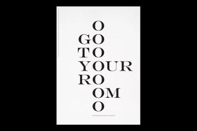
The Fedrigoni brand identity project serves as a masterclass in material storytelling, bridging the gap between tactile craftsmanship and sophisticated graphic design. By prioritizing a minimalist aesthetic, the project elevates the humble medium of high-quality paper into an immersive corporate experience. Throughout the series of studio compositions, the work leans into an editorial sensibility, utilizing precise emboss and deboss techniques to create physical depth that translates perfectly to the page. The identity relies heavily on a restrained, monochromatic palette, allowing the nuanced textures of different paper stocks—from stark white to warm, cream-toned finishes—to take center stage. Under the creative influence of TM, the branding strategy incorporates clever typography and clean infographics, which serve to emphasize the technical expertise inherent in Fedrigoni’s manufacturing. Beyond static product shots, the project extends into environmental design, where architectural simplicity meets large-scale display, further anchoring the brand within a professional and contemporary context. Whether through macro studies of geometric paper stacks or documentary-style captures of community gatherings, the project maintains a consistent focus on precision. Every element, from the subtle circular arcs to the sharp, deliberate shadows captured under soft lighting, reinforces a narrative of quality. Ultimately, this body of work succeeds as a refined showcase of how intentional print production and thoughtful design can transform industrial stationery into an artistic statement.
 Project
 Fedrigoni · Brand Identity
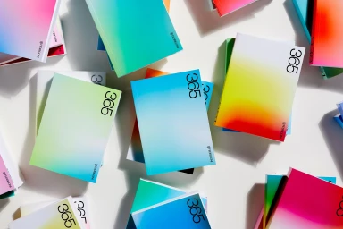
The latest brand identity project for Fedrigoni serves as a masterclass in how minimalist graphic design can communicate profound corporate narratives while leaning heavily into the tactile, premium nature of paper craft. By stripping away visual noise, the campaign utilizes a stark, high-contrast aesthetic that elevates basic typography into a dynamic tool for modern brand expression. The work traverses a diverse range of artistic styles, from the sophisticated use of layered, overlapping sans-serif letterforms that explore depth through color interaction, to the structural precision of 3D render and CGI techniques seen in the geometric grid compositions. Each piece is anchored by a deliberate focus on negative space, ensuring that the interplay between vibrant coral, cyan, and deep monochrome palettes remains the central focus. This visual language avoids the trap of decorative excess, instead prioritizing clean lines and precise vector artistry that feel both corporate and deeply human. By integrating classic serif elements alongside playful, chaotic typographic clusters, the project redefines how traditional stationery branding can evolve within a contemporary digital space. The resulting collection of posters and compositions highlights a sophisticated, paper-focused design sensibility, proving that when the execution is this focused, the material itself becomes a vital participant in the overarching brand story, grounding each message with elegance and intent.
 Project
 Fedrigoni · Brand Identity
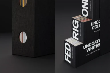
The Fedrigoni brand identity project serves as a showcase for high-quality print production and editorial graphic design. Through a series of 365 books, the project highlights the material properties of specialty paper stocks, utilizing vibrant gradients and precise typography to demonstrate diverse printing techniques. Executed with a clean, minimalist aesthetic, the work leans into macro photography and 3D render/CGI to emphasize the tactile qualities of embossed surfaces and paper layers. Each volume features consistent, balanced compositions that underscore the technical capabilities of the brand's paper portfolio. The project incorporates specialized finishes, including emboss & deboss applications, presented across a range of 416-page volumes. Creative focus remains on the interplay between light and form, utilizing natural light to delineate the structure of each book against neutral backgrounds.
 Project
 Fedrigoni · Brand Identity
Graphic Thought Facility developed the brand identity and packaging design for Fedrigoni, centering on the paper manufacturer’s extensive collection of premium stocks. The project utilizes a minimalist visual language, anchored by bold, clean typography and high-contrast layouts. The physical collateral includes a series of structured, matte-black swatch boxes and sample books. These volumes, which house a wide spectrum of paper hues and finishes, emphasize a tactile quality through subtle emboss and deboss techniques. Clean, directional studio lighting is used throughout the presentation to highlight the precise craftsmanship of the publications and the varying textures of the paper samples.
 Project
 Fedrigoni · Brand Identity
The brand identity for Fedrigoni spans a diverse range of touchpoints, from digital web interfaces and editorial layouts to corporate architectural signage and packaging. The project synthesizes a clean, minimalist aesthetic with a vibrant color palette, utilizing typography-heavy compositions and 3D render / CGI techniques to maintain a professional, high-end feel across all applications. Corporate stationery, including structured business cards featuring the brand's shield emblem, sits alongside dynamic vehicle branding and custom packaging for the beverage sector. The design system leverages natural light and studio-based lighting to emphasize texture, geometric precision, and the brand's established visual hierarchy. Projects for the brand were executed by Pentagram, DixonBaxi, Studio—BA, Brand Brothers, and A New Kind of Kick.
 Project
 Fedrigoni · Brand Identity
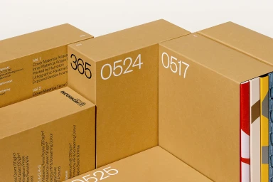
This graphic design project for Fedrigoni establishes a comprehensive brand identity through a series of structured volumes and packaging materials. The system highlights the tactile qualities of high-quality paper stocks, featuring a minimalist aesthetic across a multi-volume set that uses bold, clean typography and geometric motifs. Developed by TM, the identity system incorporates elements of screen print and custom finishing to showcase the brand's production capabilities. The execution relies on a disciplined layout and a consistent visual language to emphasize the paper texture and structural design, maintaining a clean and commercial presentation throughout the collection.
 Project
 Fedrigoni · Brand Identity
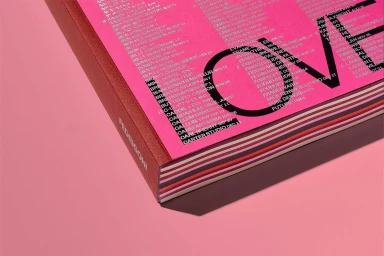
This brand identity project for Fedrigoni highlights an expansive collection of editorial design books and packaging, focusing on paper craftsmanship and print production. The collateral leverages bold typography and a saturated color palette of pinks, purples, and reds to showcase various paper stocks. Executed with a clean, minimalist aesthetic, the project utilizes precise emboss and deboss techniques to emphasize the tactile quality of the materials. Graphic design work by TM anchors the visual system, which features structured editorial layouts and studio-lit photography that highlights the distinct textures of the paper range, including Freelife, Ispira, Materica, Sirio Color, and Woodstock stocks.
Explore other brands
Explore Visie’s leading industries, projects, and the talented creatives representing them.





