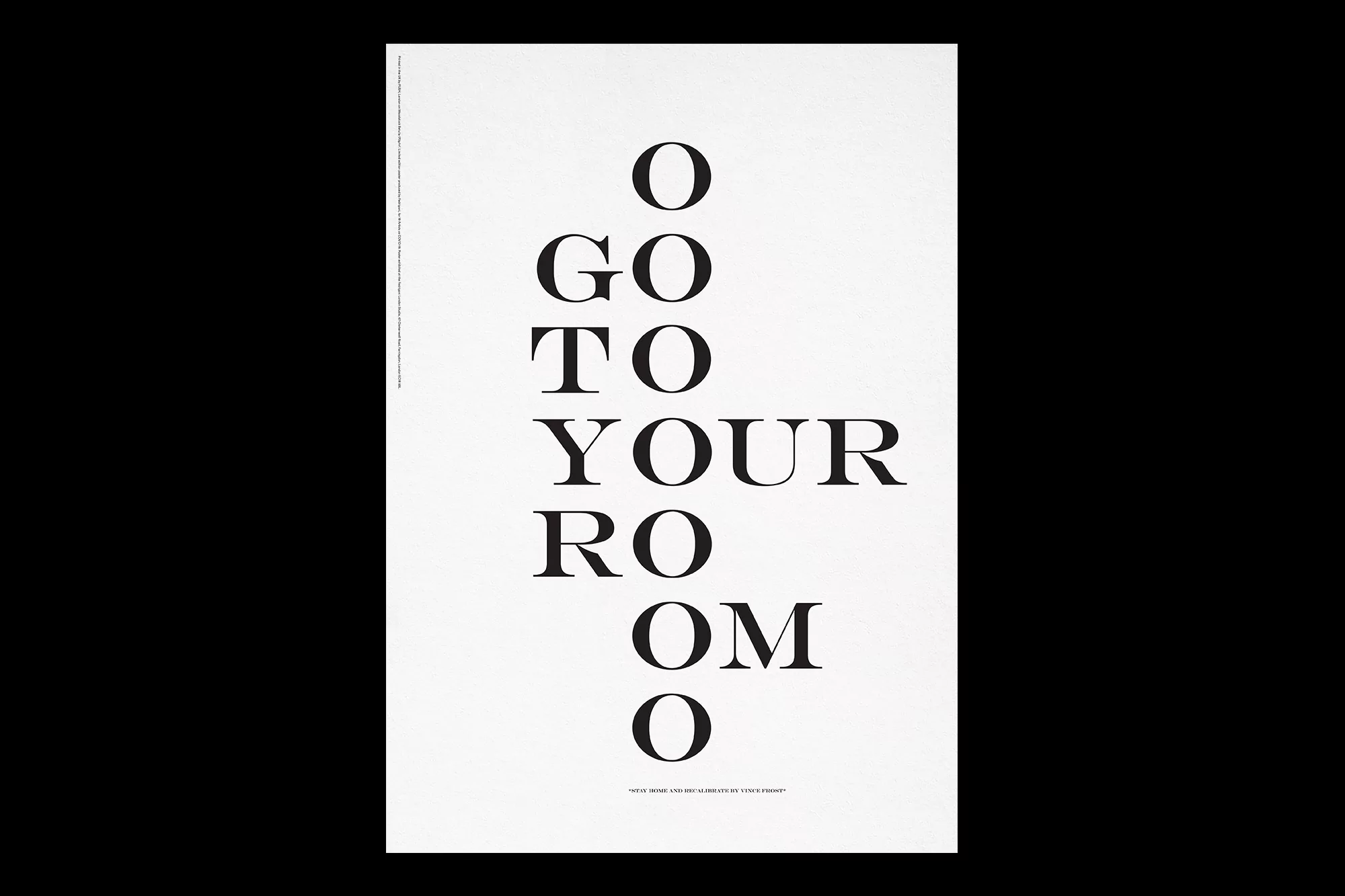
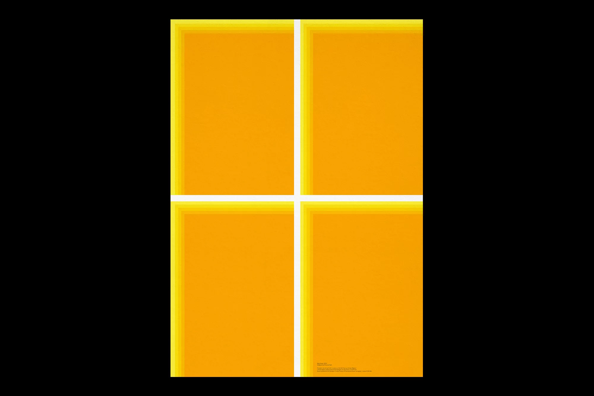
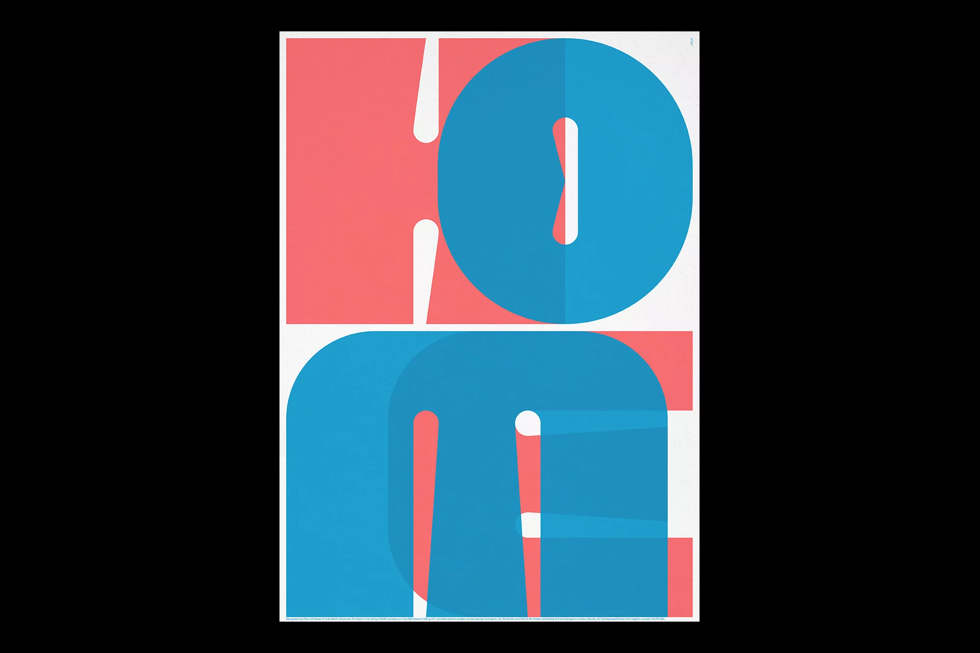
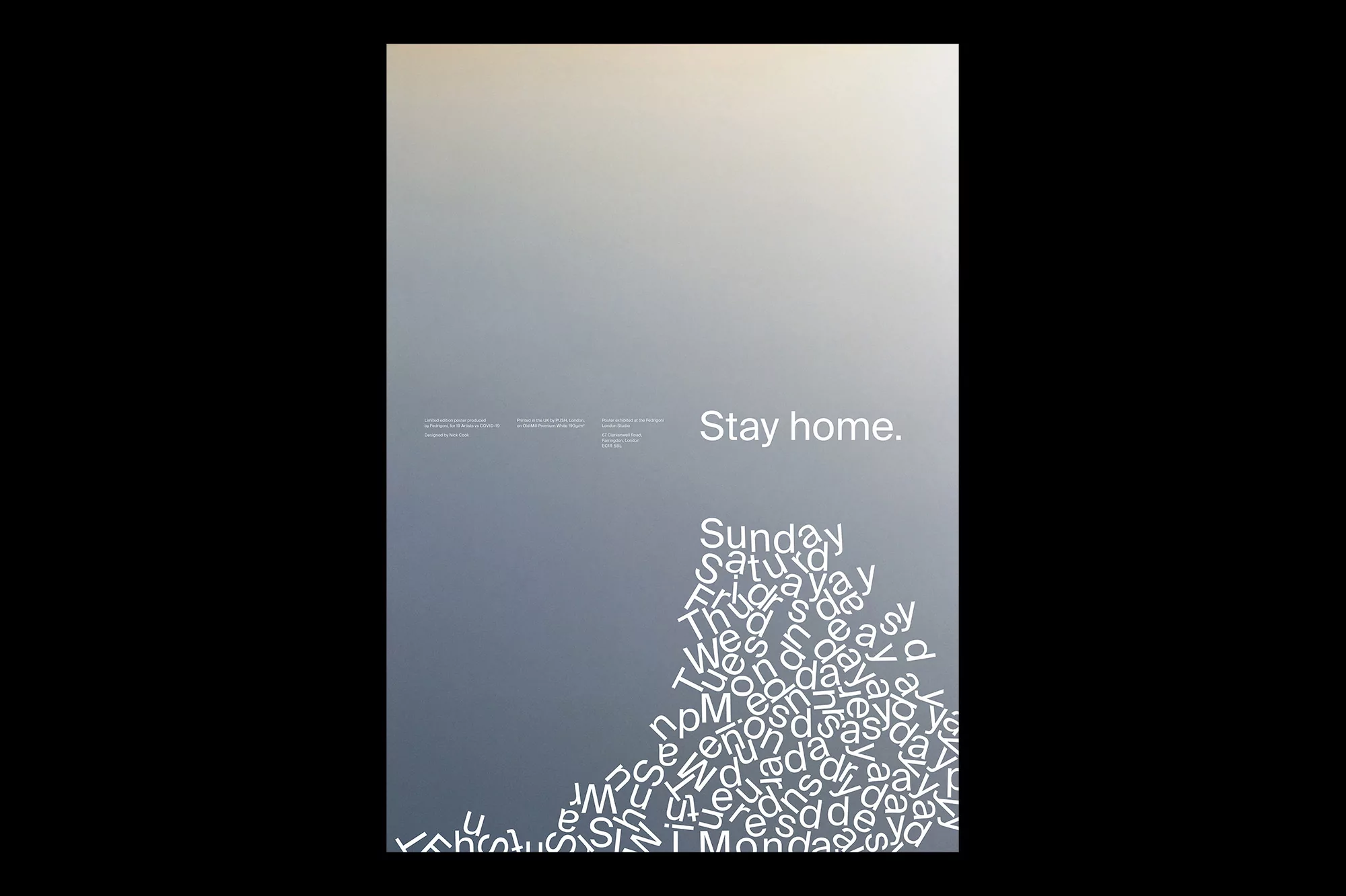
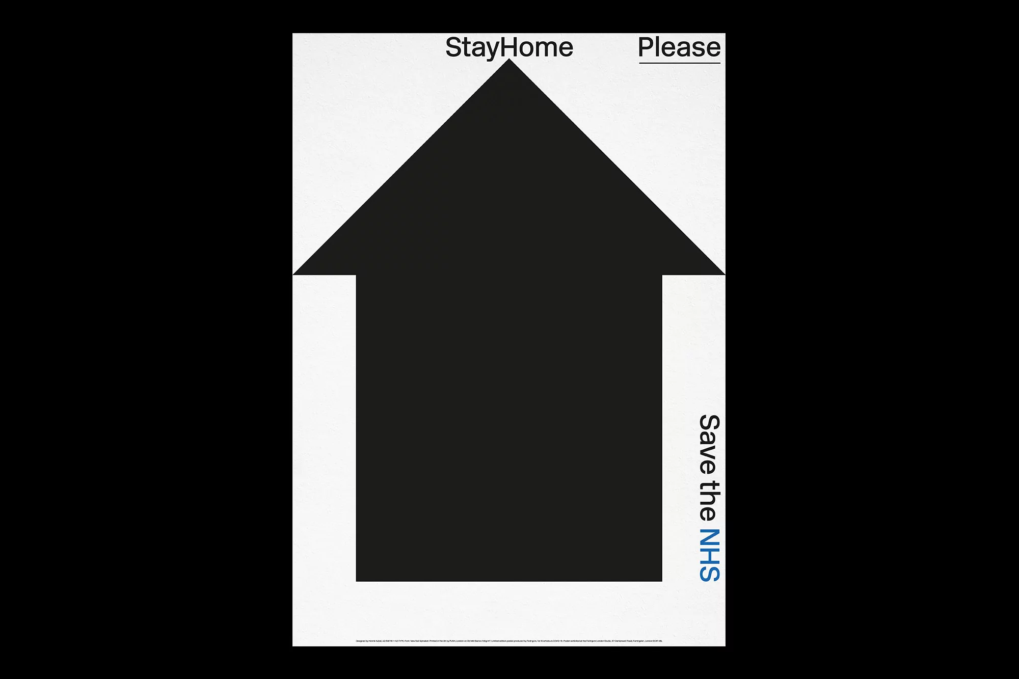
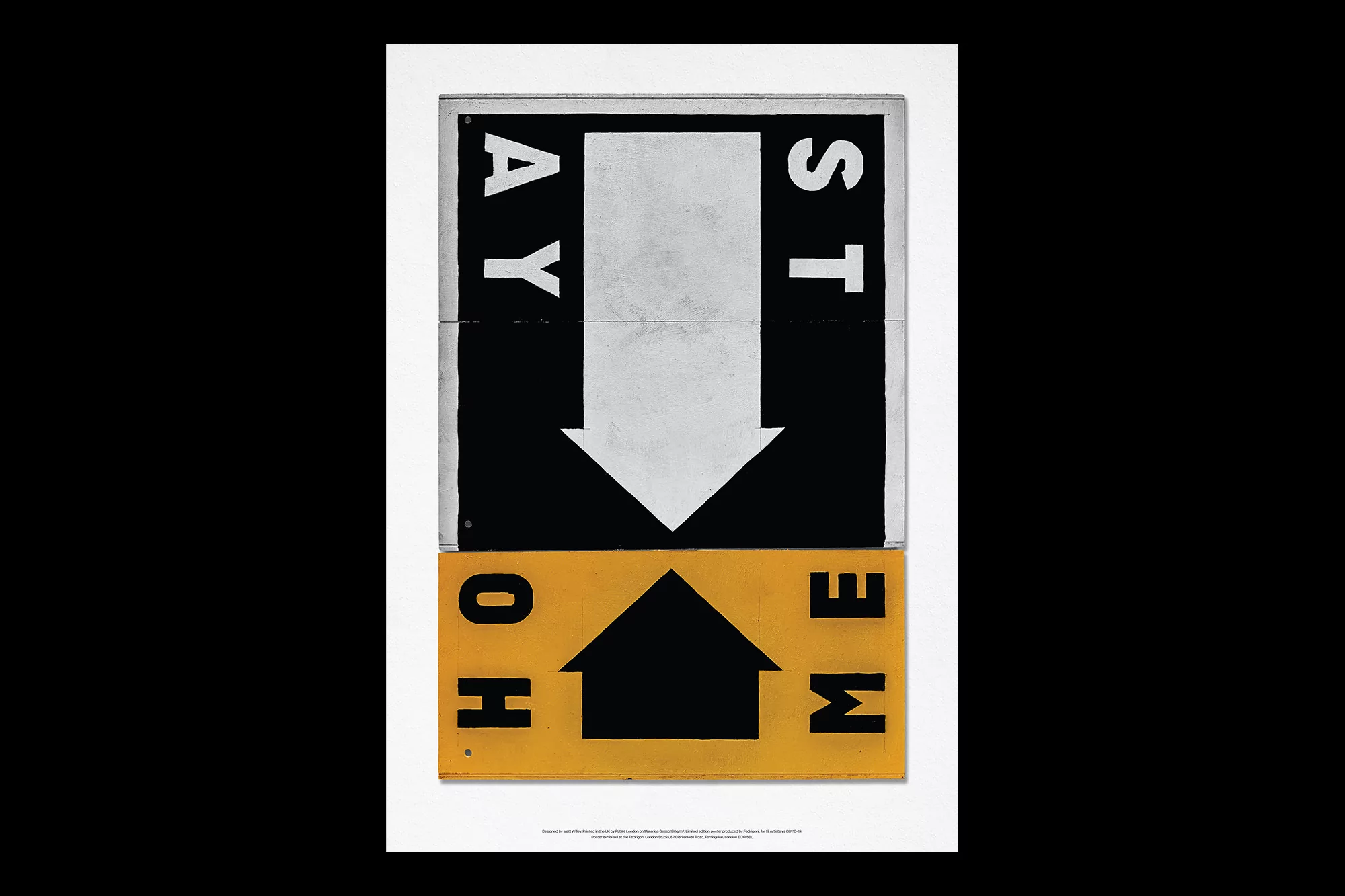
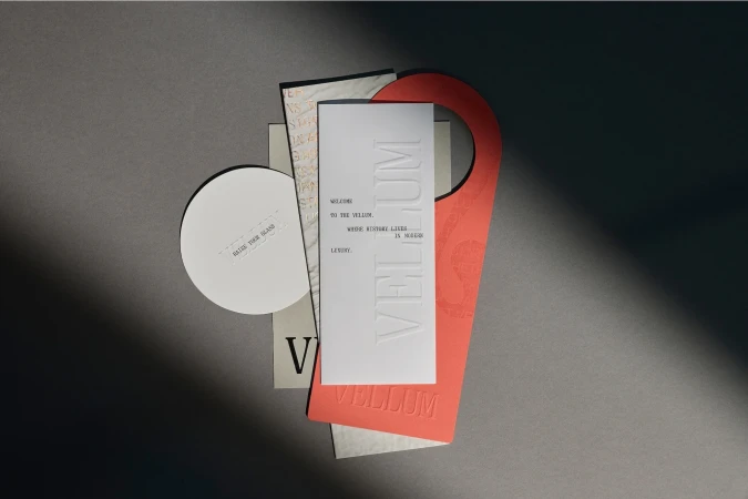
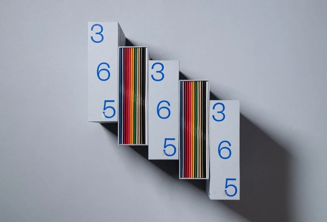
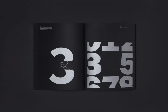
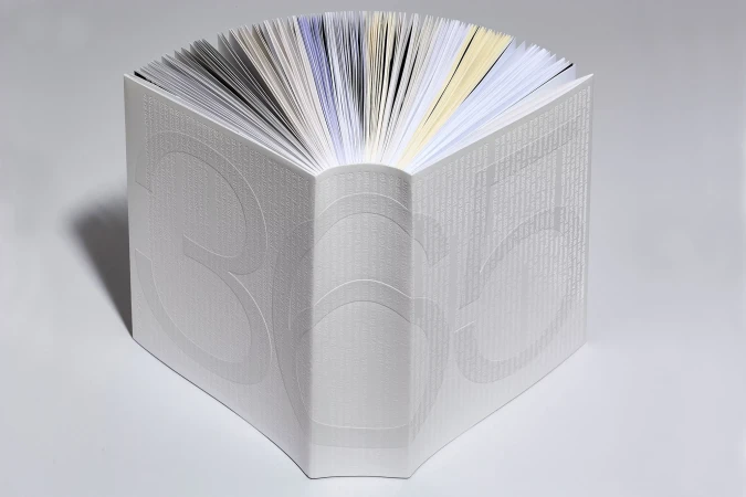
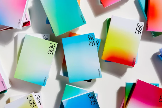
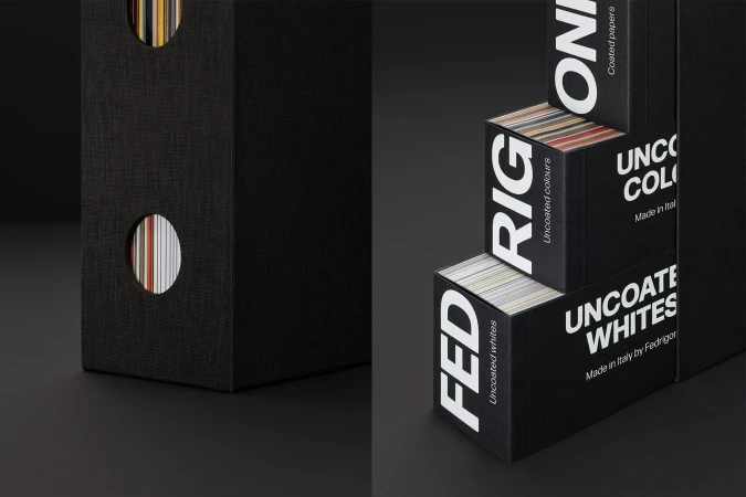
The latest brand identity project for Fedrigoni serves as a masterclass in how minimalist graphic design can communicate profound corporate narratives while leaning heavily into the tactile, premium nature of paper craft. By stripping away visual noise, the campaign utilizes a stark, high-contrast aesthetic that elevates basic typography into a dynamic tool for modern brand expression. The work traverses a diverse range of artistic styles, from the sophisticated use of layered, overlapping sans-serif letterforms that explore depth through color interaction, to the structural precision of 3D render and CGI techniques seen in the geometric grid compositions. Each piece is anchored by a deliberate focus on negative space, ensuring that the interplay between vibrant coral, cyan, and deep monochrome palettes remains the central focus. This visual language avoids the trap of decorative excess, instead prioritizing clean lines and precise vector artistry that feel both corporate and deeply human. By integrating classic serif elements alongside playful, chaotic typographic clusters, the project redefines how traditional stationery branding can evolve within a contemporary digital space. The resulting collection of posters and compositions highlights a sophisticated, paper-focused design sensibility, proving that when the execution is this focused, the material itself becomes a vital participant in the overarching brand story, grounding each message with elegance and intent.