
Fedrigoni: Brand Identity
Dec 2018
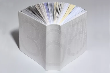
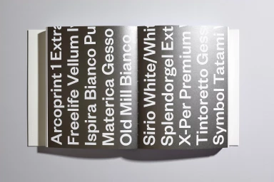
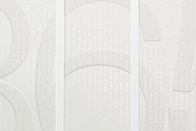
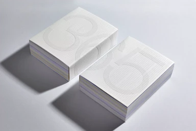
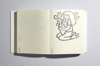
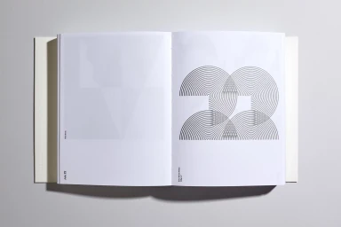
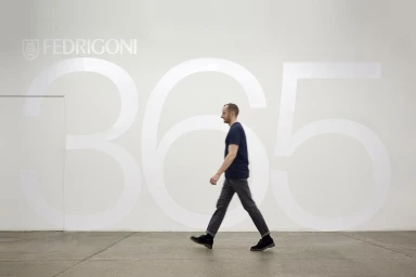
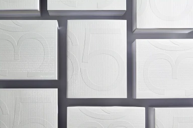
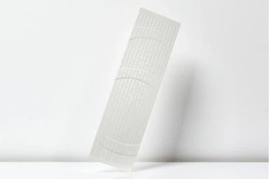
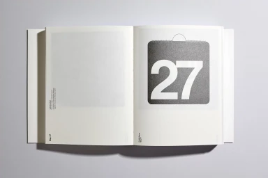
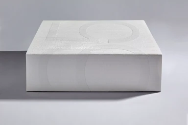
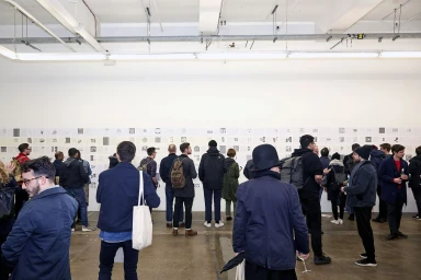
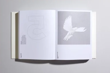
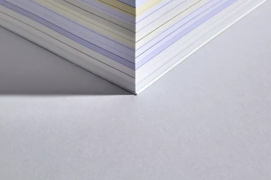
The Fedrigoni brand identity project serves as a masterclass in material storytelling, bridging the gap between tactile craftsmanship and sophisticated graphic design. By prioritizing a minimalist aesthetic, the project elevates the humble medium of high-quality paper into an immersive corporate experience. Throughout the series of studio compositions, the work leans into an editorial sensibility, utilizing precise emboss and deboss techniques to create physical depth that translates perfectly to the page. The identity relies heavily on a restrained, monochromatic palette, allowing the nuanced textures of different paper stocks—from stark white to warm, cream-toned finishes—to take center stage. Under the creative influence of TM, the branding strategy incorporates clever typography and clean infographics, which serve to emphasize the technical expertise inherent in Fedrigoni’s manufacturing. Beyond static product shots, the project extends into environmental design, where architectural simplicity meets large-scale display, further anchoring the brand within a professional and contemporary context. Whether through macro studies of geometric paper stacks or documentary-style captures of community gatherings, the project maintains a consistent focus on precision. Every element, from the subtle circular arcs to the sharp, deliberate shadows captured under soft lighting, reinforces a narrative of quality. Ultimately, this body of work succeeds as a refined showcase of how intentional print production and thoughtful design can transform industrial stationery into an artistic statement.
Horizontal, Clean, Minimalist
Typography
Grey Seamless
