
upa!: Brand Identity
Mar 2026
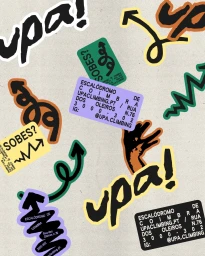
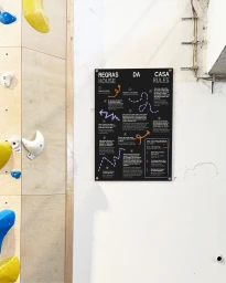
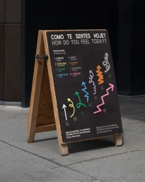
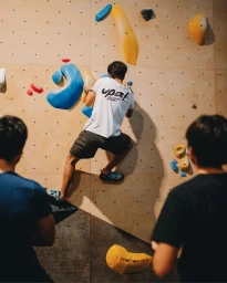
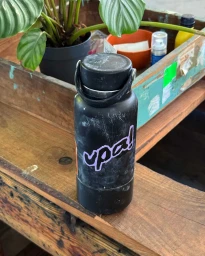
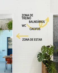
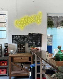
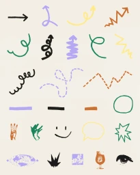
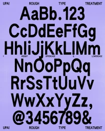
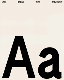
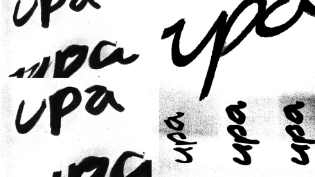
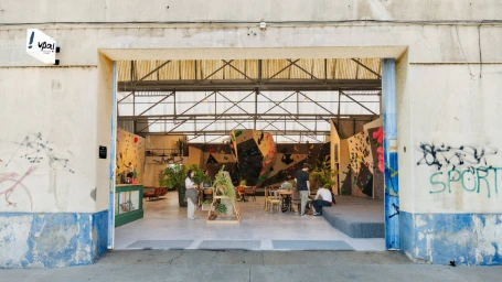
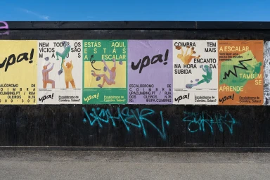
The brand identity for upa! establishes a vibrant, high-energy visual language that seamlessly bridges the gap between a technical sports facility and an urban lifestyle hub. Centered in Coimbra, the brand leans into a dynamic aesthetic that blends functional wayfinding with raw, tactile design elements. Led by designers Allie Heesh and Sara Silva Santos, the visual system utilizes a gritty, custom Upa! Rough typeface alongside expressive, hand-drawn vector illustrations and brush-script typography. This creates a cohesive dialogue across diverse touchpoints, from wheat-pasted street posters on weathered timber fences to clean, minimalist signage within the gym. The execution favors a bold palette of black, yellow, purple, and green, which pops against the industrial backdrop of the converted warehouse and the natural textures of plywood climbing walls. Whether through the clean corporate communication of instructional house rules or the playful, interactive challenge menus set on outdoor A-frame signs, the branding maintains a consistent, approachable tone. By blending cinematic live-action captures of climbers in motion with abstract graphic layouts, the project transcends traditional commercial identity work. It crafts a living, breathing environment where typography serves as both information and decoration, resulting in a cohesive experience that feels as much like an editorial street-style statement as it does a professional athletic facility.
Vertical, Clean, Commercial


