

unknown
Featured unknown projects
This week's top unknown projects, carefully handpicked by Visie's expert curators, showcase the best in style and innovation.
 Project
 unknown · Brand Identity
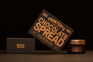
Inkpression introduces a new brand identity for Printer's Chocolate Spread, focusing on a premium packaging design that emphasizes artisanal aesthetics. The visual system employs a sophisticated black and metallic gold color palette, with industrial-style typography that grounds the brand's identity in a tactile, high-end presentation. Captured in a series of clean, minimalist product studies, the project leans into low-key and hard light techniques to highlight the matte finish and textured materials of the jars and rectangular boxes. The identity design prioritizes precise composition and consistent graphic hierarchy across all packaging elements.
unknown · Brand Identity
This comprehensive brand identity project masterfully bridges the gap between structured educational communication and emotive visual storytelling. The work functions as a multi-layered campaign that leans into a blend of commercial UI illustration and intimate reportage. Under the collaborative guidance of the team, which includes design expertise from Serviceplan and evocative illustration by Adriana Lozano, the project establishes a cohesive aesthetic that feels both professional and deeply personal. The visual language utilizes a clean, grid-based layout for data-driven infographics, providing a sharp contrast to the textured, hand-drawn pencil and graphite techniques that anchor the more expressive fine art illustrations. The inclusion of lifestyle imagery—captured with a keen eye for natural light—adds a layer of grounding authenticity, seamlessly tying together the digital product strategy and the conceptual narrative. With photography by Violeta Zambrano, film contributions from Claudia Barral Magaz, and essential web development by Daniel Kuhnlein, the identity succeeds in humanizing complex social messaging. By weaving together high-contrast colour-blocked environments and minimalist interior photography, the brand identity achieves a sophisticated equilibrium. It serves as a testament to how refined graphic iconography and deliberate art direction can transform standard institutional information into a compelling, visually vibrant narrative that resonates across both digital interfaces and traditional artistic mediums.
 Project
 unknown · Brand Identity
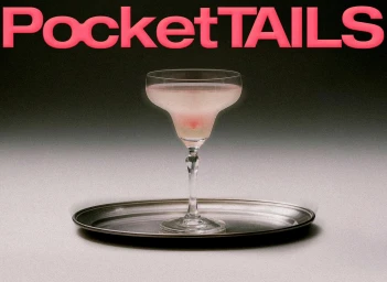
The brand identity for PocketTails reflects a sophisticated evolution in the ready-to-drink alcoholic beverage market, blending modern graphic precision with a playful, surrealist edge. Developed by COOOT Studio, the project moves beyond standard commercial product representation, opting instead for a clean, editorial aesthetic that treats every pouch and box as an object of design. By utilizing a mix of studio strobe lighting, crisp 3D render techniques, and high-speed photography, the identity emphasizes the tactile qualities of the packaging, from matte finishes to die-cut illustrations. The visual language is anchored by a restrained, neutral grey gradient backdrop, which allows the vibrant pastel and saturated color palettes of the individual cocktail pouches to take center stage. The photography, characterized by both clean commercial shots and experimental fine art compositions—such as warped liquid reflections and suspended product swirls—establishes a sense of fluid motion and refined rhythm. Typography plays a pivotal role, with bold sans-serif fonts and minimalist silhouettes grounding the brand’s Italian-inspired heritage in a contemporary context. The result is a cohesive brand identity that feels both accessible and elevated, leaning into a minimalist, high-end sensibility that distinguishes PocketTails from its competitors in the crowded food and beverage space. Through this meticulous balance of form, function, and imaginative flair, the work successfully transforms standard packaging into a compelling, modern lifestyle statement.
 Project
 unknown · Brand Identity
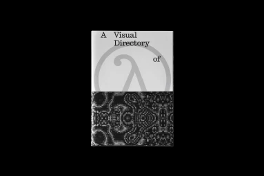
This brand identity project for A Visual Directory of Edge of Chaos represents a rigorous exploration into the intersection of computational science and editorial design. Produced through a collaborative effort with G Axis Press and featuring the sharp, technical design work of Joyce Shi, the publication acts as a bridge between academic inquiry and modern visual communication. The aesthetic leans into editorial minimalism, utilizing a strict, high-contrast monochrome palette that transforms dense scientific citations and complex data into a cohesive, readable graphic system. Through the use of 3D render and CGI elements, the project navigates the fine line between order and entropy, with layouts that juxtapose rigid typographic structures against fluid, generative patterns. These abstract, fractal-like motifs mirror the publication’s focus on cellular automata and chaos theory, grounding theoretical concepts in a tangible, printed format. By employing varied techniques such as high-key lighting and structured data visualisation, the team has crafted a visual language that feels simultaneously experimental and academic. The result is a bold, modern identity that prioritizes negative space and precise typography, successfully translating abstract mathematical phenomena into a sophisticated, tactile experience. This project serves as a compelling study in how traditional print media can effectively house contemporary digital logic, providing a refined blueprint for future ventures in technical and conceptual brand identity design.
 Project
 unknown · Brand Identity
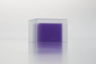
The brand identity for Delve Jewellery signals a definitive shift in the landscape of contemporary luxury, moving away from traditional status symbols toward a foundation of ethical craftsmanship and material integrity. Through a series of highly controlled visual executions, this project establishes a sophisticated design language that balances stark minimalist aesthetics with precise, modern typography. Photographed by Valérie van der Wal, the campaign utilizes studio strobe techniques to highlight the structural beauty of gold and diamonds, capturing their luster through sharp macro focus and high-contrast lighting. The graphic identity, crafted by the design team at Resoluut, relies on a restrained palette of deep navy, white, and cream to allow the message of quality and lab-grown innovation to take center stage. By blending editorial-style abstraction—seen in the play of light against obsidian-like forms—with utilitarian corporate typography, the project succeeds in elevating jewelry from a mere accessory to a conceptual statement. The resulting visuals channel a sense of quiet refinement that feels both timeless and forward-thinking. With meticulous attention to detail, from the laser-etched hallmarks captured in close-up to the balanced negative space of the brand invitations, this project serves as a masterclass in luxury branding, emphasizing that the future of the jewelry industry lies in technical precision, transparency, and a curated, minimalist visual dialogue.
 Project
 unknown · Brand Identity
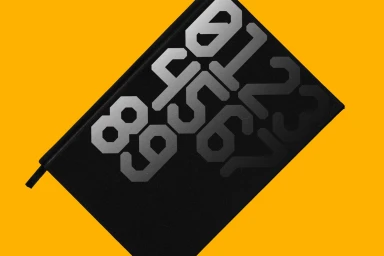
This sophisticated brand identity project, spearheaded by the team at Kurppa Hosk, serves as a masterclass in modular graphic design and typographic precision. By establishing a cohesive visual language centered on geometric rigor and high-contrast palettes, the work effectively translates complex identity systems into a clean, industrial aesthetic. The project leans into a bold color story—utilizing vibrant yellow against deep black—to frame an expansive suite of assets, ranging from custom monospaced typefaces like STS Mono Display to abstract, vector-based iconography. The execution is deeply systematic, favoring grid-based construction and structural clarity that underscores the functional nature of the branding. Through a diverse array of media, the design moves seamlessly between technical specimen sheets that deconstruct character utility and tangible, real-world applications such as premium business stationery. The work channels a modern, minimalist sensibility where negative space is as critical as the typography itself, creating a balanced tension across every layout. By integrating hand sign motifs and angular character sets, the identity system feels both cryptic and approachable, successfully bridging the gap between artistic abstraction and professional commercial utility. The result is a robust, versatile toolkit that maintains total visual consistency while highlighting the underlying logic of the design, proving that effective brand identity thrives when built upon a foundation of deliberate, thoughtful geometric constraints.
 Project
 unknown · Brand Identity
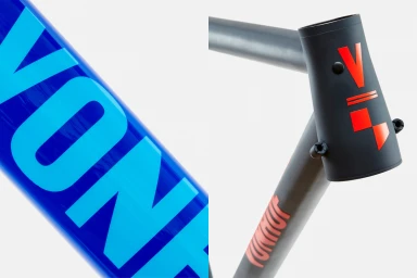
The brand identity for Vonhof Cycles strikes a sophisticated balance between mechanical precision and modern graphic expression, effectively positioning the manufacturer within the premium cycling market. Through a rigorous application of commercial design principles, the project establishes a cohesive visual language that translates seamlessly across physical hardware and digital touchpoints. The identity leans heavily into a bold, minimalist aesthetic, utilizing a punchy color palette of high-contrast reds, deep charcoal, and vibrant oranges to demand attention. Franklyn brings this vision to life through a sharp use of typography, favoring bold, sans-serif letterforms that emphasize clarity and geometric balance. By leveraging studio strobe lighting, the imagery highlights the interplay between matte and glossy textures on the bike frames, ensuring that every design detail—from the custom logotype to the structural chevrons—reads with intentionality. The UI illustration components further unify the brand, presenting a clean, focused digital presence that mirrors the craftsmanship of the handmade bicycles themselves. This identity work is a masterclass in visual consistency, utilizing vector-based assets and disciplined composition to elevate the functional nature of gravel and road bikes into a high-end lifestyle proposition. The resulting aesthetic feels both timeless and aggressively modern, successfully anchoring Vonhof Cycles as a performance-driven brand where every graphic choice serves the overarching commitment to industrial excellence.
 Project
 unknown · Brand Identity
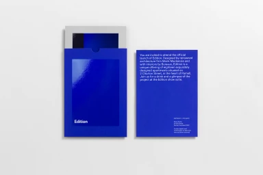
This sophisticated brand identity project for Parnell exemplifies the power of restraint and precise visual systems in contemporary corporate communications. Executed with a focus on editorial minimalism, the collection leans into a disciplined aesthetic where bold, electric blue accents serve as a strategic counterpoint to the stark, matte black and white substrates. The visual language is defined by a rigorous application of typography, utilizing clean sans-serif typefaces to create an atmosphere of professional consistency and high-end elegance. Across a comprehensive suite of printed materials—including brochures, rigid presentation boxes, and business collateral—Studio South has crafted a rhythmic, structured experience that feels as much like a curated gallery piece as it does a commercial toolkit. The execution is grounded in high-level graphic design principles, utilizing studio strobe lighting to emphasize the tactility of the packaging materials and the sharp geometric forms inherent in the design. By masterfully employing negative space and a consistent, grid-based layout, the project transforms simple information into an immersive brand experience. The inclusion of subtle details, such as vibrant ribbon pull-tabs and high-contrast gradients, elevates the collateral beyond standard documentation, resulting in a cohesive identity that effectively communicates a modern, architectural ethos. It is a masterclass in how purposeful design and thoughtful material selection can define a premium market presence.
 Project
 unknown · Brand Identity
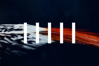
StudioSmall masterfully channels the tension between the organic and the synthetic in this comprehensive brand identity project, effectively blending tactile reality with a rigorous, minimalist graphic language. By marrying the raw, microscopic intricacies of nature—such as the delicate structure of a bird feather and the angular, crystalline topography of glass—with sharp, typographic precision, the agency creates a visual system that feels both ancient and aggressively modern. The work leans into a high-contrast aesthetic, utilizing a restrained palette of deep charcoal and pure white to anchor its narrative. This editorial approach to branding manifests in a highly structured layout that utilizes significant negative space, allowing individual elements like dewy peonies or monochromatic plumage to command attention within a larger, rhythmic composition. Throughout the series, the integration of geometric vector interventions against organic textures reads as a sophisticated dialogue between chaos and control. The application of clean sans-serif typography serves as a grounding force, ensuring the brand maintains a premium, commercial edge while preserving its fine art sensibilities. Ultimately, this identity functions as a masterclass in visual storytelling, where every macro detail and graphic mark is calibrated to foster a sense of curated luxury, proving that modern brand design is most potent when it embraces such stark, cinematic simplicity.
 Project
 unknown · Brand Identity
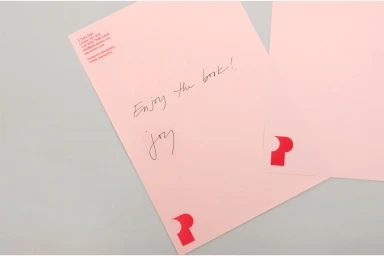
This brand identity project for the e-commerce and retail sector represents a masterclass in visual cohesion, centering on a bold and highly recognizable abstract logo. Designed by the team at DNCO, the project leans into a minimalist aesthetic that bridges the gap between commercial graphic design and tactile lifestyle application. By utilizing a saturated red and soft pink color palette, the identity achieves a striking visual contrast that demands attention across varied media platforms. The project effectively demonstrates how a core brand asset, specifically the stylized letterform, translates from static vector files to physical manifestations like canvas tote bags and minimalist bookshelf displays. The execution emphasizes clean, modern typography and a highly organized visual language, ensuring the brand remains both professional and approachable. Captured largely through natural light, the photography showcases the practical versatility of these branding assets, moving seamlessly from commercial stationery to lifestyle portraiture. The deliberate use of stark, monochromatic backgrounds alongside the vibrant brand colors serves to elevate the geometric precision of the logo, making it the undeniable anchor of the entire visual system. This thoughtful integration of assets proves that a well-executed identity is not merely about a static mark, but about creating a consistent, rhythmic experience that functions effectively whether applied to paper, textiles, or retail environments.
 Project
 unknown · Brand Identity
The brand identity for Bonde stands as a masterclass in high-contrast visual communication, effectively balancing industrial utility with a bold, creative spirit. Developed by the design studio PORTO ROCHA, the system leans into the power of color blocking, utilizing a high-saturation yellow backdrop that serves as a consistent anchor across both digital and physical touchpoints. This vibrant hue creates an immediate visual impact, grounding the typography and layout in a way that feels both archival and distinctly modern. The project employs a strict, minimalist approach to information architecture, characterized by clean sans-serif typefaces and a precise typographic hierarchy that ensures clarity in dense data sets, such as event schedules and contributor indices. Beyond the static graphics, the identity translates seamlessly into the environmental design of an urban event, where signage—ranging from tiered bookshelves to towering check-in markers—bridges the gap between institutional branding and casual, reportage-style lifestyle imagery. By embracing a raw, functional aesthetic, the design captures the energy of a community gathering while maintaining a sharp, professional edge. Through this integration of abstract vector elements and commercial signage, the identity succeeds as a cohesive ecosystem that feels as much at home on a printed flyer as it does standing against the textured, red brick backdrop of an active urban space.
 Project
 unknown · Brand Identity
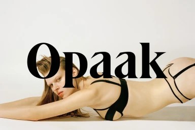
The brand identity for Opaak manifests as a masterclass in editorial minimalism, weaving together an industrial aesthetic with the delicate intimacy of high-fashion lingerie. Designed by the creative team at Deutsche & Japaner, the project leans into a rigorous, monochrome-focused visual language that emphasizes material contrast and graphic precision. By juxtaposing the tactile softness of lace and fine mesh against cold, perforated metallic surfaces, the identity establishes a sophisticated tension between the organic and the engineered. This project type is defined by a modular system that flows seamlessly from packaging and stationery to evocative campaign photography. The use of studio strobe lighting enhances the crisp clarity of the branding, while bold serif typography serves as a recurring anchor across various touchpoints. The incorporation of a precise grid of circular perforations acts as a signature motif, mirrored in both the physical collateral and the abstract portraiture that bridges human features with rugged, stone-like textures. Throughout the suite, the thoughtful application of colour blocking—specifically the strategic use of vibrant red against black and white—elevates the product presentation, ensuring that every element, from product labels to envelopes, reinforces a coherent and high-end narrative. Ultimately, the work functions as a disciplined study in brand consistency, where live-action technique and clean typographic layout converge to create a distinct, modern presence.
Explore other brands
Explore Visie’s leading industries, projects, and the talented creatives representing them.





