
unknown
Brand Identity

Oct 2017
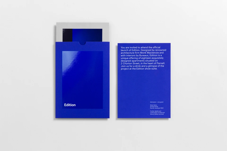
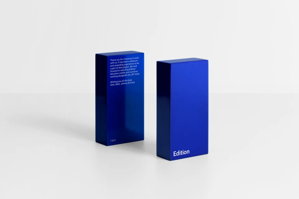
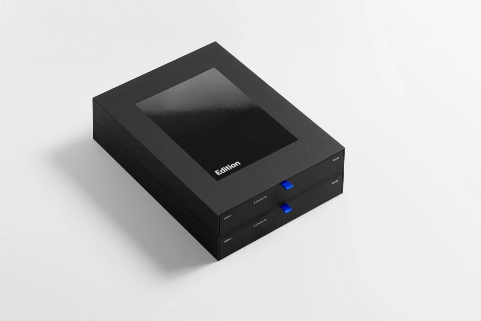
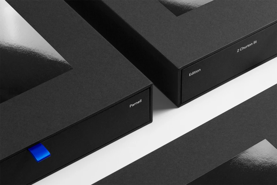
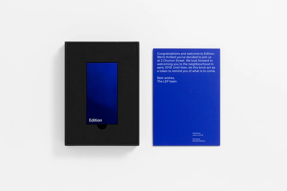
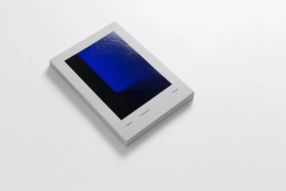
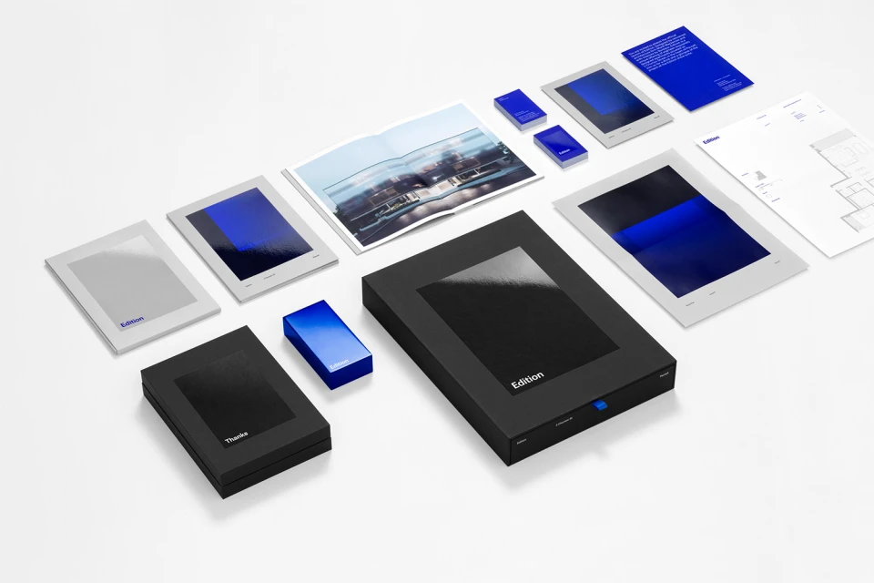
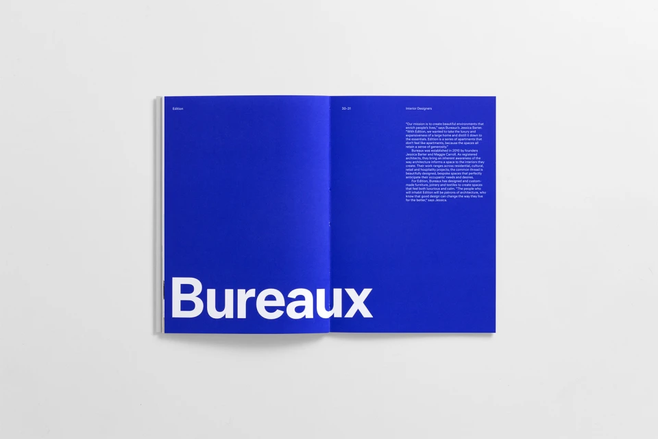
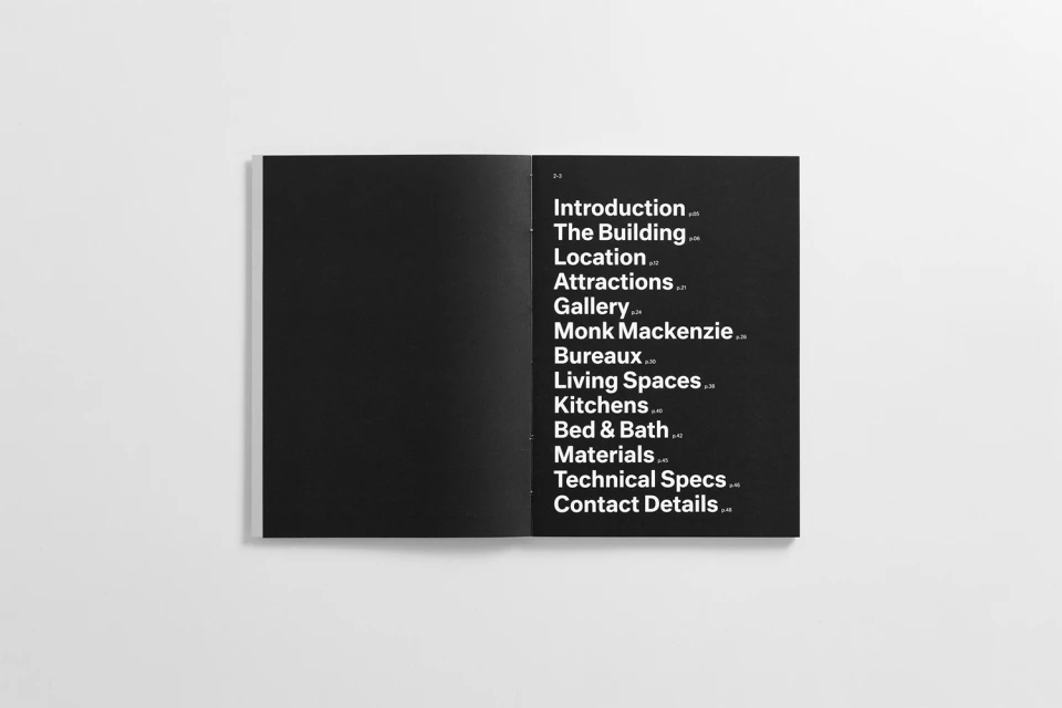
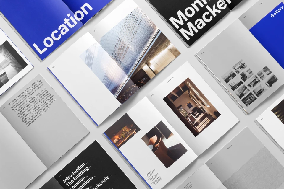
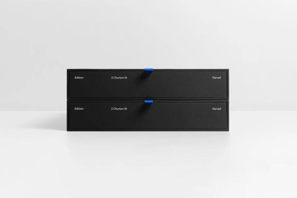
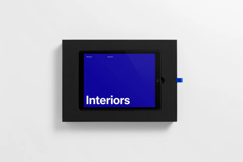
This sophisticated brand identity project for Parnell exemplifies the power of restraint and precise visual systems in contemporary corporate communications. Executed with a focus on editorial minimalism, the collection leans into a disciplined aesthetic where bold, electric blue accents serve as a strategic counterpoint to the stark, matte black and white substrates. The visual language is defined by a rigorous application of typography, utilizing clean sans-serif typefaces to create an atmosphere of professional consistency and high-end elegance. Across a comprehensive suite of printed materials—including brochures, rigid presentation boxes, and business collateral—Studio South has crafted a rhythmic, structured experience that feels as much like a curated gallery piece as it does a commercial toolkit. The execution is grounded in high-level graphic design principles, utilizing studio strobe lighting to emphasize the tactility of the packaging materials and the sharp geometric forms inherent in the design. By masterfully employing negative space and a consistent, grid-based layout, the project transforms simple information into an immersive brand experience. The inclusion of subtle details, such as vibrant ribbon pull-tabs and high-contrast gradients, elevates the collateral beyond standard documentation, resulting in a cohesive identity that effectively communicates a modern, architectural ethos. It is a masterclass in how purposeful design and thoughtful material selection can define a premium market presence.
Commercial, Horizontal, Clean, Minimalist
White Seamless
E-commerce / Product
