
unknown
Brand Identity
Jan 2018
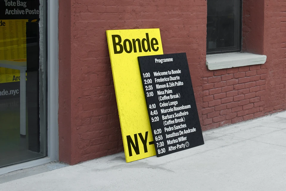
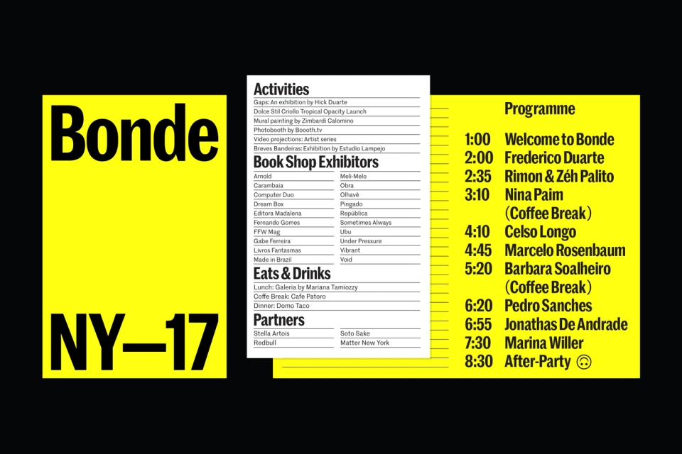
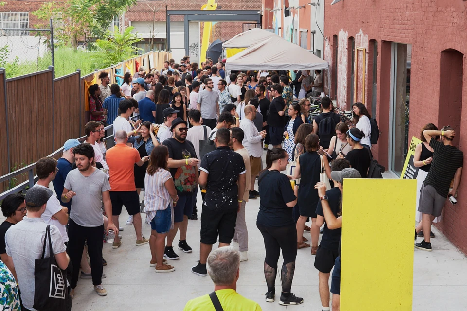
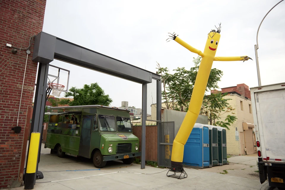
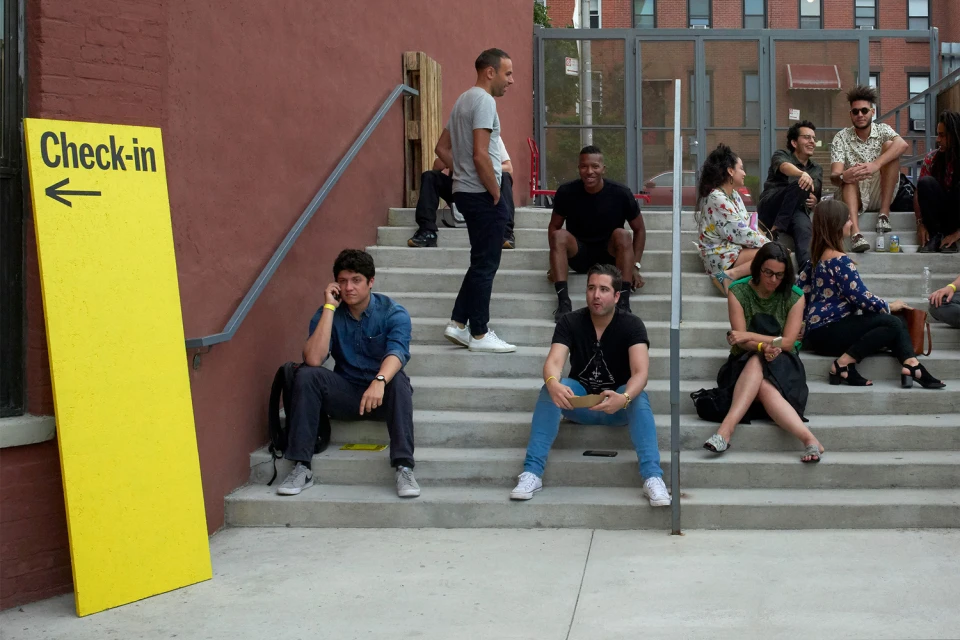
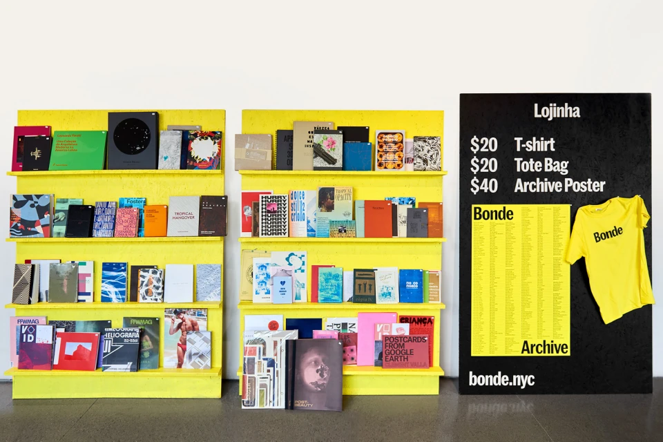
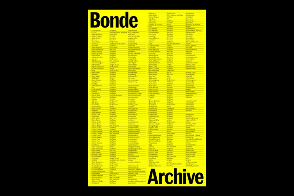
The brand identity for Bonde stands as a masterclass in high-contrast visual communication, effectively balancing industrial utility with a bold, creative spirit. Developed by the design studio PORTO ROCHA, the system leans into the power of color blocking, utilizing a high-saturation yellow backdrop that serves as a consistent anchor across both digital and physical touchpoints. This vibrant hue creates an immediate visual impact, grounding the typography and layout in a way that feels both archival and distinctly modern. The project employs a strict, minimalist approach to information architecture, characterized by clean sans-serif typefaces and a precise typographic hierarchy that ensures clarity in dense data sets, such as event schedules and contributor indices. Beyond the static graphics, the identity translates seamlessly into the environmental design of an urban event, where signage—ranging from tiered bookshelves to towering check-in markers—bridges the gap between institutional branding and casual, reportage-style lifestyle imagery. By embracing a raw, functional aesthetic, the design captures the energy of a community gathering while maintaining a sharp, professional edge. Through this integration of abstract vector elements and commercial signage, the identity succeeds as a cohesive ecosystem that feels as much at home on a printed flyer as it does standing against the textured, red brick backdrop of an active urban space.
Horizontal, Clean
Typography
