
unknown
Brand Identity

Feb 2016
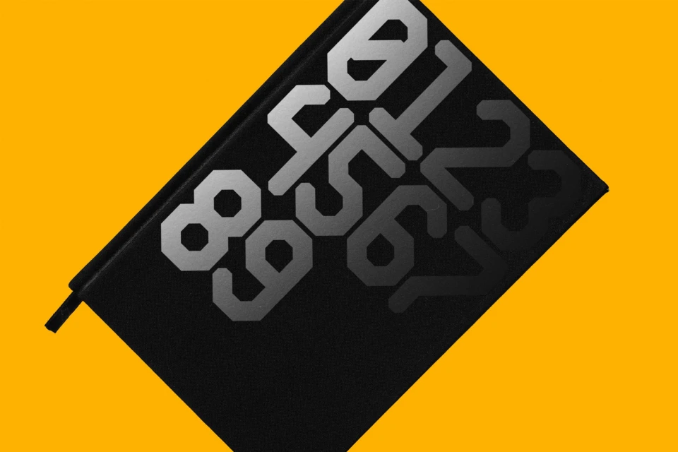
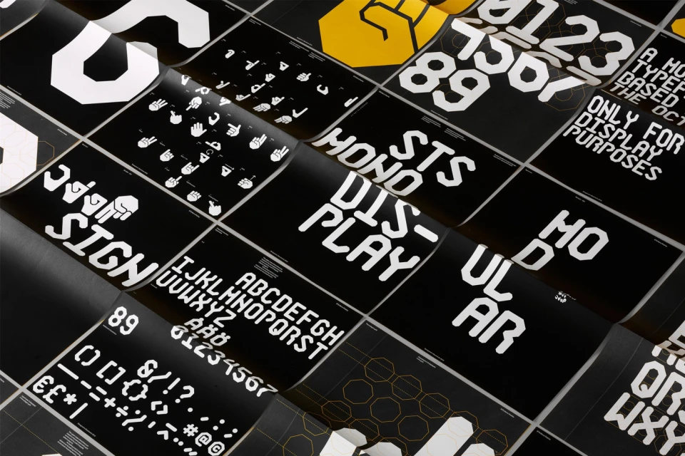
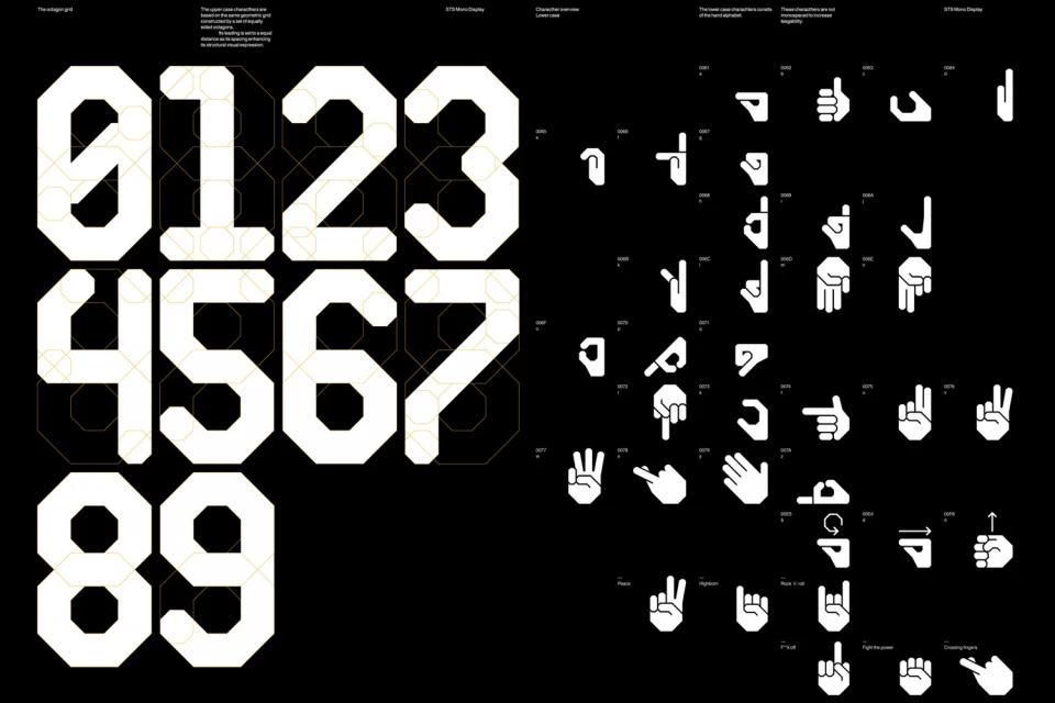
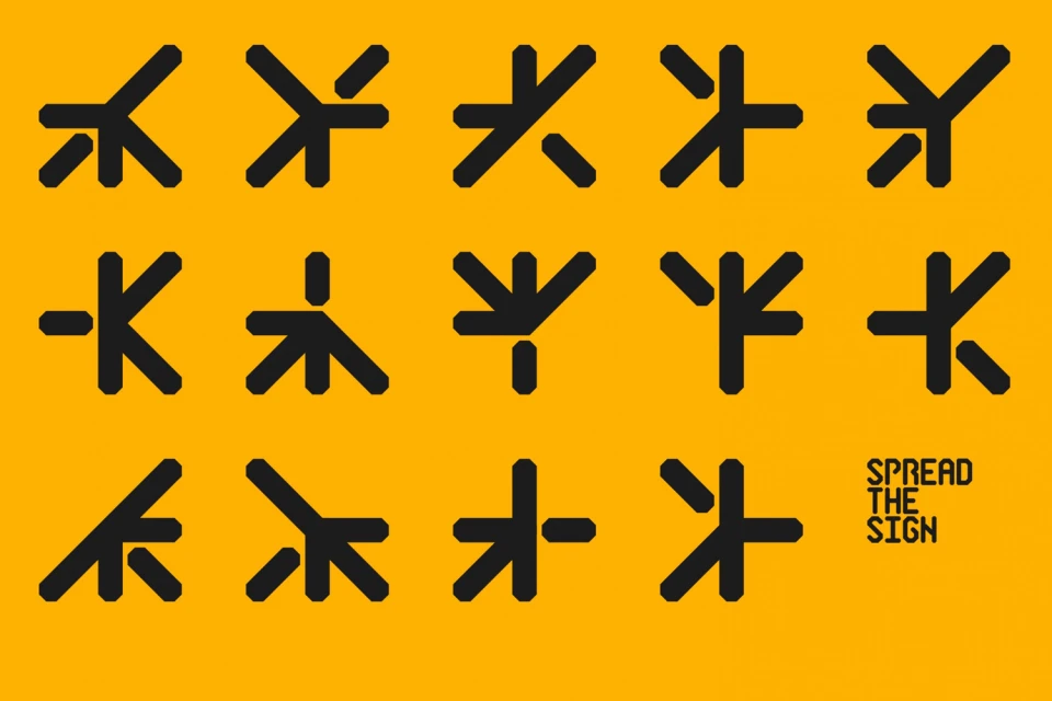
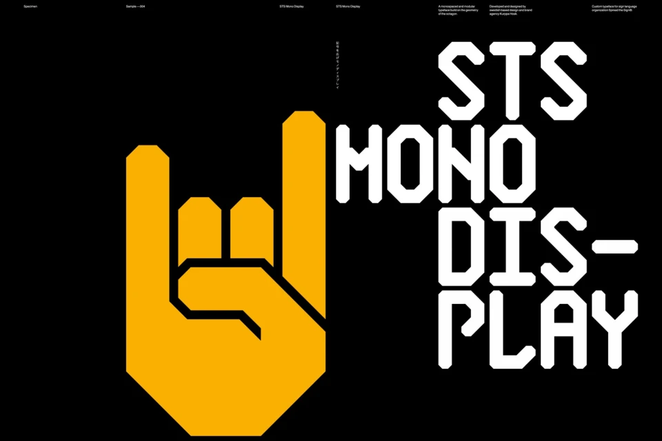
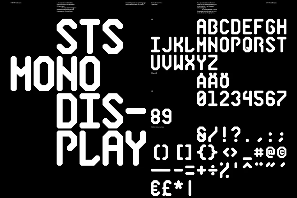
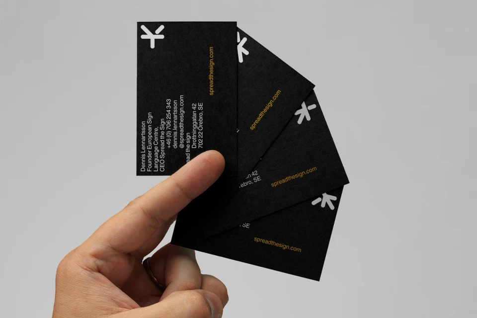
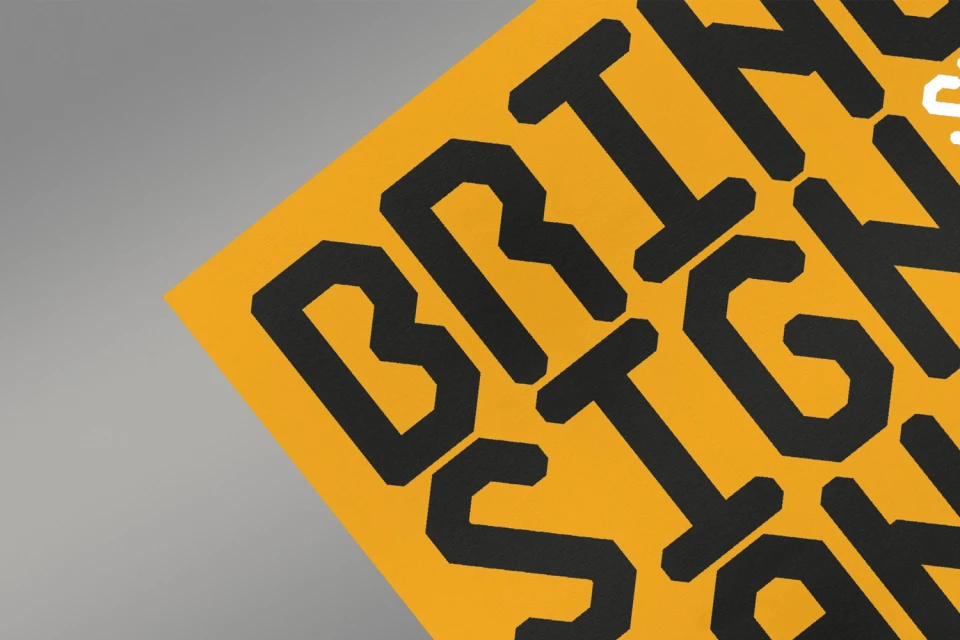
This sophisticated brand identity project, spearheaded by the team at Kurppa Hosk, serves as a masterclass in modular graphic design and typographic precision. By establishing a cohesive visual language centered on geometric rigor and high-contrast palettes, the work effectively translates complex identity systems into a clean, industrial aesthetic. The project leans into a bold color story—utilizing vibrant yellow against deep black—to frame an expansive suite of assets, ranging from custom monospaced typefaces like STS Mono Display to abstract, vector-based iconography. The execution is deeply systematic, favoring grid-based construction and structural clarity that underscores the functional nature of the branding. Through a diverse array of media, the design moves seamlessly between technical specimen sheets that deconstruct character utility and tangible, real-world applications such as premium business stationery. The work channels a modern, minimalist sensibility where negative space is as critical as the typography itself, creating a balanced tension across every layout. By integrating hand sign motifs and angular character sets, the identity system feels both cryptic and approachable, successfully bridging the gap between artistic abstraction and professional commercial utility. The result is a robust, versatile toolkit that maintains total visual consistency while highlighting the underlying logic of the design, proving that effective brand identity thrives when built upon a foundation of deliberate, thoughtful geometric constraints.
Minimalist, Horizontal, Graphic, Commercial
Typography, Vector
