
unknown
Brand Identity


Aug 2016
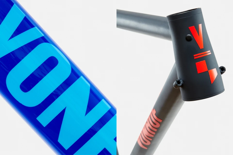
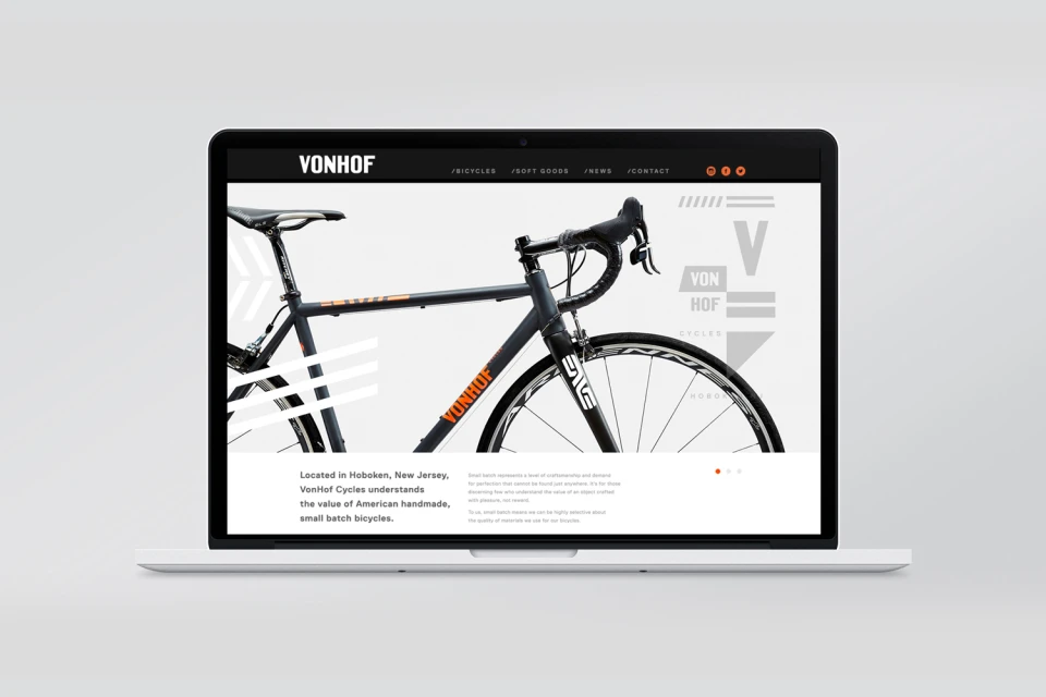
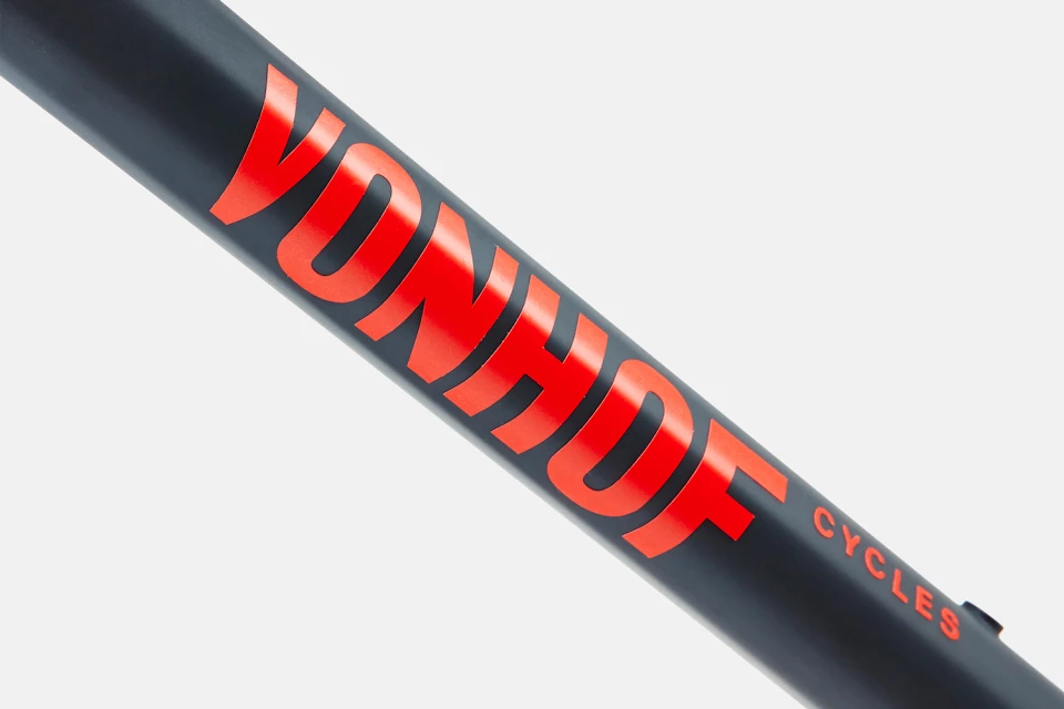
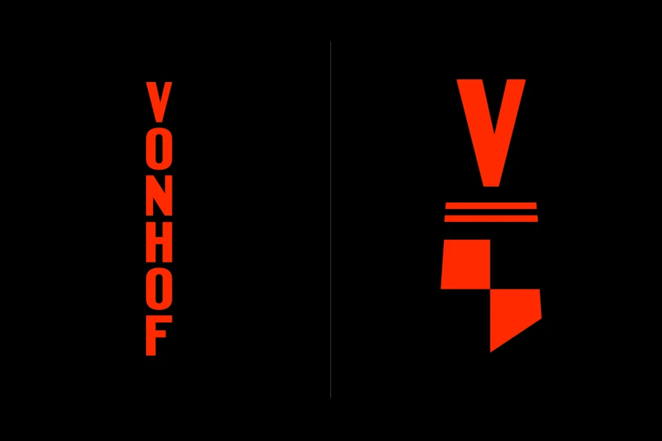
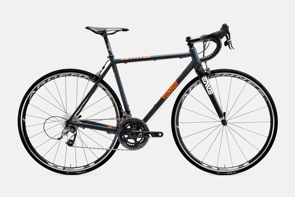
The brand identity for Vonhof Cycles strikes a sophisticated balance between mechanical precision and modern graphic expression, effectively positioning the manufacturer within the premium cycling market. Through a rigorous application of commercial design principles, the project establishes a cohesive visual language that translates seamlessly across physical hardware and digital touchpoints. The identity leans heavily into a bold, minimalist aesthetic, utilizing a punchy color palette of high-contrast reds, deep charcoal, and vibrant oranges to demand attention. Franklyn brings this vision to life through a sharp use of typography, favoring bold, sans-serif letterforms that emphasize clarity and geometric balance. By leveraging studio strobe lighting, the imagery highlights the interplay between matte and glossy textures on the bike frames, ensuring that every design detail—from the custom logotype to the structural chevrons—reads with intentionality. The UI illustration components further unify the brand, presenting a clean, focused digital presence that mirrors the craftsmanship of the handmade bicycles themselves. This identity work is a masterclass in visual consistency, utilizing vector-based assets and disciplined composition to elevate the functional nature of gravel and road bikes into a high-end lifestyle proposition. The resulting aesthetic feels both timeless and aggressively modern, successfully anchoring Vonhof Cycles as a performance-driven brand where every graphic choice serves the overarching commitment to industrial excellence.
Horizontal, Commercial, Clean, Minimalist
Cycling
White Seamless
