
unknown
Brand Identity

Apr 2026
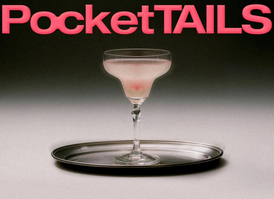
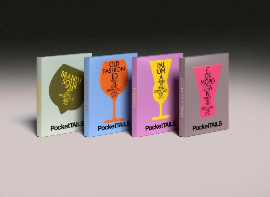
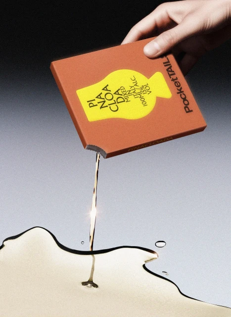
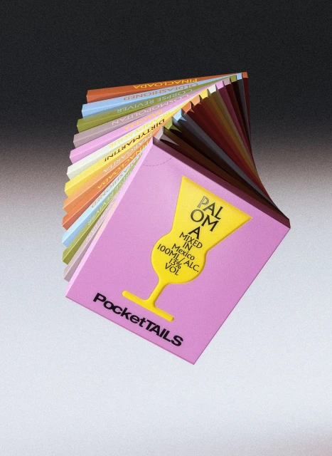
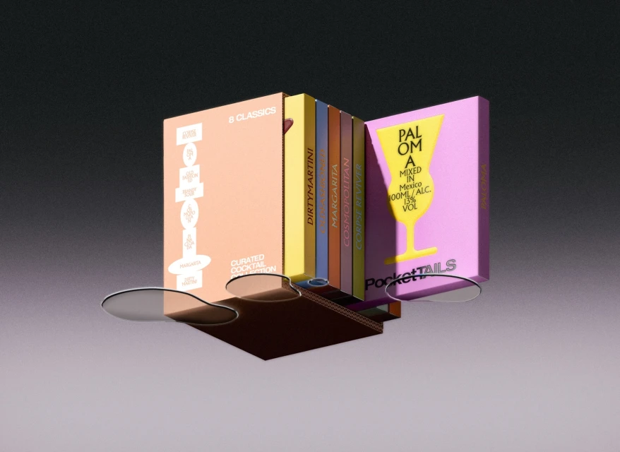
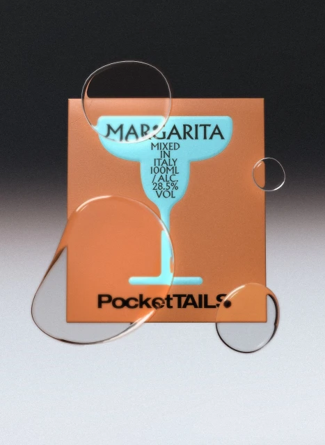
The brand identity for PocketTails reflects a sophisticated evolution in the ready-to-drink alcoholic beverage market, blending modern graphic precision with a playful, surrealist edge. Developed by COOOT Studio, the project moves beyond standard commercial product representation, opting instead for a clean, editorial aesthetic that treats every pouch and box as an object of design. By utilizing a mix of studio strobe lighting, crisp 3D render techniques, and high-speed photography, the identity emphasizes the tactile qualities of the packaging, from matte finishes to die-cut illustrations. The visual language is anchored by a restrained, neutral grey gradient backdrop, which allows the vibrant pastel and saturated color palettes of the individual cocktail pouches to take center stage. The photography, characterized by both clean commercial shots and experimental fine art compositions—such as warped liquid reflections and suspended product swirls—establishes a sense of fluid motion and refined rhythm. Typography plays a pivotal role, with bold sans-serif fonts and minimalist silhouettes grounding the brand’s Italian-inspired heritage in a contemporary context. The result is a cohesive brand identity that feels both accessible and elevated, leaning into a minimalist, high-end sensibility that distinguishes PocketTails from its competitors in the crowded food and beverage space. Through this meticulous balance of form, function, and imaginative flair, the work successfully transforms standard packaging into a compelling, modern lifestyle statement.
Commercial, Clean, Vertical
3D render / CGI
Beverages
Gradient
E-commerce / Product
