
unknown
Brand Identity
Dec 2017
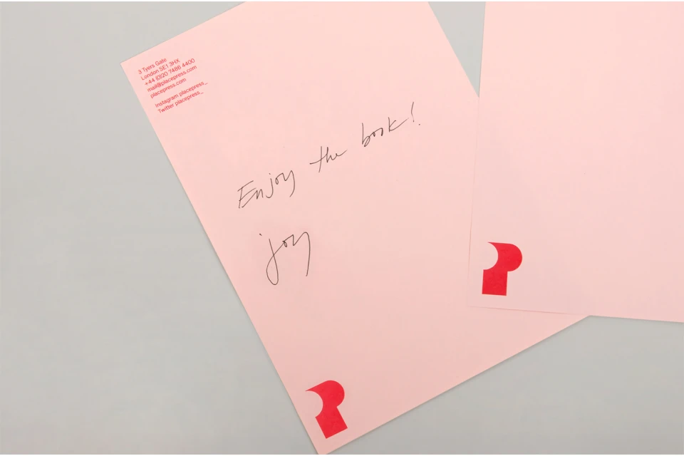
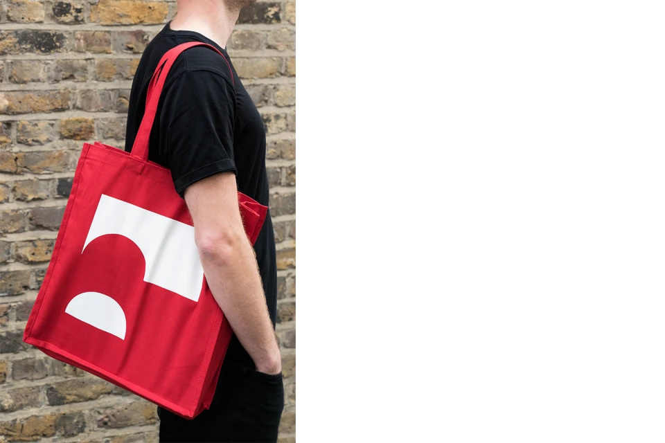
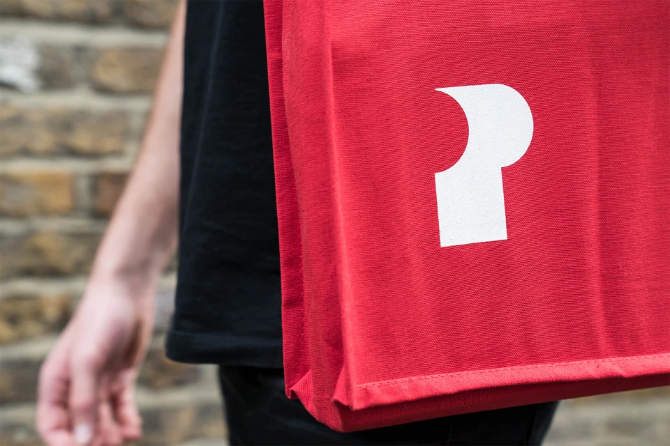
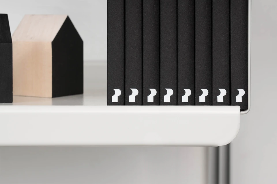
This brand identity project for the e-commerce and retail sector represents a masterclass in visual cohesion, centering on a bold and highly recognizable abstract logo. Designed by the team at DNCO, the project leans into a minimalist aesthetic that bridges the gap between commercial graphic design and tactile lifestyle application. By utilizing a saturated red and soft pink color palette, the identity achieves a striking visual contrast that demands attention across varied media platforms. The project effectively demonstrates how a core brand asset, specifically the stylized letterform, translates from static vector files to physical manifestations like canvas tote bags and minimalist bookshelf displays. The execution emphasizes clean, modern typography and a highly organized visual language, ensuring the brand remains both professional and approachable. Captured largely through natural light, the photography showcases the practical versatility of these branding assets, moving seamlessly from commercial stationery to lifestyle portraiture. The deliberate use of stark, monochromatic backgrounds alongside the vibrant brand colors serves to elevate the geometric precision of the logo, making it the undeniable anchor of the entire visual system. This thoughtful integration of assets proves that a well-executed identity is not merely about a static mark, but about creating a consistent, rhythmic experience that functions effectively whether applied to paper, textiles, or retail environments.
Horizontal, Commercial, Clean, Minimalist
White Seamless
