
unknown
Brand Identity
Jan 2018
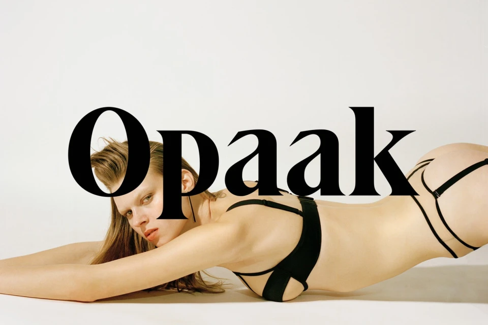
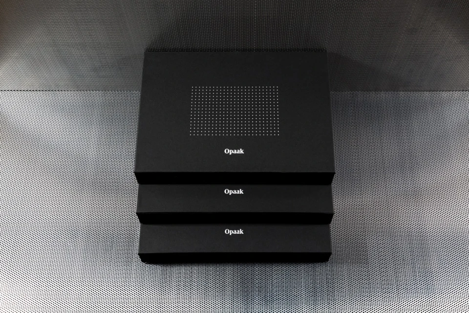
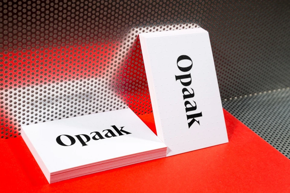
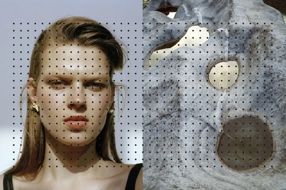
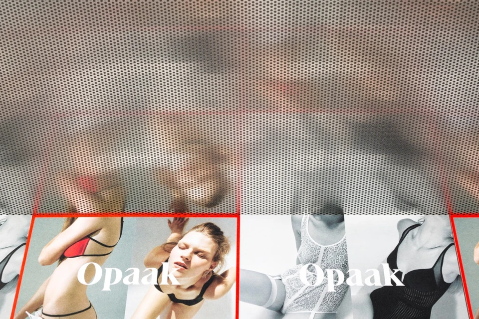
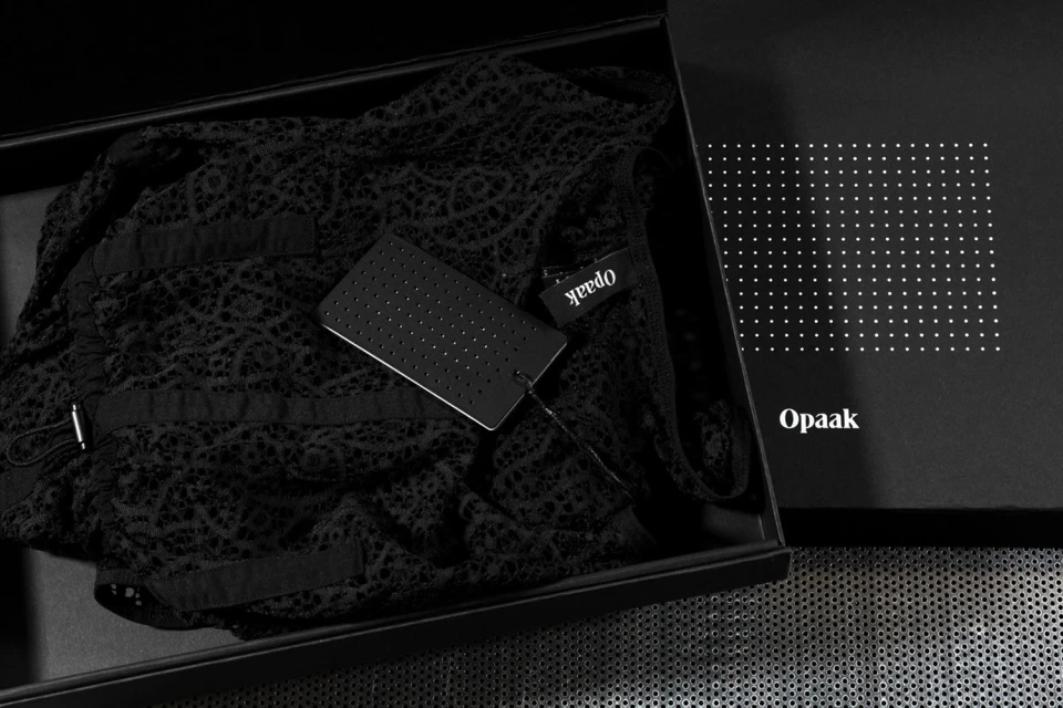
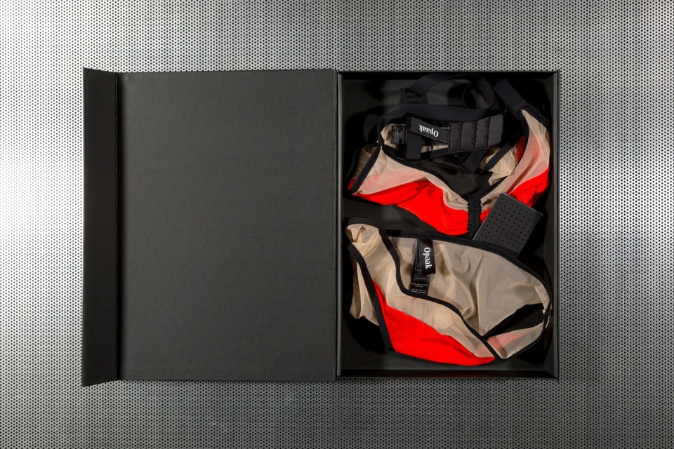
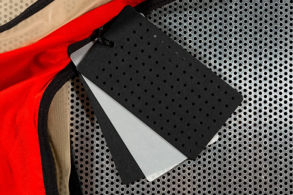
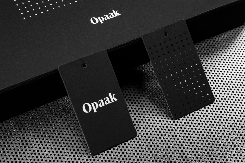
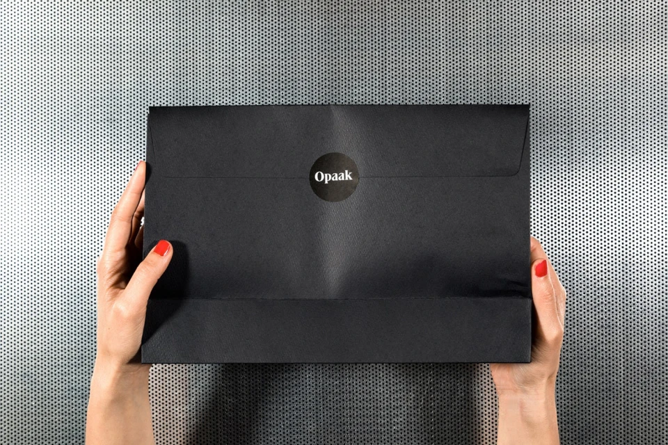
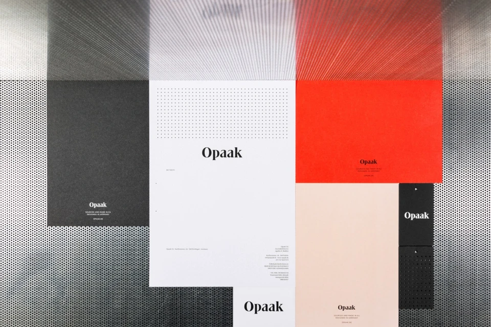
The brand identity for Opaak manifests as a masterclass in editorial minimalism, weaving together an industrial aesthetic with the delicate intimacy of high-fashion lingerie. Designed by the creative team at Deutsche & Japaner, the project leans into a rigorous, monochrome-focused visual language that emphasizes material contrast and graphic precision. By juxtaposing the tactile softness of lace and fine mesh against cold, perforated metallic surfaces, the identity establishes a sophisticated tension between the organic and the engineered. This project type is defined by a modular system that flows seamlessly from packaging and stationery to evocative campaign photography. The use of studio strobe lighting enhances the crisp clarity of the branding, while bold serif typography serves as a recurring anchor across various touchpoints. The incorporation of a precise grid of circular perforations acts as a signature motif, mirrored in both the physical collateral and the abstract portraiture that bridges human features with rugged, stone-like textures. Throughout the suite, the thoughtful application of colour blocking—specifically the strategic use of vibrant red against black and white—elevates the product presentation, ensuring that every element, from product labels to envelopes, reinforces a coherent and high-end narrative. Ultimately, the work functions as a disciplined study in brand consistency, where live-action technique and clean typographic layout converge to create a distinct, modern presence.
Horizontal, Commercial, Clean, Minimalist
Typography
Metal Texture
E-commerce / Product
