
Soho House
Brand Identity
Sep 2017
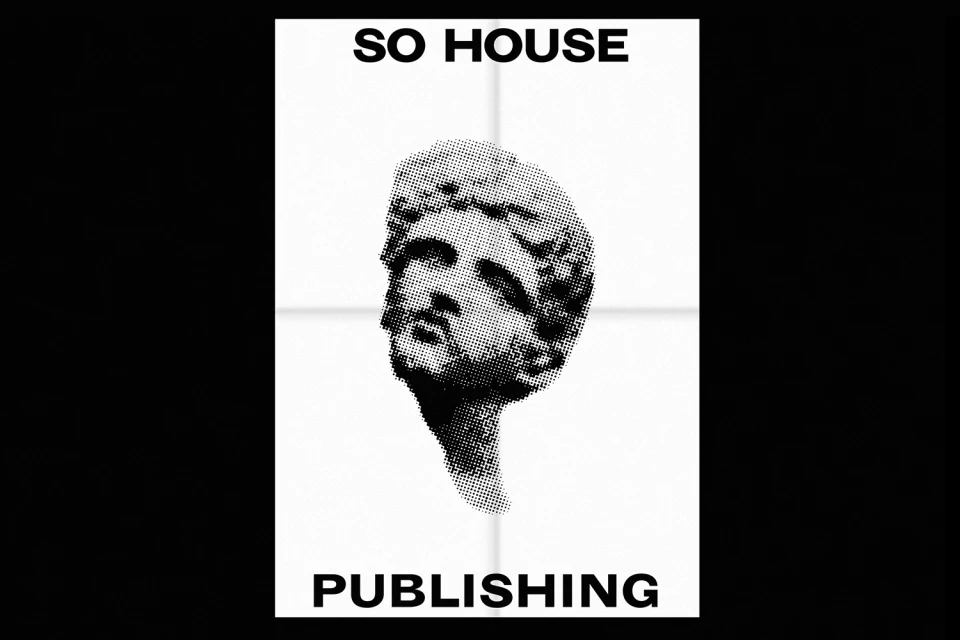
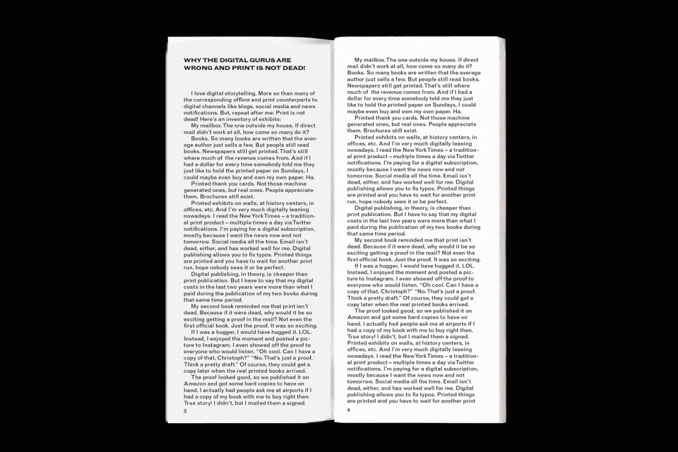
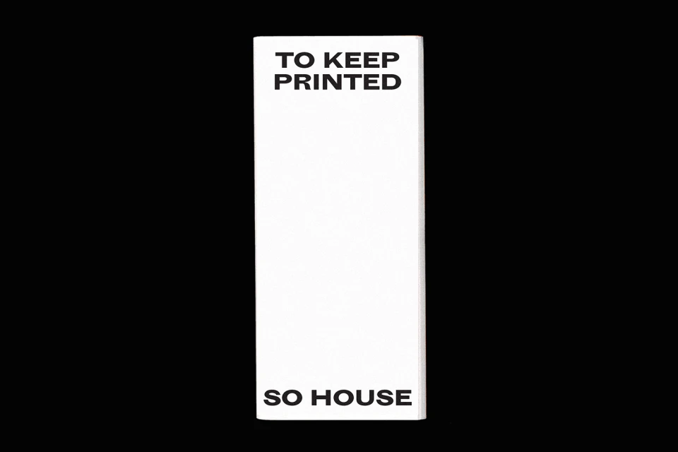
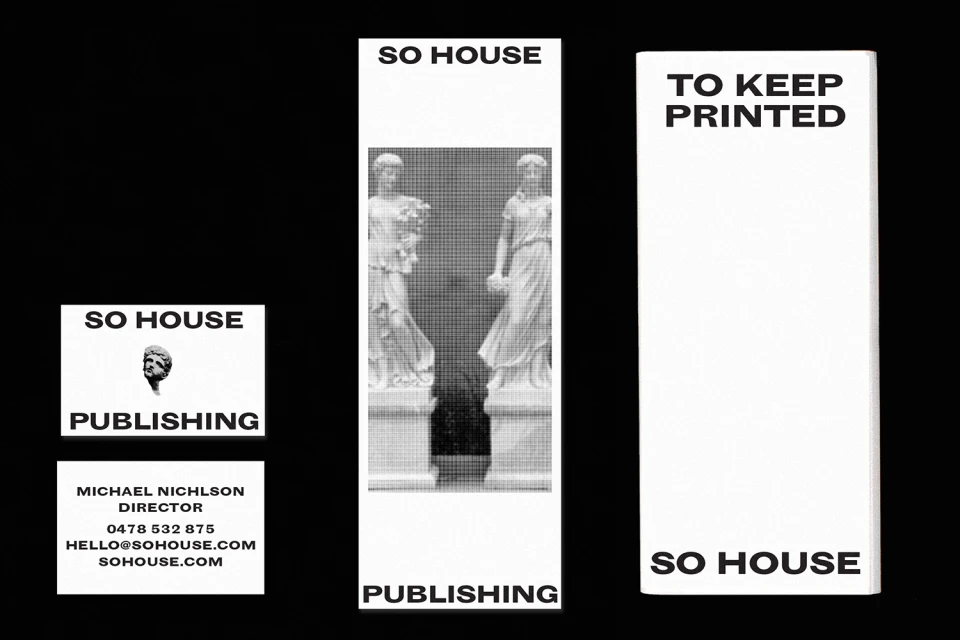
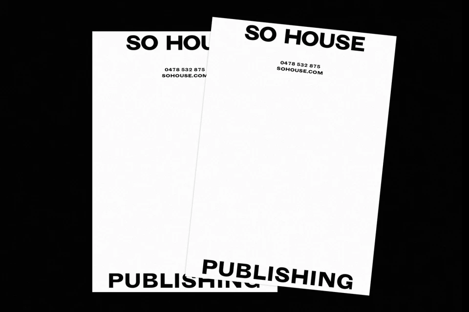
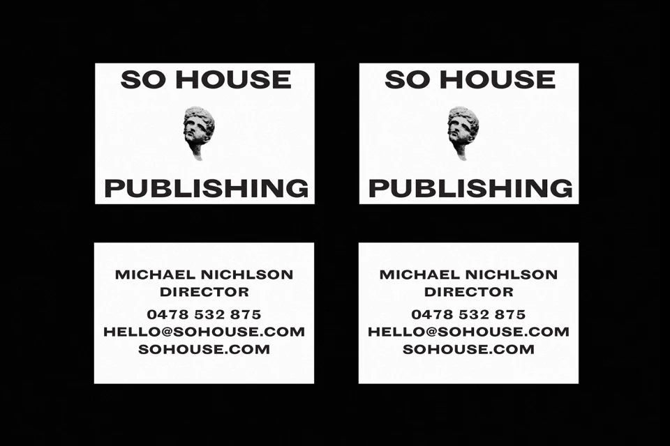
Soho House Publishing represents a masterclass in editorial design and corporate branding, stripping away excess to focus entirely on the potency of the printed word. Under the visionary graphic design of Gemma Mahoney, the project crafts a distinct visual identity that serves as a defiant love letter to physical media in an increasingly digitized landscape. The design language leans heavily into the stark intersection of classical motifs and modern functionality, utilizing high-contrast monochrome palettes that feel both timeless and urgent. By pairing halftone renderings of classical marble busts with sharp, sans-serif typography, the identity establishes a sophisticated aesthetic that bridges historical gravitas with contemporary minimalism. This project successfully utilizes screen print and silkscreen techniques to introduce a tactile, authentic quality that elevates standard stationery and signage into pieces of art. The deliberate use of negative space and rigorous symmetry creates a powerful visual rhythm, positioning the brand as a leader in high-end publishing. Whether through the clean execution of business collateral or the bold, manifesto-like layout of internal communications, the branding reinforces the enduring relevance of print. Every element, from the deliberate text placement to the refined editorial formatting, works in tandem to ensure that Soho House Publishing communicates authority, intellectual clarity, and a profound respect for the craft of traditional graphic design.
Clean, Minimalist
Typography
Black Seamless
Brand Film / Corporate Video
