
BrandSoho House
ProjectBrand Identity
Soho House Brand Identity 2017
Associated creatives

Tags
Description
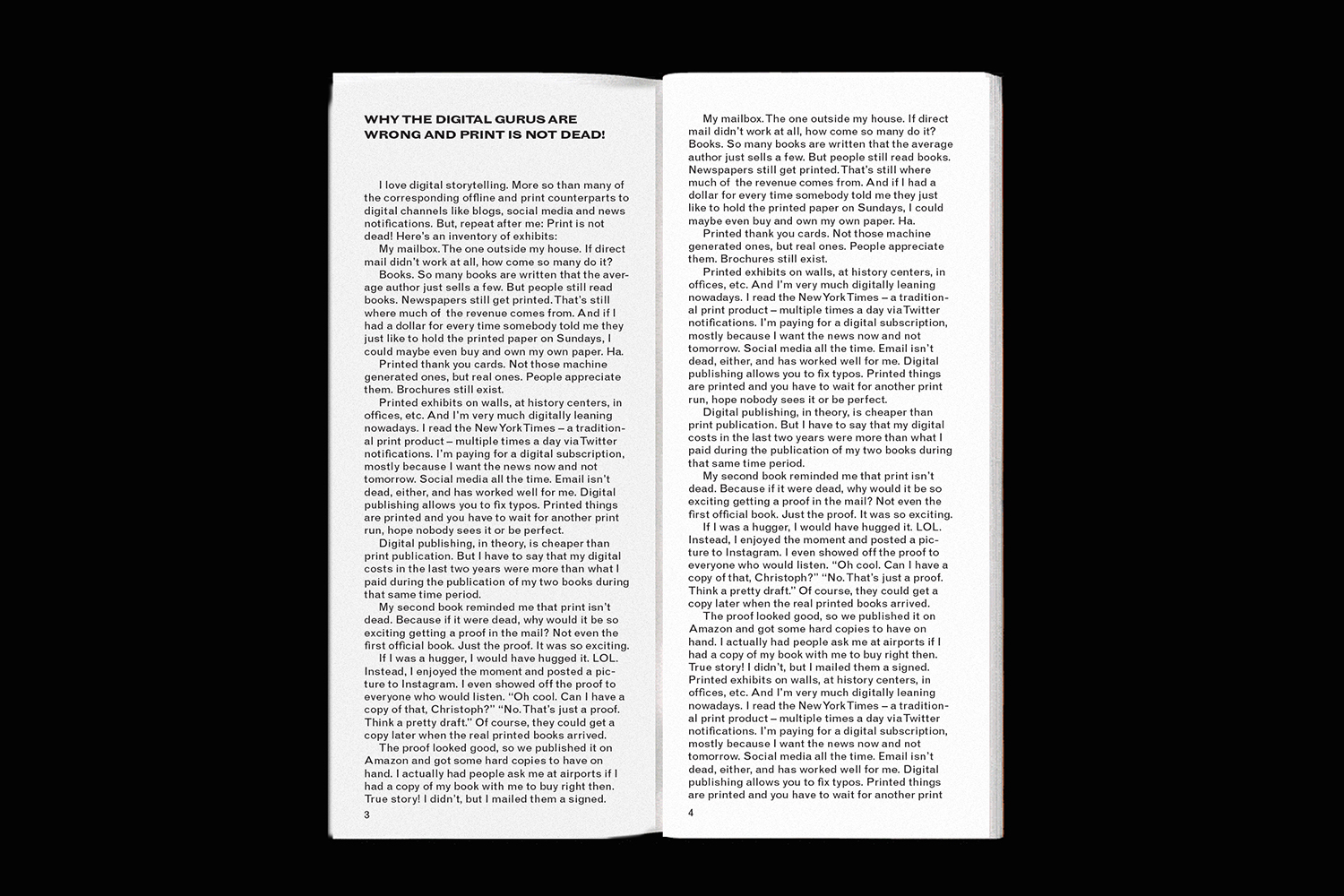
An open softcover book displays two pages filled with clean, justified columns of black typography against a matte white paper background. The left page features a bold heading reading WHY THE DIGITAL GURUS ARE WRONG AND PRINT IS NOT DEAD! followed by multiple paragraphs of legible editorial text. The composition is shot straight-on from above, emphasizing the crisp contrast between the black ink and the white paper pages. This brand identity piece for Soho House was designed by Gemma Mahoney.
Style
Editorial, Horizontal, Clean, Minimalist
Techniques
Typography, Screen print / silkscreen
Industries
Digital Media & Publishers
Color
Pure White (70%)
Jet Black (30%)
Background
Paper Texture
Context
Advertising Campaign, Website / Web