
unknown: Brand Identity
Dec 2019
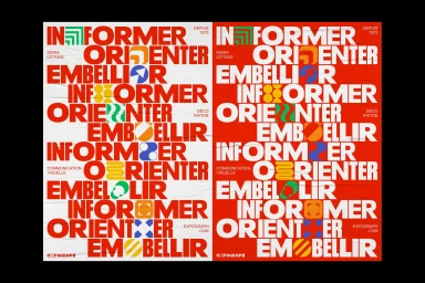
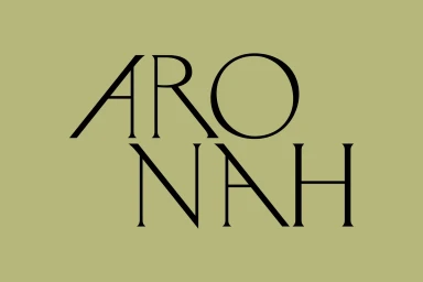
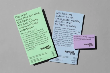
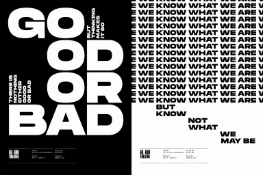
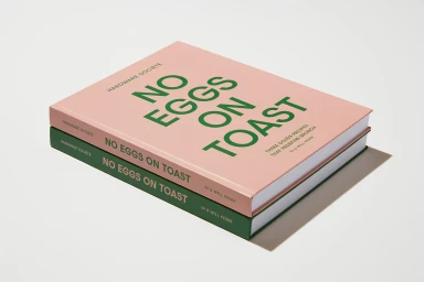
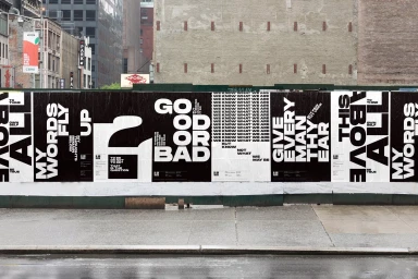
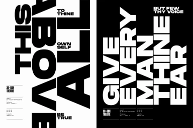
This collection of work highlights a sophisticated approach to brand identity design, where the power of typography serves as the primary visual anchor across diverse commercial and artistic applications. By leveraging a rigorous grid-based architecture and a masterclass in negative space, these projects demonstrate how strategic visual communication can elevate corporate presence and cultural storytelling alike. Whether through the clean, high-contrast serif aesthetics seen in corporate branding or the bold, rhythmic sans-serif layouts designed for theatrical narratives, the work leans into a philosophy of editorial minimalism that prioritizes legibility and structural impact. Each project demonstrates an acute sensitivity to material quality, from the tactile matte finish of printed oenological collateral to the raw, urban energy of wheat-pasted posters on city hoardings. These compositions are united by a deliberate tension between symmetry and abstraction, utilizing geometric symbols and stark monochromatic palettes to convey intentionality. The integration of UI illustration principles alongside traditional print design results in a cohesive visual language that feels both modern and timeless. Through the collaborative contributions of creative outfits like Brand Brothers, Studio Round, and Gemma Mahoney, the work successfully navigates the balance between functionality and creative expression, proving that a well-executed typeface is often the most evocative element of any brand system, capable of transforming simple information into a compelling, graphic experience.
Horizontal, Graphic
Typography


