
Fora
Brand Identity
Dec 2017
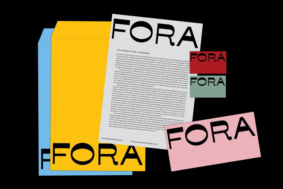
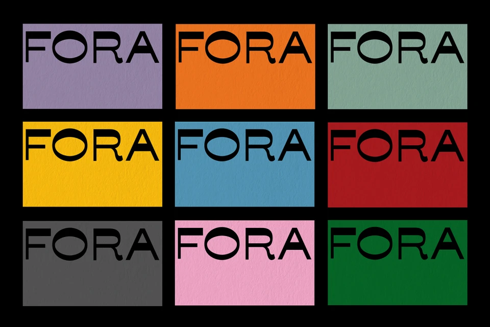
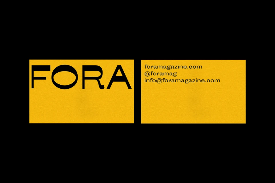
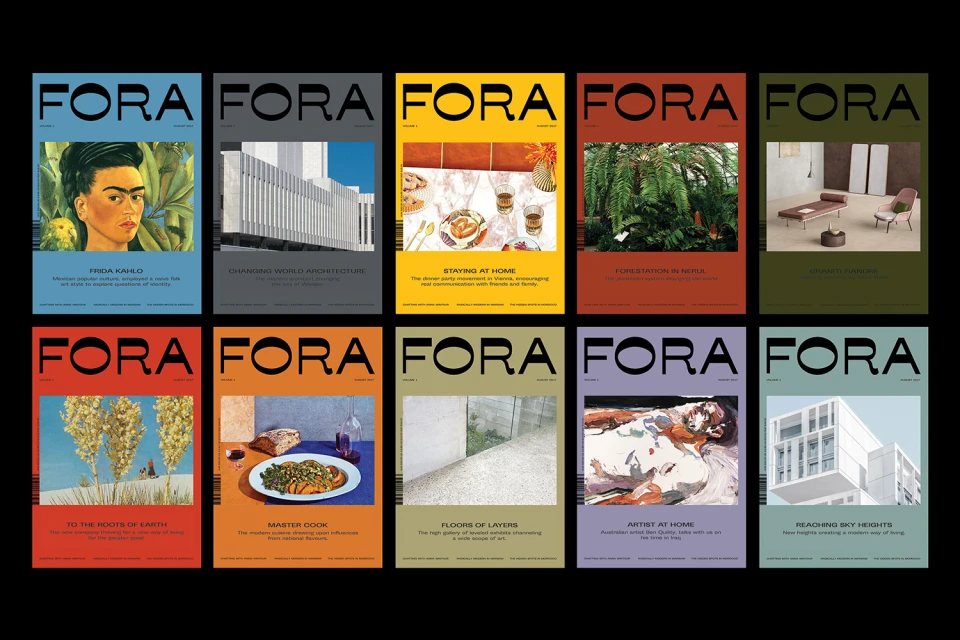
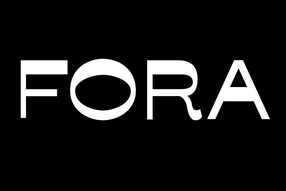
The brand identity for Fora establishes a sophisticated visual language that thrives on high-contrast graphic design and a rigorous, systematic approach to corporate communication. Orchestrated by graphic designer Gemma Mahoney, the project leans into a modernist aesthetic where bold, geometric sans-serif typography serves as the primary anchor for a diverse range of assets. The identity is built upon a vibrant, multifaceted color palette—ranging from punchy yellows and deep blues to muted sage greens—which are expertly balanced against stark black backgrounds to heighten visual impact. Across the collection, the design team employs vector-based precision to ensure the brand name remains legible and authoritative, whether applied to minimalist business stationery or a complex grid of editorial magazine covers. This commercial project effectively utilizes color blocking to delineate individual segments while maintaining a cohesive look that feels both professional and contemporary. By stripping away extraneous details and focusing on clean lines and symmetrical layouts, the identity ensures that Fora communicates a sense of refined clarity. The inclusion of architectural and culinary photography within the magazine covers further demonstrates the versatility of the system, proving that a disciplined typography-focused strategy can seamlessly span various creative domains while retaining a unified brand character that feels inherently editorial and intentional in every application.
Horizontal, Graphic, Commercial, Clean
Typography, Vector
Black Seamless
Advertising Campaign
