
Sheraton: Brand Identity


Jul 2020
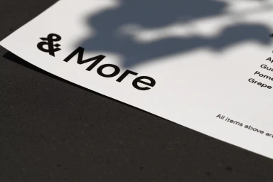
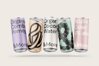
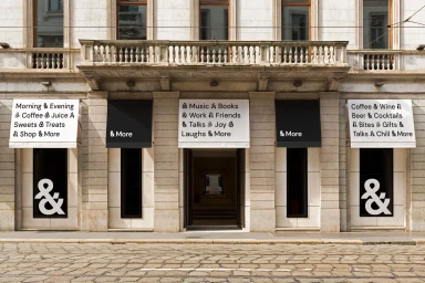
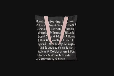
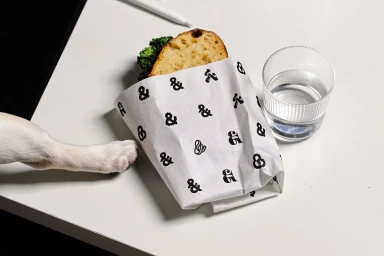
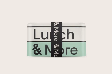
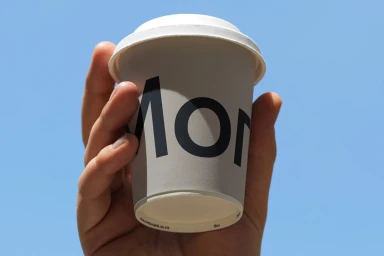
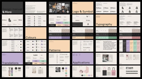
Sheraton has undergone a comprehensive brand identity refresh, successfully pivoting from traditional hotel aesthetics toward a highly curated, lifestyle-forward experience. Orchestrated by Oddity, the new design language leans heavily into editorial minimalism, utilizing a sophisticated, sans-serif typography system that anchors the brand across various touchpoints. The project gracefully bridges the gap between corporate utility and modern lifestyle branding, as evidenced by a diverse array of branded ephemera ranging from bespoke bento boxes and coffee cups to canvas tote bags. By weaving consistent motifs like the ampersand and a restrained, neutral color palette into everyday amenities, the studio creates a cohesive visual narrative that feels both professional and inviting. The execution relies on a clean, commercial photographic style, often utilizing natural light to accentuate the matte textures of paper goods and packaging. Through the lens of 3D render and CGI techniques, even the digital representations of their product line maintain a crisp, sharp presence. This holistic approach, meticulously detailed in their design manual, moves beyond simple hospitality signage to craft an immersive, brand-led ecosystem. Whether captured in the urban setting of a historic facade or presented in a refined studio space, the identity feels intentional, focusing on negative space and tactile quality to elevate the guest experience into a cohesive and stylish community-centric identity.
Horizontal, Commercial, Clean, Minimalist
