
Oddity: Brand Identity



Mar 2023
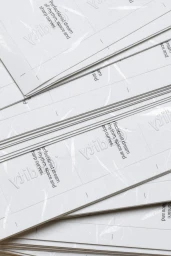
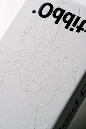
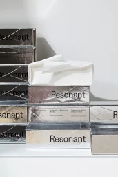
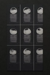
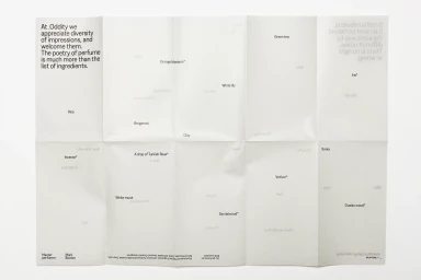
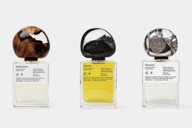
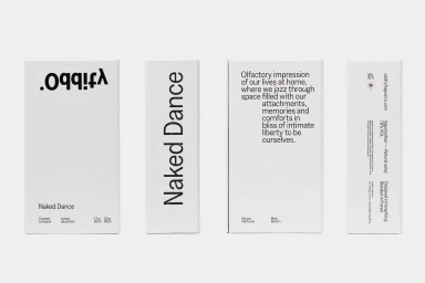
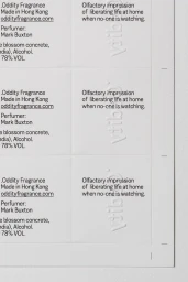
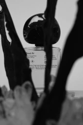
The brand identity for Oddity serves as a tactile exploration of beauty and fragrance, focusing on the intersection of minimalist design and high-end print production. The work balances graphic precision with organic materiality, utilizing a palette of textured Neenah Cotton and James Cropper paper stocks to anchor the identity in a physical, sensory experience. The project incorporates sophisticated finishing techniques, including emboss and deboss detailing, to elevate the packaging and collateral. Through a series of clean, grid-based layouts and bold typography, the visual system communicates fragrance notes and product narratives with a restrained, editorial aesthetic. This systematic approach extends across both static packaging and experimental environmental graphics. Beyond traditional print, the identity integrates diverse material textures—from polished wood and resin to reflective metallic foils—to define the product range. The execution utilizes a blend of natural lighting and deliberate chiaroscuro, ensuring each piece maintains a consistent, refined atmosphere across both digital and physical applications.
Clean, Minimalist, Commercial
Typography


