
Soulgarden: Brand Identity




Oct 2020
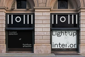
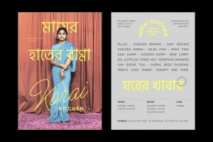
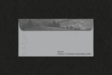
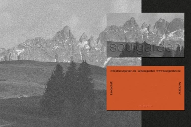
The brand identity work for Soulgarden serves as a masterclass in modern, curated visual communication, blending organic sensibilities with a sharp, industrial design language. Spanning across diverse commercial applications—from high-end packaging and tactile stationery to architectural storefront treatments—the project establishes a cohesive aesthetic that feels both premium and approachable. Central to this execution is a sophisticated use of typography, where clean sans-serif fonts interact with bold, architectural layouts to anchor the brand's identity within the design space. The creative approach leans into a refined minimalist branding ethos, effectively utilizing techniques like emboss and deboss finishes to add a layer of sensory depth to corporate materials. By layering grainy, monochrome landscape imagery with vibrant, geometric UI illustrations, the work creates a compelling contrast between the raw beauty of nature and the precision of structural design. Whether it is through the meticulous top-down flat lay photography that emphasizes balanced spacing or the clever integration of multilingual text on premium packaging, every asset reinforces a consistent, modern narrative. With collaborative contributions from Studio 87, Oddity, Badal Patel, and ZAK, the project achieves a professional and highly polished look, successfully positioning the Soulgarden brand at the intersection of landscape, architecture, and contemporary lifestyle aesthetics.
Horizontal, Commercial, Clean
Advertising Campaign


