
Playboy: Brand Identity


Jan 2023
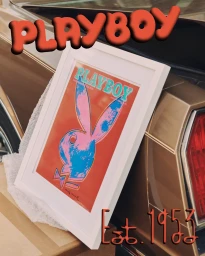
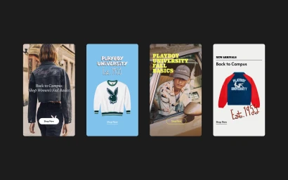
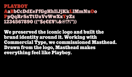
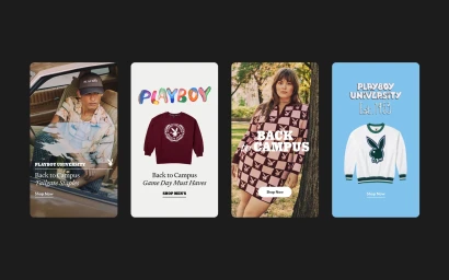
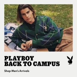
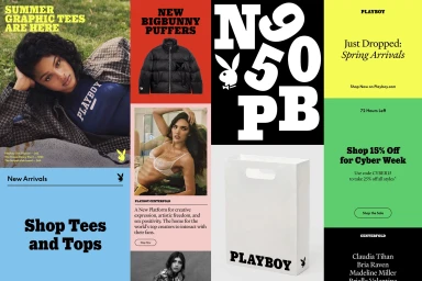
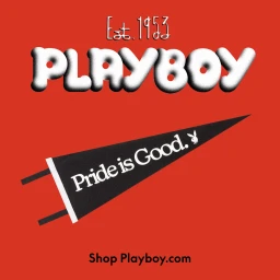
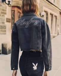
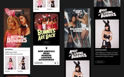
Playboy’s comprehensive brand identity project serves as a structured visual system for the legacy label, blending collegiate aesthetics with contemporary streetwear sensibilities. The design language, developed in collaboration with Commercial Type, centers on a custom typeface named Masthead, which draws its stylistic lineage directly from the iconic brand logo. Executed with graphic design precision, the brand identity extends across diverse digital and physical touchpoints. The system utilizes a bold, retro-inspired typographic hierarchy paired with a vibrant, block-colour palette. Editorial assets lean into a nostalgic, outdoor collegiate mood, incorporating natural light and tactile textures within a campus-inspired visual framework. The identity was further codified by Decade, which established rigorous standards for logo lock-ups, display types, and layout rules to ensure consistency across e-commerce platforms and social media advertising.
Typography
Advertising Campaign
