
Jatachi: Brand Identity




Sep 2018
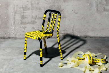
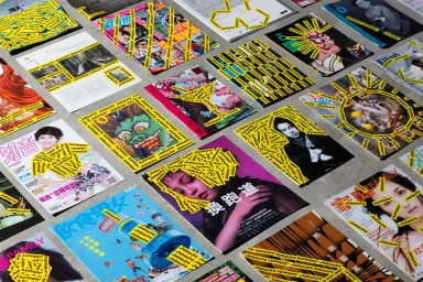
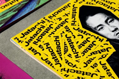
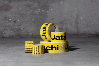
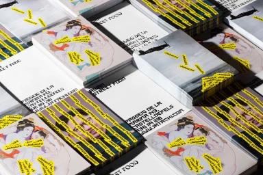
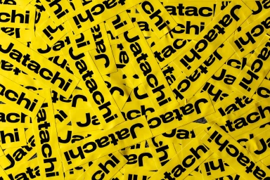
The brand identity for Jatachi, developed by the design studio Pràctica, is a masterclass in visual cohesion through aggressive, high-contrast graphic layering. By leveraging a signature palette of vibrant yellow and industrial black, the project establishes a distinct and memorable presence that bleeds seamlessly from digital assets to physical architecture. The visual system relies heavily on bold typography and repeated logo stickers, which serve as unifying motifs that anchor disparate materials—ranging from delicate business cards featuring traditional Japanese illustration to the raw, corrugated metal siding of the brand's physical storefront. Utilizing a variety of techniques including macro photography to highlight embroidered patch textures and deliberate, industrial-style product staging, the identity thrives on a raw, street-inspired aesthetic. The use of natural light ensures that the tactile quality of materials, such as adhesive tape and matte printed stickers, remains at the forefront of the narrative. This project leans into a corporate-meets-streetwear ethos, creating an organized chaos that feels both curated and urgent. By prioritizing rhythm and composition across every touchpoint—whether it is an overhead editorial layout of magazines or a sculptural arrangement of branded tape on furniture—Pràctica delivers a robust brand language. The final result is a versatile and scalable system that successfully transforms everyday utilitarian objects into a cohesive, high-impact cultural expression that feels equally at home in an editorial gallery or on the bustling urban facade.
Horizontal, Commercial, Clean
Advertising Campaign
