
Canela Fina: Brand Identity


Apr 2018
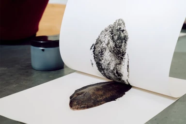
The brand identity for Canela Fina is a masterclass in artisanal storytelling, grounding its corporate presence in the raw, tactile nature of traditional craft. Under the sophisticated graphic design direction of Pràctica, the project successfully bridges the gap between commercial structure and organic, human-centric design. By leveraging a high-contrast palette of monochromatic ink and sage green, the visual system leans into an editorial minimalism that feels both timeless and contemporary. The identity is defined by a distinctive distressed typography, where ink stamping techniques and weathered textures suggest a handcrafted sensibility, moving away from sterile digital perfection toward something authentic. This is particularly evident in the lifestyle photography, where the brand’s Toca, Taca, and Cuina mission is captured amidst the kinetic energy of an urban market, utilizing soft light and natural light to emphasize the materiality of cotton canvas and paper stock. The work functions as a cohesive ecosystem, from the physical application of metal digits on stationery to the gallery-style arrangement of monochromatic ingredient illustrations. By blending corporate precision with the artistic influence of ceramics and sculpture, the branding creates a versatile, immersive language that feels rooted in the culinary space while maintaining a sharp, modern edge. It is a striking example of how typography and intentional print choices can elevate a brand into a deeply immersive, sensory-driven experience.
Horizontal, Clean, Commercial
Typography
Advertising Campaign
