ZETAK: Brand Identity
Aug 2020
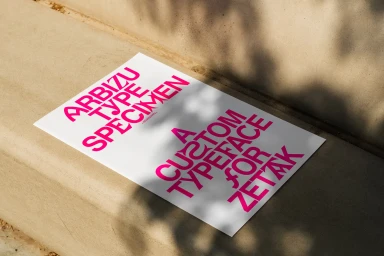
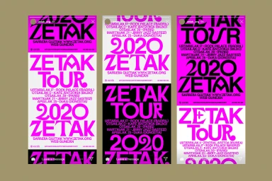
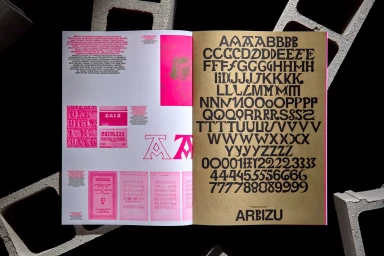
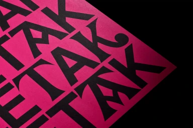
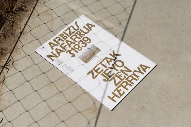
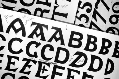
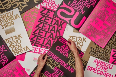
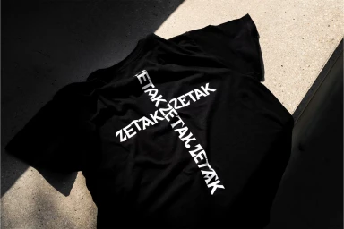
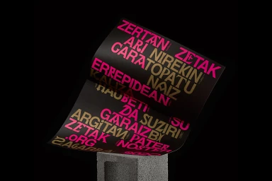
The brand identity for ZETAK stands as a masterclass in typographic exploration, blending industrial grit with high-fashion editorial polish. Spearheaded by the design team at Pràctica, the project moves beyond traditional visual systems to treat the alphabet itself as an expressive, sculptural medium. The execution centers on the custom Arbizu typeface, a geometric and sharp font that anchors the identity across diverse applications, from tour-specific collateral in Paris and Madrid to minimalist merchandise. Visually, the campaign leans into a high-contrast palette of vibrant magenta-pink, metallic gold, and stark black, often set against raw concrete textures and natural light to emphasize a tactile, grounded aesthetic. Through a series of print-heavy compositions, the project displays a rigorous, artistic development process—capturing hand-drawn sketches alongside finished, polished layouts. This layering of mediums, facilitated by the precision of Nova Era Publications, reflects a cohesive visual language that feels both modern and deeply rooted in a professional design philosophy. Photography by Kiwi Bravo elevates the brand, utilizing dynamic shadows and geometric framing to highlight the interplay between paper, ink, and the surrounding environment. By balancing experimental type treatments with functional, commercial clarity, the identity succeeds as both a raw artistic study and a fully realized corporate presence, defining ZETAK through its distinctive, rhythmic typography and bold, monochromatic structure.
Horizontal, Clean
Typography
Advertising Campaign