
Catalonia: Brand Identity
Sep 2019
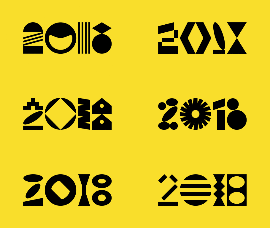
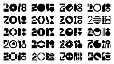
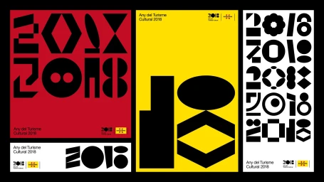
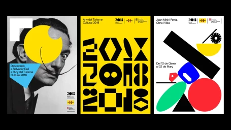
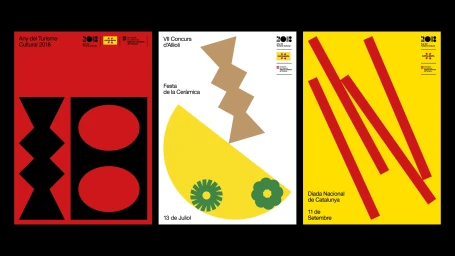
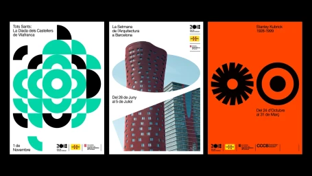
The brand identity developed for Catalonia’s 2018 Year of Cultural Tourism is a masterclass in modular graphic design and typographic experimentation. Led by the design studio Pràctica, the project moves beyond standard promotional tropes, instead utilizing an abstract visual language that leans into the interplay of geometric forms and high-contrast color fields. By distilling the year 2018 into a series of bold, structural icons composed of circles, diamonds, and vertical lines, the team successfully created a versatile system that feels both institutional and inherently artistic. The project employs a striking, minimalist aesthetic that balances vibrant, primary color blocks with stark white or black negative space, ensuring the typography remains the primary focus. This commercial work effectively weaves together cultural heritage—referenced through subtle nods to Catalan history and iconic figures—with a modern, vector-based approach that maintains visual coherence across a diverse array of media, from triptych posters to grid-based typographic explorations. Through consistent grid alignment and a rigorous adherence to structural variation, Pràctica delivers a brand identity that reads as both a celebration of regional identity and a forward-thinking exercise in modern corporate communication. The result is a cohesive, highly recognizable system that relies on deliberate, clean composition to elevate the cultural tourism campaign, proving that effective graphic design often thrives within the intentional limitations of a modular and systematic framework.
Horizontal, Graphic, Artistic, Clean
Typography, Vector
Advertising Campaign
