
Mohawk: Brand Identity
Apr 2023
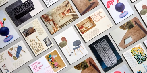
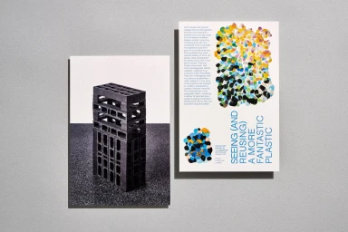
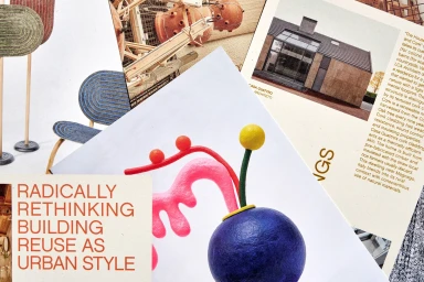
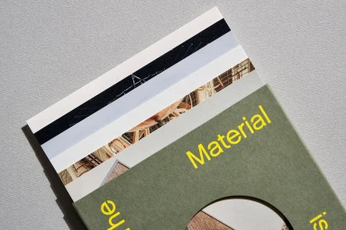
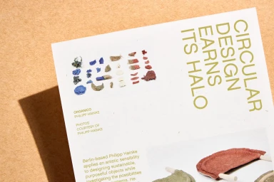
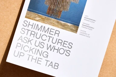
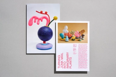
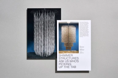
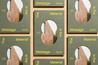
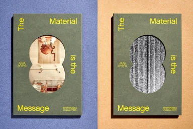
Mohawk’s brand identity project serves as a showcase for high-end paper manufacturing, blending tactile materiality with editorial precision. Developed by Hybrid Design, the collateral explores the intersection of sustainability and print production through a series of layered layouts, die-cut booklets, and material sample packaging. The identity leans into clean, minimalist graphic standards to elevate technical paper specifications into a cohesive visual language. Captured by photographer Henrik Kam, the imagery utilizes natural light and sharp, rhythmic compositions to highlight the physical grain and texture of the paper stocks. By incorporating collage techniques and bold, structured typography, the project functions as both a brand manual and a medium for artistic documentation. The work emphasizes the tactile quality of the collection, using subtle shadows and deliberate spacing to frame archival photographs and sculptural illustrations within a professional editorial context.
Horizontal, Clean
Typography
Editorial

