
Mohawk: Brand Identity
Nov 2024
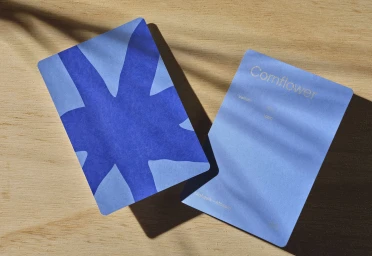
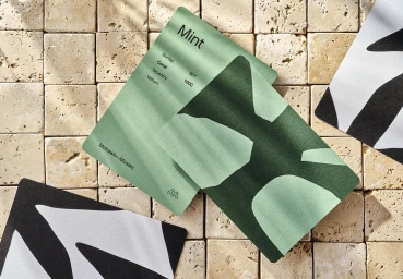
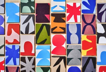
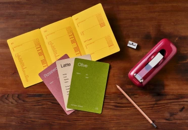
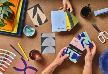
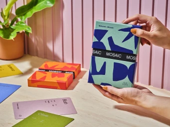
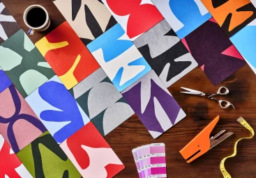
Mohawk’s brand identity project showcases an extensive range of paper samples and collateral, emphasizing the intersection of tactile design and print production. The collection features a variety of swatch books, geometric packaging, and die-cut cards that explore texture through the use of natural light and clean, minimalist compositions. Designed by Hybrid Design, the project highlights specialized printing and binding techniques, including emboss and deboss finishes. Photographer Rob Williamson and stylist Megan Petrilla capture these materials across diverse table settings, incorporating organic paper art and studio workspace elements to demonstrate the versatility of the brand's paper stock.
Horizontal, Commercial, Clean
Natural light
Wood Texture
Advertising Campaign


