
Brand
ProjectBrand Identity
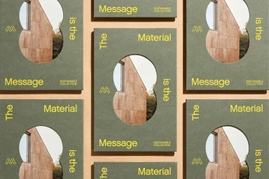
Mohawk Brand Identity 2023
Associated creatives


Tags
Description
This brand identity project for Mohawk features a flat-lay arrangement of grey textured paper booklets with distinct die-cut circular window cutouts. Through the cutouts, a photographic glimpse of a modern wooden building exterior and trees is visible. Yellow typography is printed across the covers, with phrases reading 'The Material is the Message' and 'Sustainable Collection'. The composition is symmetrically styled on a warm tan paper background. Photography was captured by Henrik Kam with graphic design by Hybrid Design.