
Sonos: Brand Identity
Feb 2022
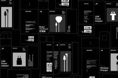
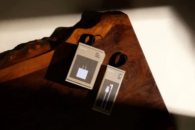
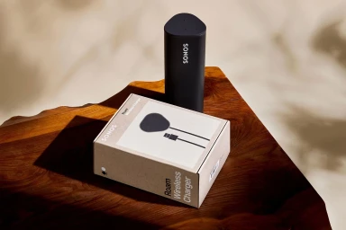
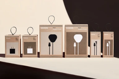
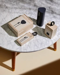
Sonos updates its brand identity through a cohesive series of product packaging designs. Developed in collaboration with Hybrid Design, the project replaces standard enclosures with custom kraft paper packaging, prioritizing sustainable materials and a refined visual language. Photographer Rob Williamson captures the collection across a variety of settings, from polished wooden surfaces to neutral marble. The imagery leverages natural light and high-contrast shadows to highlight the tactile textures of the recycled paper, pairing them with minimalist typography and precise graphic icons that detail the included accessories. This commercial work serves to unify the consumer electronics brand's presentation through clean lines and geometric order.
Horizontal, Commercial, Minimalist, Clean
Natural light
E-commerce / Product


