
Indeed: Brand Identity
Brand
Date
Dec 2022
Description
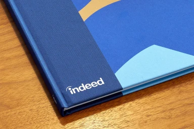
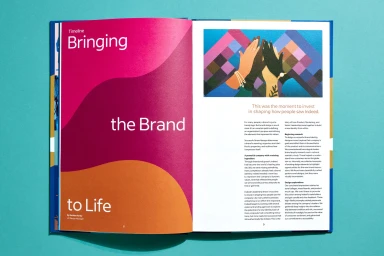
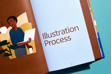
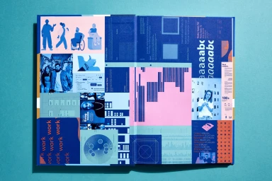
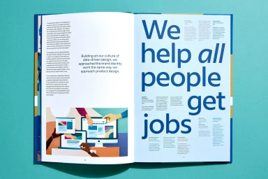
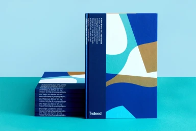
Indeed presents its evolved brand identity through a comprehensive series of design guidelines. Developed by Hybrid Design, the project establishes a cohesive visual language that integrates abstract geometric patterns, a vibrant palette of blue, turquoise, and magenta, and structured grid systems. The collateral explores the application of these design principles across editorial layouts, featuring a mix of character illustrations and typographic specimens. Captured in photography by Henrik Kam, the physical manuals highlight tactile material choices, emphasizing a clean and minimalist aesthetic that bridges digital platform elements with printed brand materials.
Style
Horizontal, Commercial, Clean, Minimalist
Industries
Color
Pure White
Associated creatives


5000+ creatives to discover
Sign up to gain access to the entire directory. It’s free.
Visie is a curated library of creative professionals.