
Brand
ProjectBrand Identity
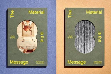
Mohawk Brand Identity 2023
Associated creatives


Tags
Description
This image showcases the Brand Identity project for Mohawk, photographed by Henrik Kam with graphic design by Hybrid Design. Two olive green books feature die-cut circular openings that reveal interior imagery and textured paper samples. Bold yellow typography reading The Material is the Message frames each cover alongside subtle branding marks. The books are laid flat against a split-colour background of purple and textured tan surfaces, casting sharp shadows to the left. The composition highlights sustainable paper collection materials and precise typographic layout.