
Mohawk: Brand Identity
Apr 2023
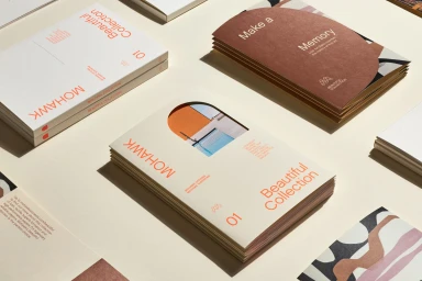
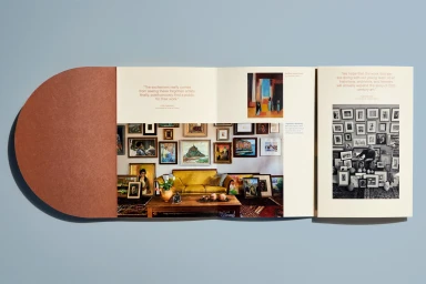
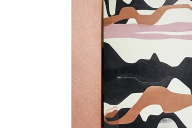
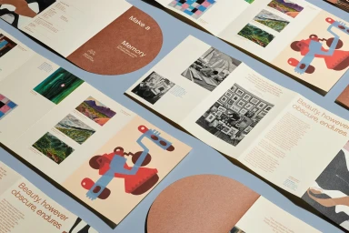
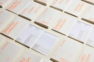
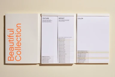
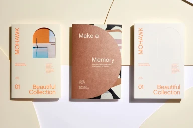
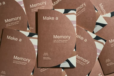
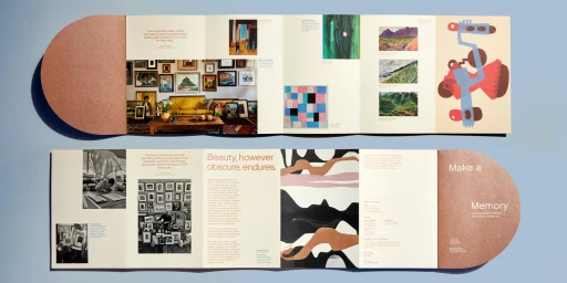
This brand identity project for Mohawk presents a comprehensive visual system designed by Hybrid Design. The collateral focuses on the tactile properties of specialty paper stocks, utilizing clean typography and structured grid systems to showcase the brand's diverse range of textures and finishes. Photographed by Henrik Kam, the series highlights promotional brochures and swatch portfolios through minimalist compositions. The execution leans into a natural light aesthetic, incorporating techniques such as screen printing, blind embossing, and arched die-cuts to create depth within the print materials. These design elements emphasize an earthy color palette and careful attention to negative space, reflecting a methodical approach to print collateral.
Horizontal, Commercial, Clean, Minimalist
Typography
Advertising Campaign

