
Hackney Half Marathon: Brand Identity
May 2019
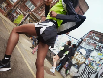
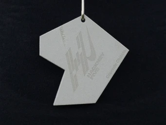
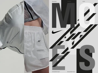
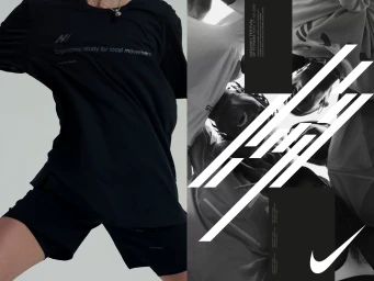
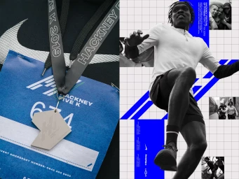
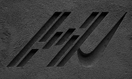
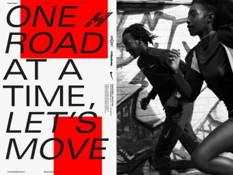
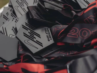
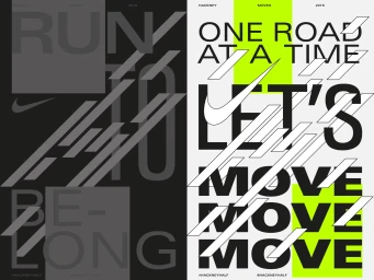
The brand identity for the Hackney Half Marathon perfectly captures the pulse of urban athletics, blending high-performance energy with a sophisticated, Swiss-influenced graphic language. Developed with sharp design expertise by Soft Power, the project establishes a cohesive visual narrative that bridges the gap between commercial event marketing and editorial storytelling. The aesthetic leans heavily into a stark, monochromatic palette, utilizing bold typography and sliced letterforms to mirror the rapid, forward motion of long-distance running. By integrating industrial textures, such as debossed concrete and matte metallic finishes on finisher medals, the design language communicates a sense of grit and precision that resonates with competitive runners. The creative execution skillfully balances these structural elements with lifestyle photography that emphasizes human endurance against the backdrop of an urban landscape. Through the use of natural light and high-contrast compositions, the branding transforms technical athletic gear and race-day logistics into a cohesive lifestyle movement. Every touchpoint, from UI illustrations and infographic layouts to event collateral, reinforces a modern, minimalist identity that feels both professional and deeply rooted in the city's unique cultural atmosphere. This work showcases how disciplined typography and deliberate graphic framing can elevate a standard sporting event into a premium, memorable brand experience defined by speed, structural harmony, and a commitment to movement.
Commercial, Horizontal
Advertising Campaign
