
Early Studies: Brand Identity

Jan 2020
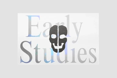
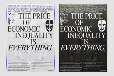
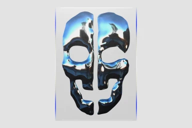
In an increasingly noisy digital landscape, Early Studies cuts through the static with a brand identity that leans into a sophisticated, corporate-intellectual aesthetic. The project, meticulously crafted by Soft Power, establishes a visual language rooted in minimalist composition and high-contrast typography. By utilizing a neutral, light grey palette as a canvas, the work prioritizes clarity, allowing bold serif typefaces to command attention. The brand icon—a stylized, fragmented human skull—serves as a recurring visual anchor, appearing in both flat vector formats and a polished, metallic chrome iteration that channels a modern, high-end sensibility. Across various collateral, including manifesto-style posters, the design navigates the complex intersection of technology and economic commentary with precision. The layout is disciplined and intentional, favoring grid-based structures that reflect a professional approach to digital branding. By integrating artistic sensibilities with commercial viability, the identity avoids unnecessary ornamentation, instead focusing on the weight of the message through typography and texture. Whether through a stark black-and-white print application or a 3D render / CGI surface, the project maintains a cohesive, rigorous look. Soft Power has successfully developed a visual system that feels both timeless and urgent, positioning Early Studies as a thoughtful player within the competitive space of apps and digital platforms through an unapologetically clean and authoritative design framework.
Horizontal, Commercial, Clean, Minimalist
Typography, Vector
White Seamless
Website / Web
