
Britten Sinfonia: Brand Identity
Sep 2019
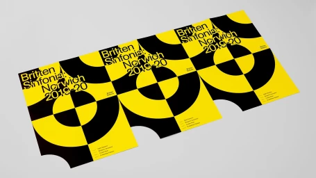
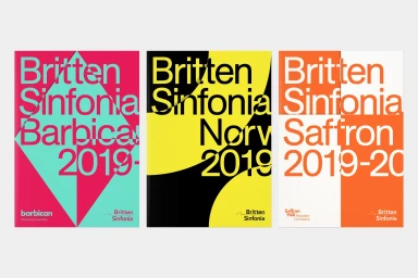
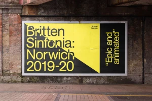
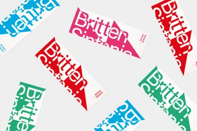
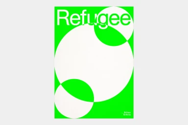
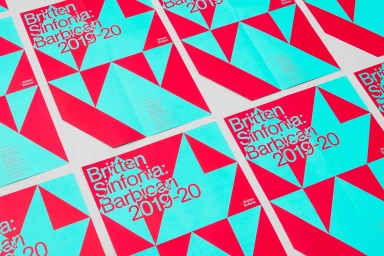
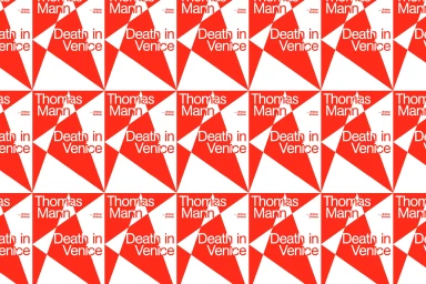
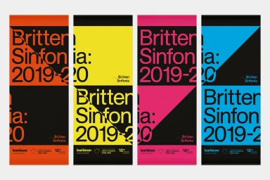
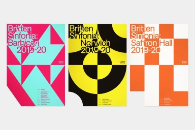
The brand identity developed by The District for Britten Sinfonia represents a masterclass in modern, modular design within the music, media, and entertainment industry. By eschewing traditional orchestral imagery, the project leans into high-contrast geometric abstraction to define the organization’s visual language. The system centers on a bold typographic hierarchy, utilizing clean sans-serif fonts that slice through vibrant, saturated color palettes ranging from neon greens and hot pinks to striking yellows and teals. This project functions as an expansive visual system, seamlessly translating from printed concert posters and vertical banners to outdoor billboard advertising and branded collateral. Across these varied touchpoints, the work employs vector-based graphics to build rhythmic, interlocking patterns of circles and triangles that evoke a sense of movement and contemporary precision. The aesthetic is relentlessly minimalist and purposeful, ensuring that season information remains highly legible while commanding attention in urban environments. Through the expert use of negative space and a disciplined approach to grid layouts, the identity manages to feel both artistic and corporate, providing a cohesive framework that elevates Britten Sinfonia’s promotional event communication. The result is an impactful, scalable identity that captures the energy of a live performance through sheer graphic innovation and a rigorous adherence to structural symmetry, establishing a distinct, recognizable presence in a crowded cultural landscape.
Horizontal, Commercial, Graphic
Typography, Vector
Advertising Campaign
