
Cooke Curtis & Co
Brand Identity
Mar 2017
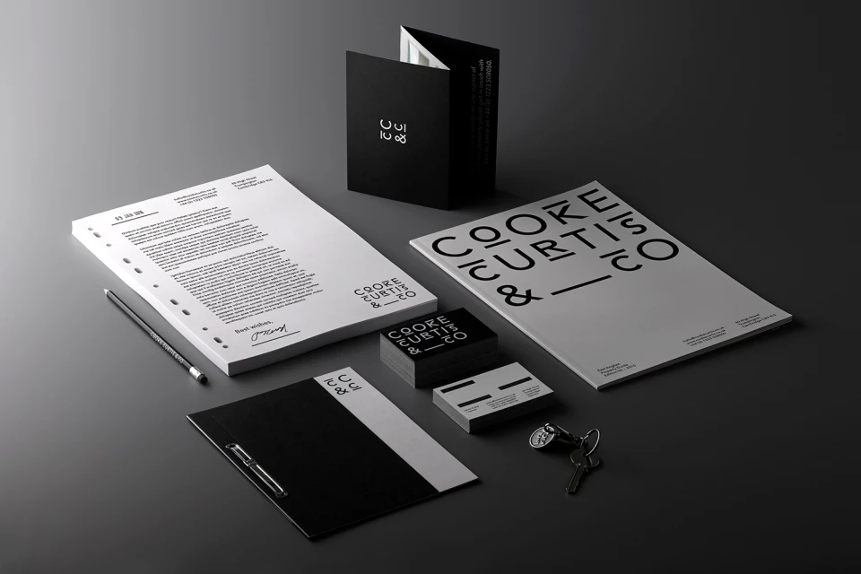
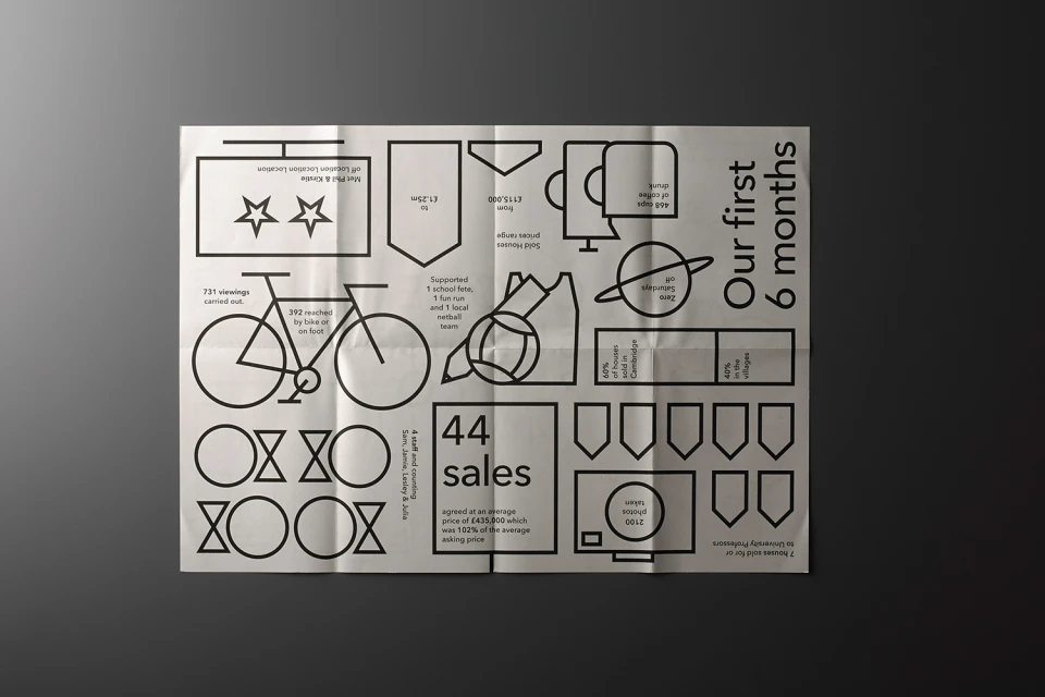
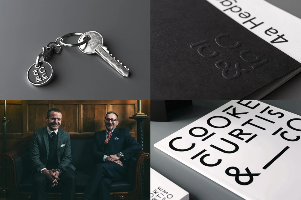
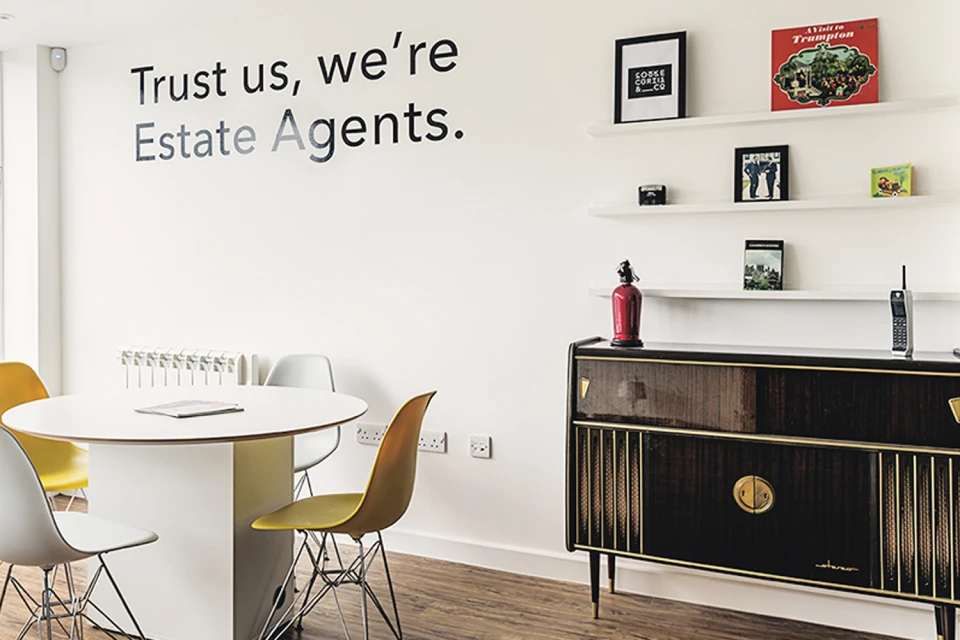
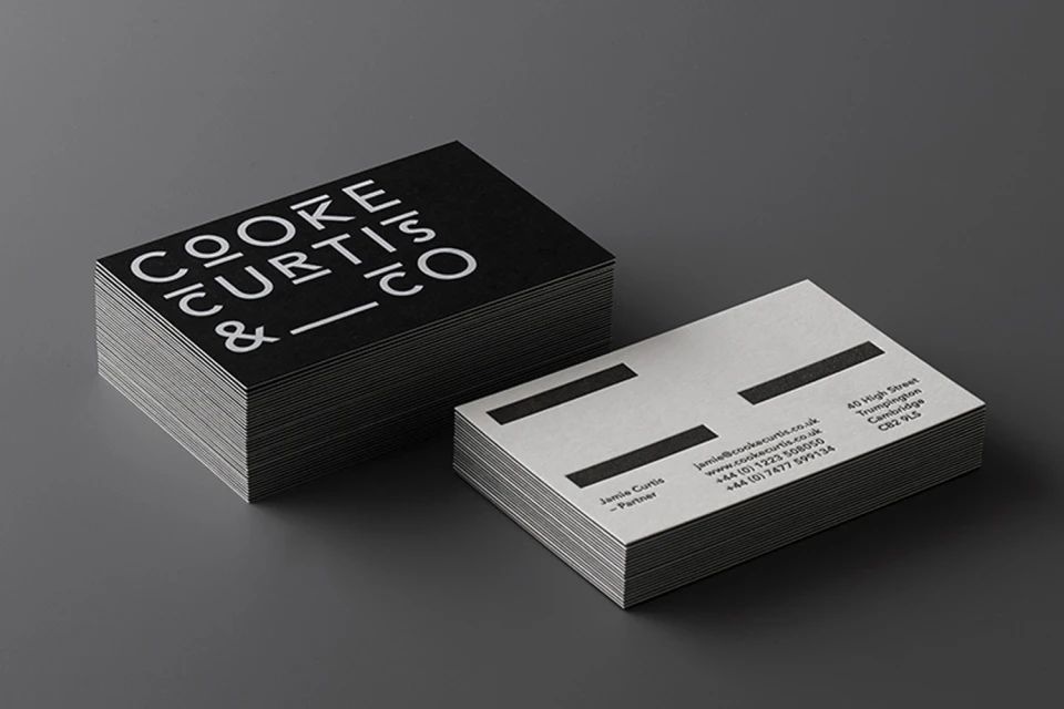
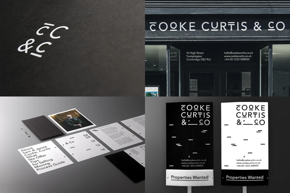
In the highly competitive landscape of real estate platforms, Cooke Curtis & Co has successfully redefined its market presence through a sophisticated and uncompromising brand identity that leans into editorial minimalism. Executed with precision by The District, the design system centers on a high-contrast, monochrome black-and-white color palette that communicates authority and professional clarity. By leveraging clean, bold sans-serif typography across an extensive suite of collateral—ranging from tactile, embossed stationery to complex infographics—the brand avoids the visual clutter common in the real estate sector. The project utilizes a mix of studio strobe photography to emphasize the sharp, geometric lines of its corporate branding, while seamlessly integrating lifestyle imagery to ground the identity in human-centric service. This dual approach, evident in both the printed materials and the bright, natural light-filled office interior, underscores the firm's ethos of transparency and modern professionalism. From the intricate detailing on branded key fobs to the structured layout of internal performance data, the design identity feels both tangible and authoritative. The result is a cohesive visual language that successfully elevates the brand from a traditional estate agency to a contemporary authority in property management, ensuring every touchpoint, whether a signage installation or a folded brochure, reinforces their identity with consistent, modern intent.
Horizontal, Commercial, Clean, Minimalist
Typography
Real Estate Platforms
