
Storey's Field Centre: Brand Identity

Mar 2018
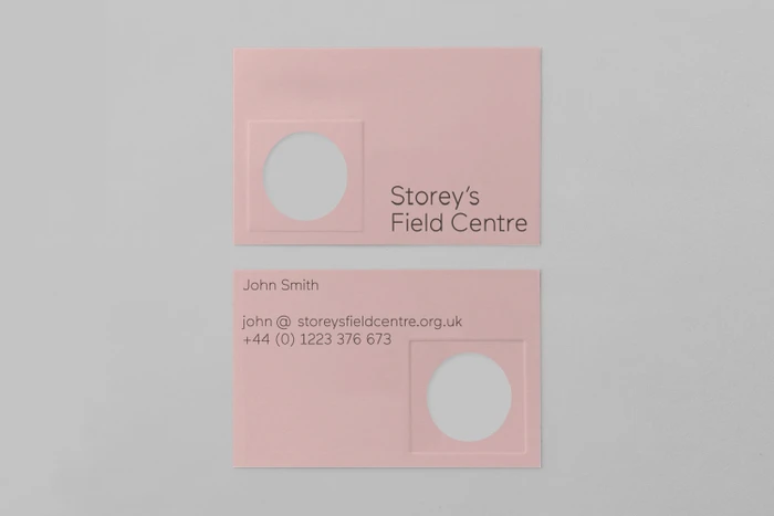
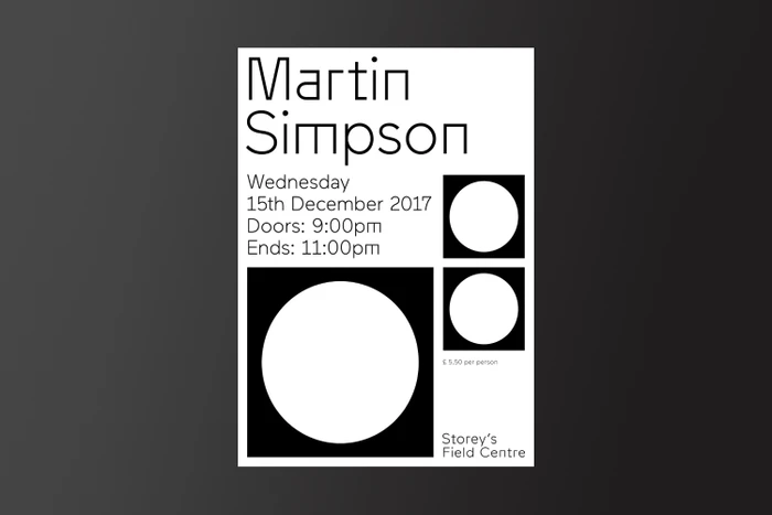
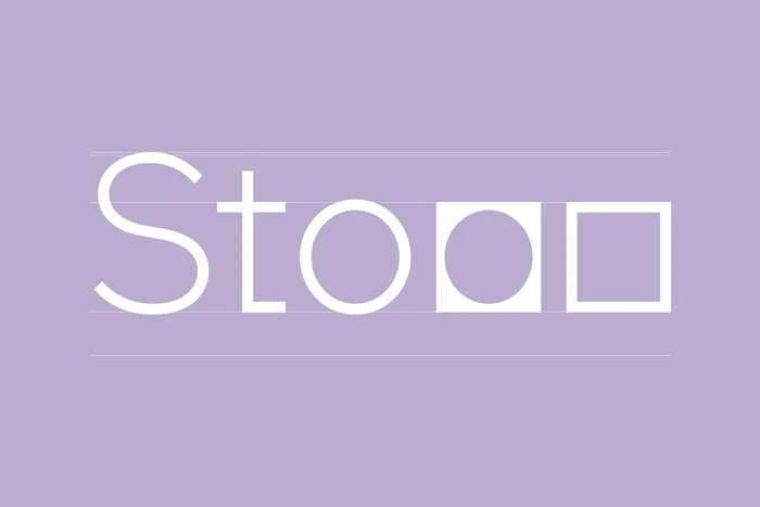
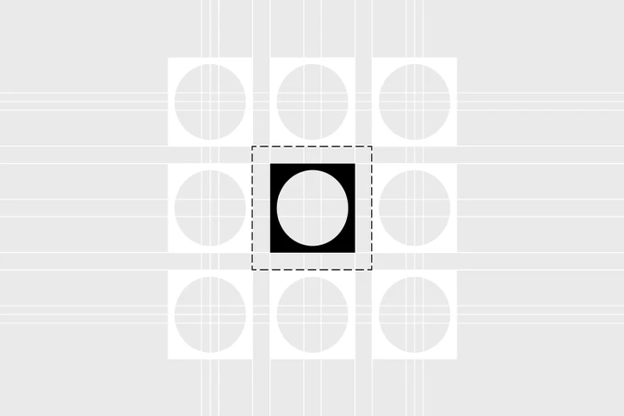
The brand identity for Storey's Field Centre stands as a masterclass in geometric restraint and modern corporate design. Executed with precision by The District, the project moves beyond mere aesthetics to establish a cohesive visual language that feels both structural and highly accessible. By leveraging a rigorous grid system, the design team creates a sense of order that reflects the architectural nature of the facility. The identity is defined by its commitment to minimalist principles, utilizing a clean, sans-serif typography that ensures maximum clarity across all brand collateral. Throughout the suite, viewers encounter a sophisticated play between circular and square motifs, most notably in the clever integration of a solid black square within the letter O, which serves as a recurring visual anchor. The use of a curated, soft-hued color palette—shifting from pastel pinks to lavender and high-contrast black-and-white—adds a necessary layer of warmth to an otherwise technical framework. This project excels in its use of abstract vector elements and refined graphic layouts, ensuring that every touchpoint, from event posters to tactile business cards, feels intentional. By prioritizing negative space and geometric clarity, the identity conveys an institutional authority that remains distinctly contemporary, positioning Storey's Field Centre as a landmark of thoughtful, design-led communication in the commercial sector.
Minimalist, Vertical
Typography, Vector
Solid Colour
