
Brand
ProjectBrand Identity
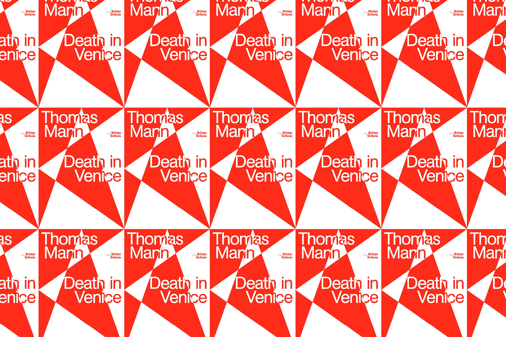
Britten Sinfonia Brand Identity 2019
Associated creatives

Tags
Description
This graphic design project by The District for Britten Sinfonia presents a striking repeating pattern built from sharp red and white geometric angular shapes. Prominent typography arranged across the composition displays the names Thomas Mann and Death in Venice alongside the Britten Sinfonia branding. The vibrant red and clean white contrast creates a dynamic visual rhythm across the tiled layout. Created as part of the Brand Identity project, the work showcases crisp graphic execution and intentional typographic arrangement.
Style
Horizontal, Commercial, Graphic
Techniques
Typography, Vector
Industries
Music
Color
Pure White (50%)
Scarlet (50%)
Background
Typographic
Context
Brand Film / Corporate Video