
Brand
ProjectBrand Identity
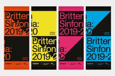
Britten Sinfonia Brand Identity 2019
Associated creatives

Tags
Description
Graphic design project featuring four vertical posters with bold diagonal color blocking in orange, yellow, pink, and blue against black segments. The composition incorporates clean sans-serif typography displaying Britten Sinfonia and season dates with partner logos arranged along the bottom edge. Created by The District for Britten Sinfonia, the branding showcases a cohesive visual system with vibrant flat color fields and striking geometric splits.