
Brand
ProjectBrand Identity
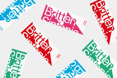
Britten Sinfonia Brand Identity 2019
Associated creatives

Tags
Description
Graphic identity project for Britten Sinfonia created by The District, featuring multiple rectangular printed tickets scattered across a pale grey background. Each ticket showcases bold diagonal geometry with contrasting triangular sections in vibrant tones of red, turquoise blue, emerald green, and hot pink. The typographic layout integrates the Britten Sinfonia logotype cleanly within the dynamic geometric composition. The clean studio lighting highlights the sharp contrast and crisp paper edges of each piece. This branding collateral emphasizes modern minimalism and bold visual rhythm.